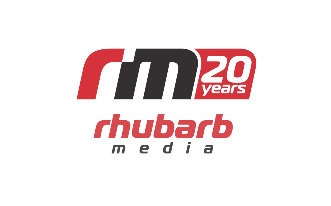
Rhubarb Turns 20
Sometimes milestones sneak up on you.
This past year has been quite the adventure: open heart surgery and two kids got married.
I often say creating and building brands is a lot like having kids. They’re born with great effort and over time you pour into them what you can. You nurture, guide, lose sleep, make mistakes and try again. Then one day you find yourself standing at the front officiating one of their weddings, giving a speech and singing at the other, and it hits you. Where did the time go? You just hope the years of care have set them up for health and success.
In 2006, Rhubarb Media was born out of necessity. It was not really planned.
We landed back in Barrie after 13+ years in church ministry, having been basically kicked out of the U.S. for having our visa extension denied and overstaying our welcome. (But that is another story for another day.)
I had no formal training in design or marketing, but several years of experience by default. So of course we started a media and marketing company.
It began as Ballantyne Design, and eventually became Rhubarb Media (along with Pastor Pixel). You can read the story of the name and brand here.
With a Mac and Adobe Creative Suite, I launched from the basement of Sandra’s mom’s townhome. (Thanks Mommer!)
Along the way we were joined by some amazing and talented staff: Tim, Iris, Mark, Mario, Tyler, Jess, Dan, Zhenya, Joelle, Alma, Steedan, Jeni, and Josh. Freelancers Thain and Collin. We’ve also partnered with others such as Burton Marketing Management, Stature Films and FlyPress, Cole Bennet, Samantha Erin, Jennifer Klementti, MH Connect, Catalyst Communications Choreography, RedBird and Vireo Research. (I’m sure I am forgetting people – sorry!) Our success really is a reflection of their passion, dedication and talent.
We have had the privilege of serving some incredible clients too. Many have been with us for a decade or more. I think we are now over 550 in the database.
Over the years we have also been able to donate hundreds of thousands of dollars in-kind support to local social organizations, arts communities, theatre groups, and faith-based support services.
We have won a few awards along the way, but our biggest reward has always been happy, cared for clients and staff.
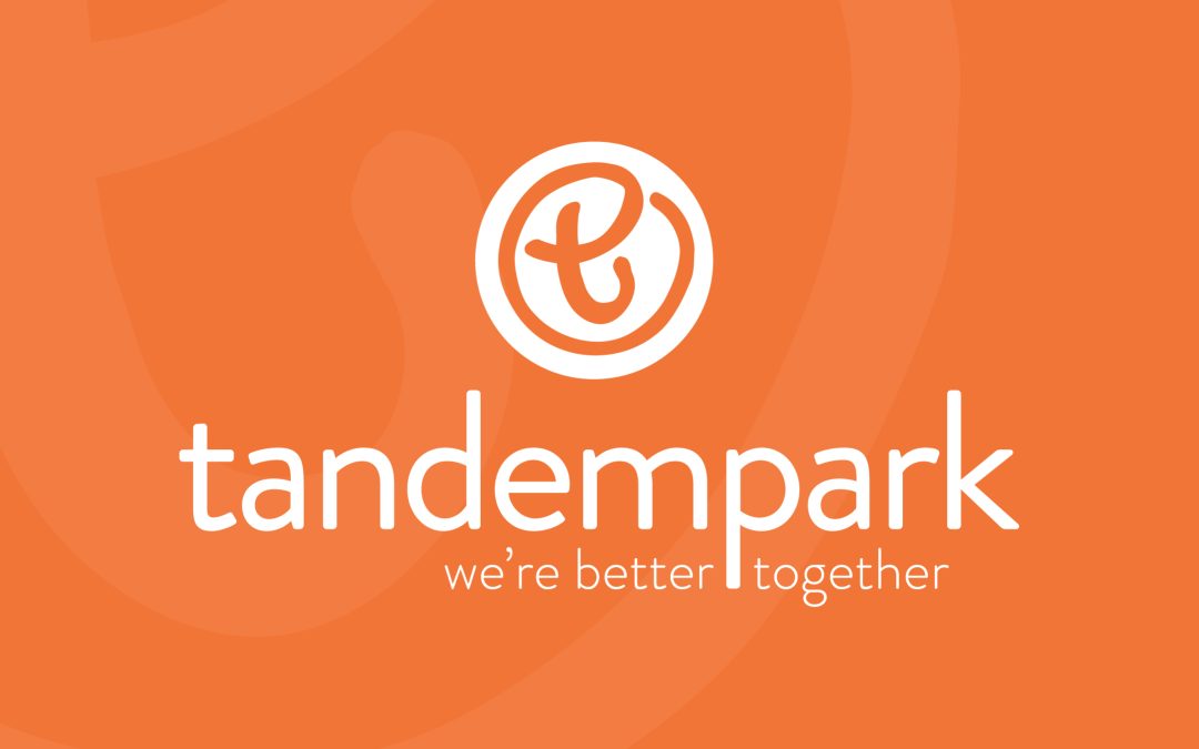
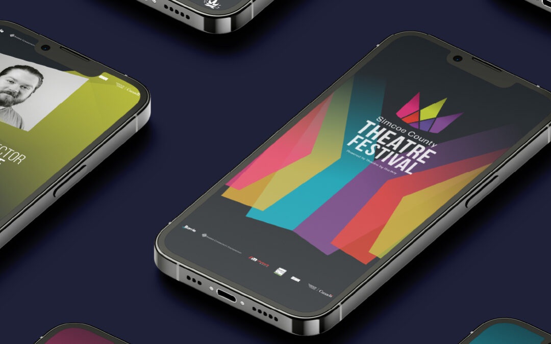
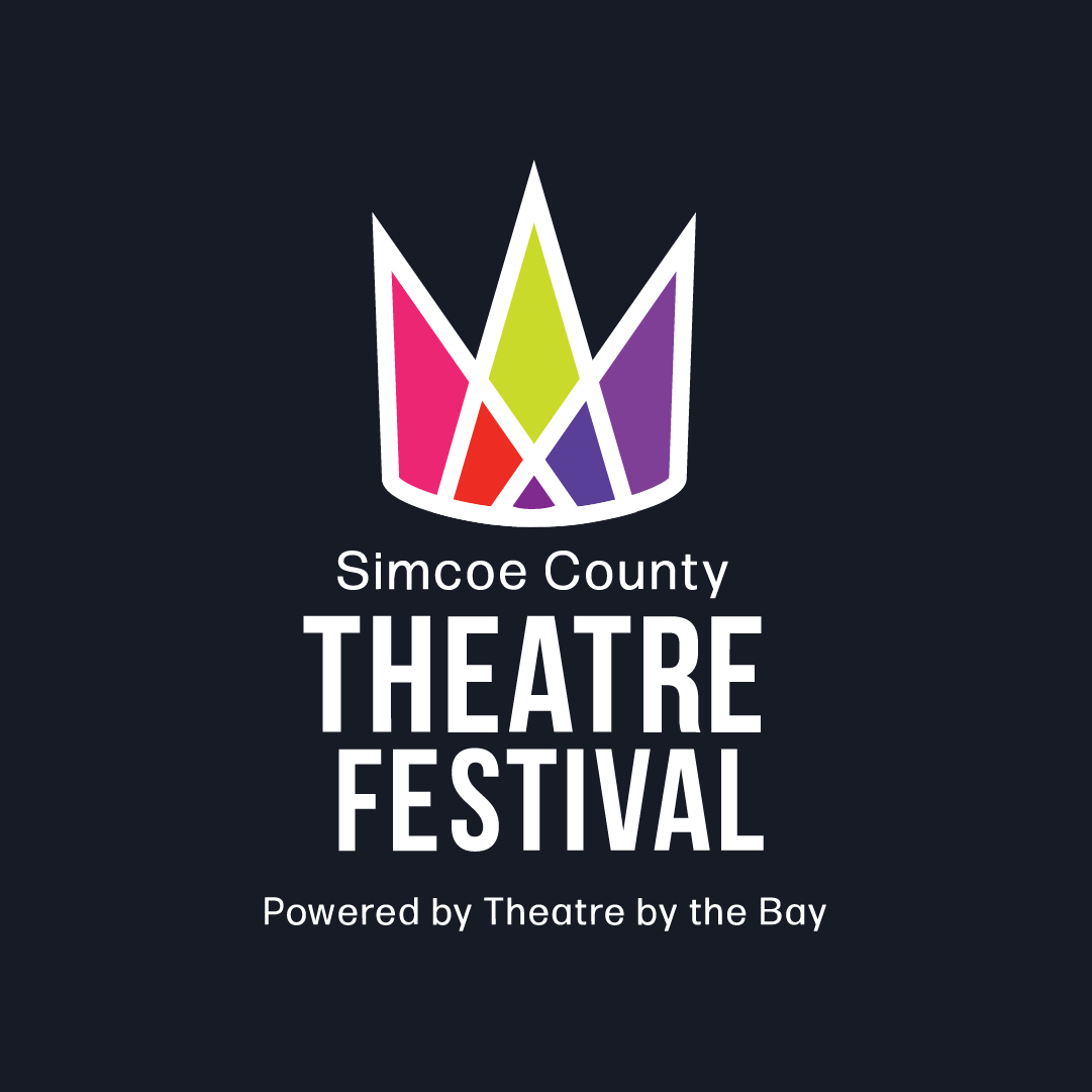
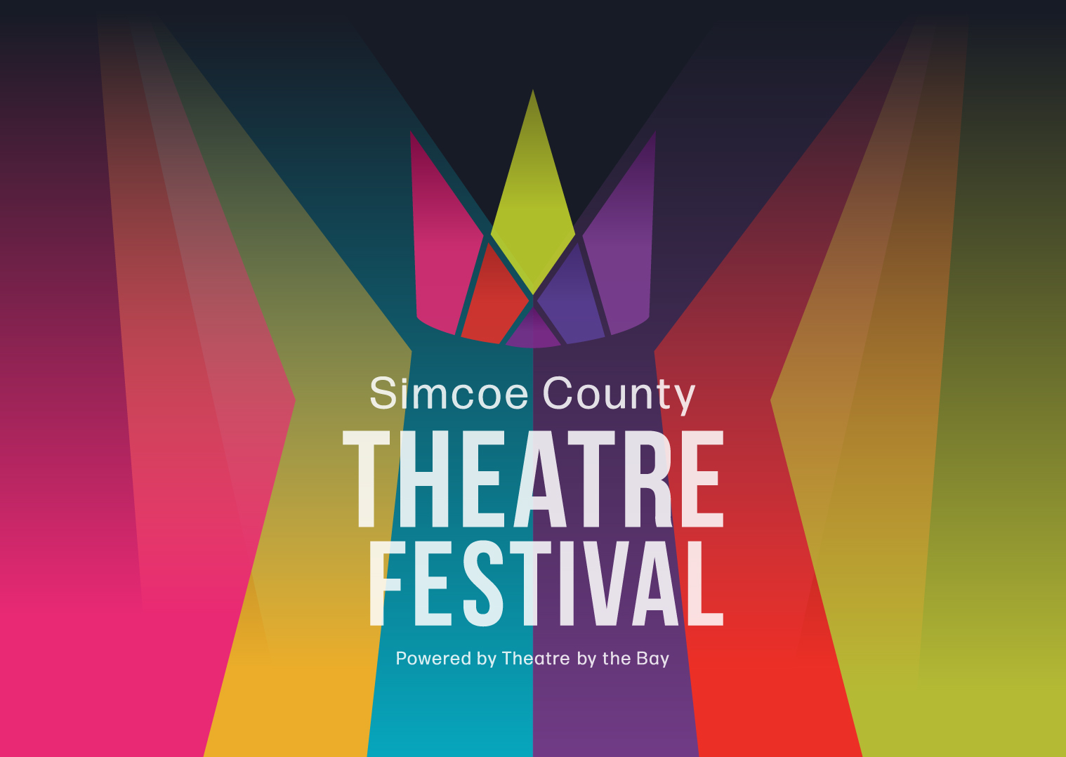
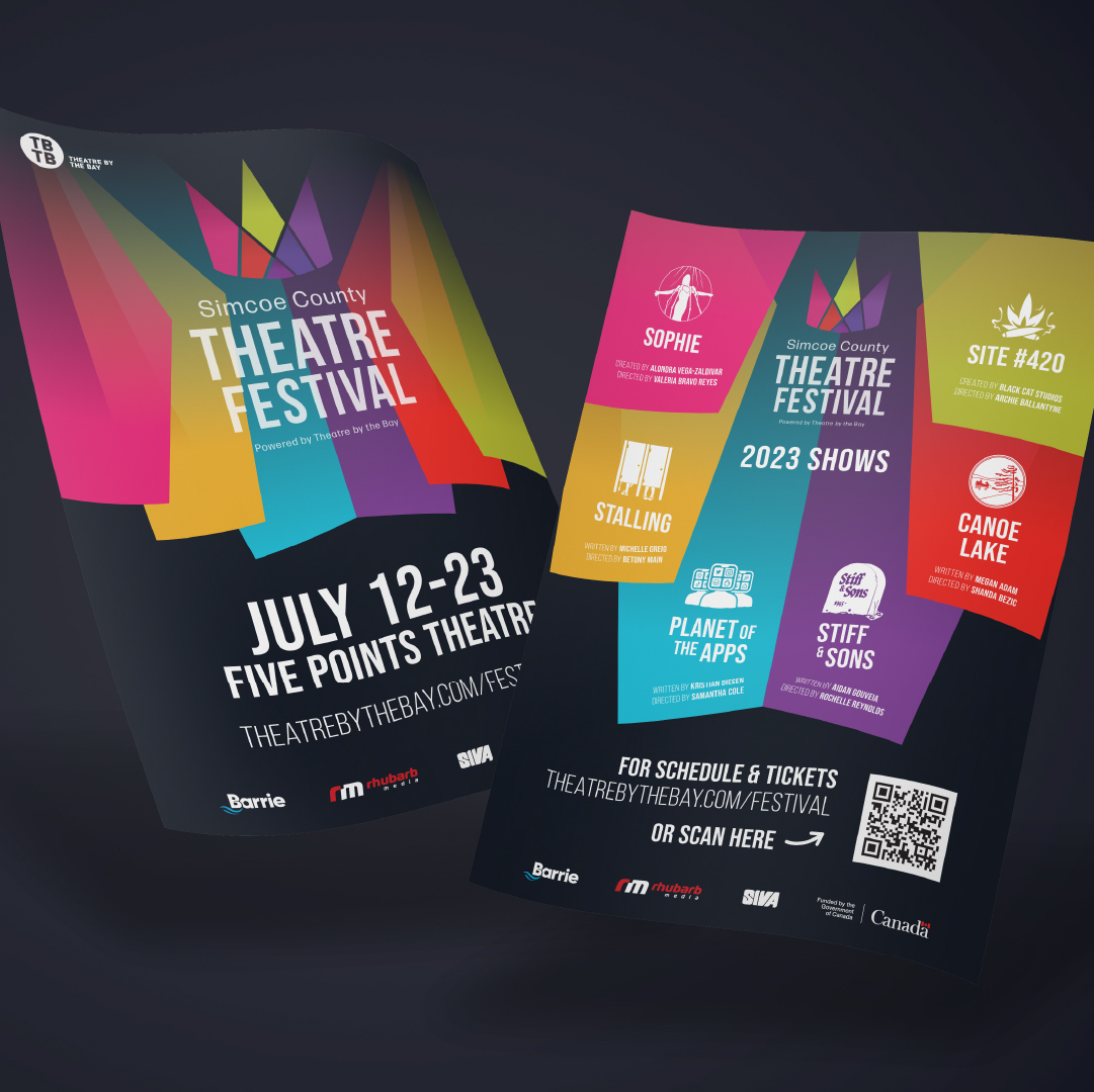
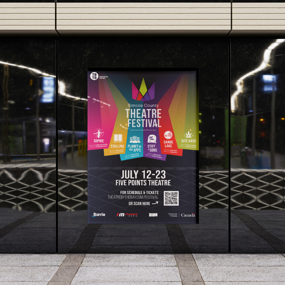
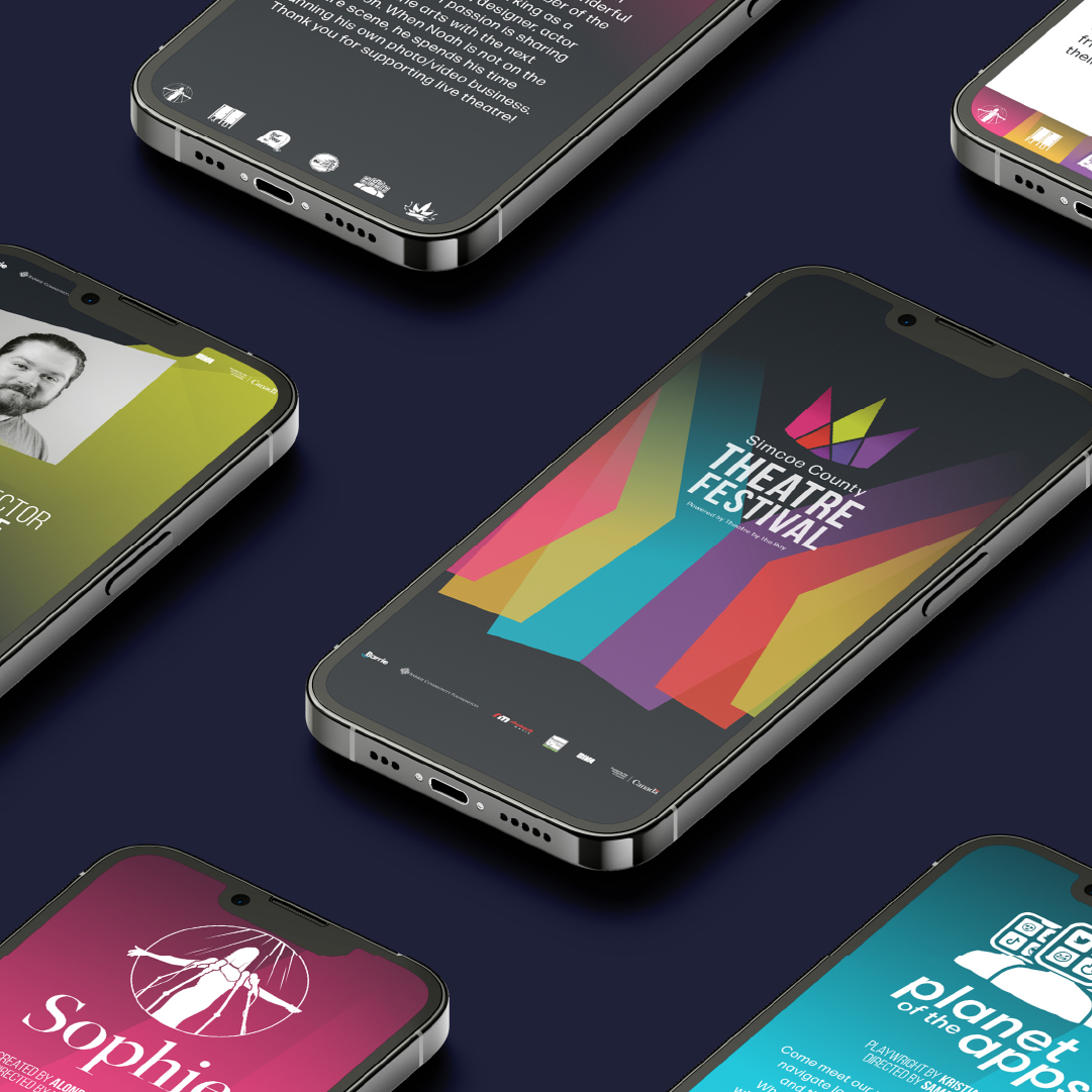
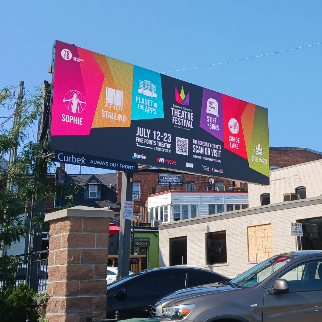
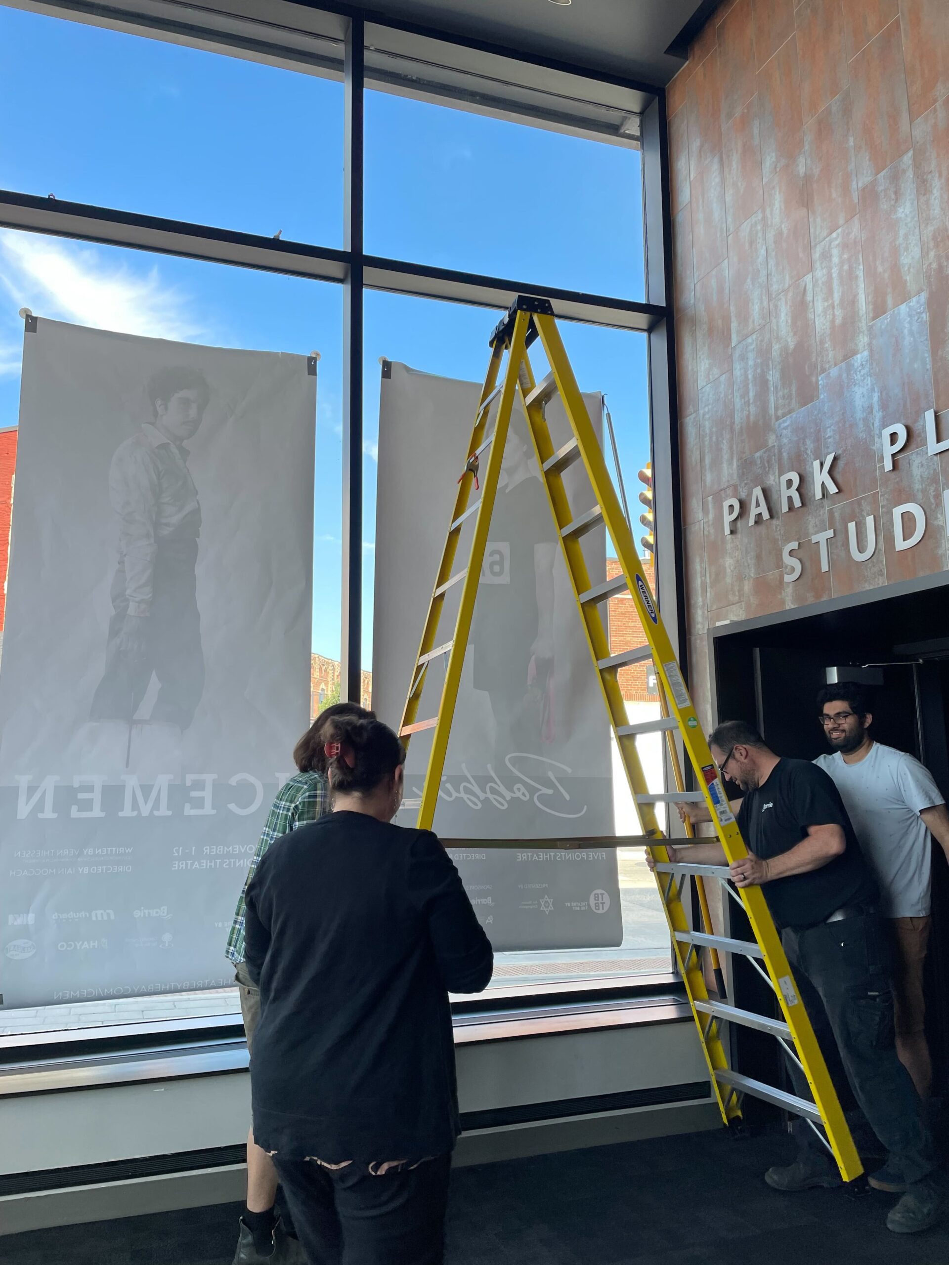
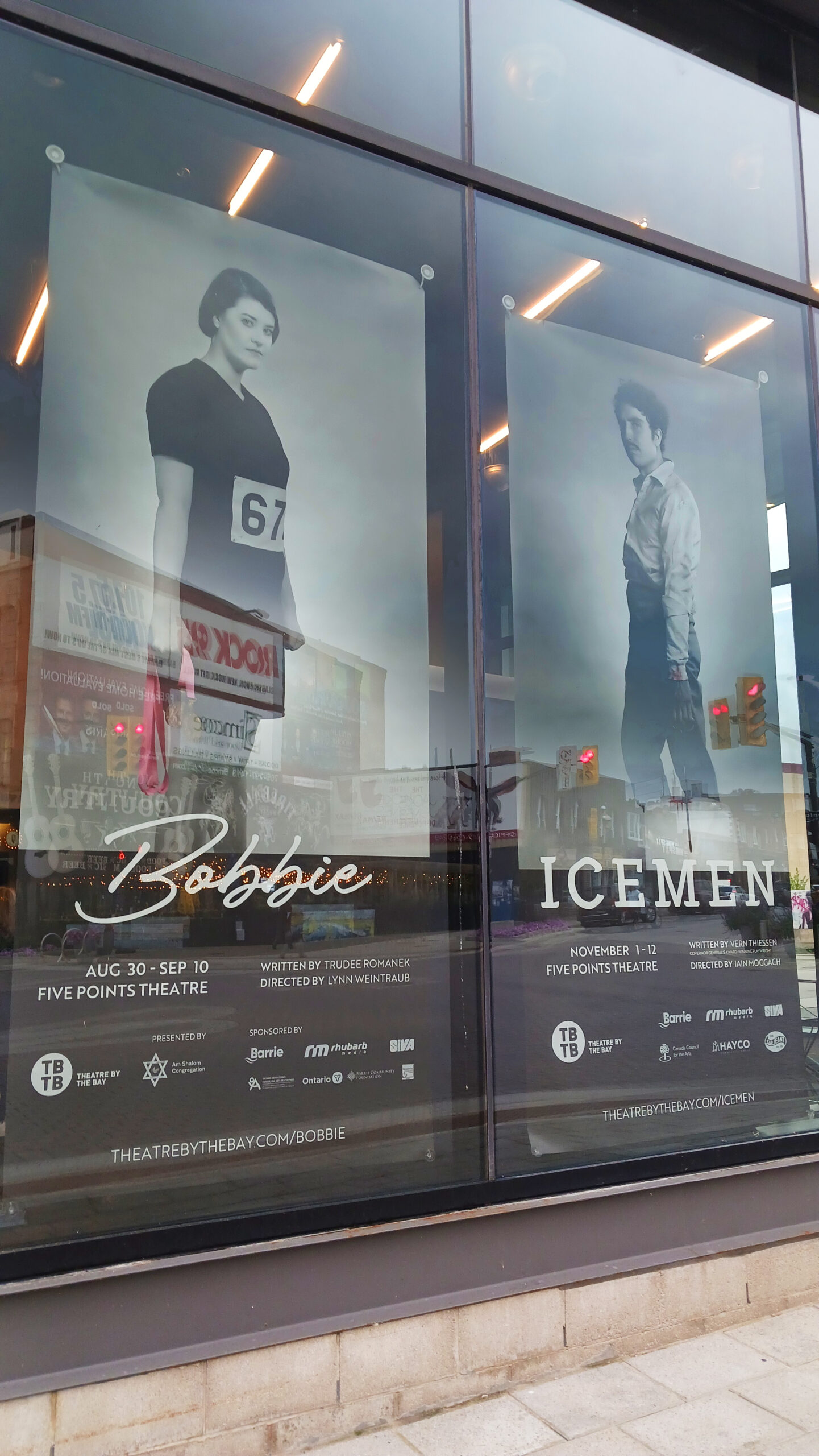
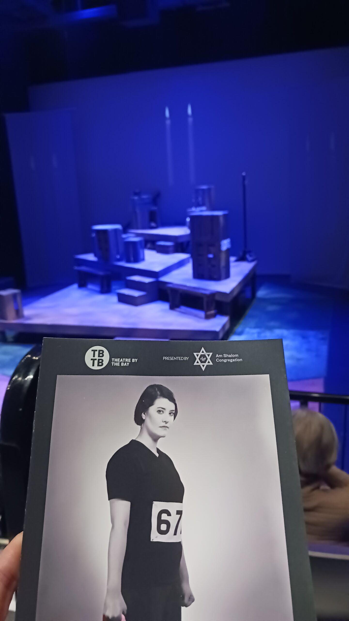
This 20 year logo reel is just a snapshot of many of the brands we have helped create and build. (Sorry if yours did not make it in!) Some of those companies have come and gone, but it is really the relationships that stand out most for us. Rhubarb has always been a relational company, and with every flash of a logo comes a memory and a moment with our clients who have become friends.
Now we look toward another year and new adventures. We hope to see the Rhubarb legacy continue, serving more clients and helping them tell their story.