by webteam | Jun 12, 2025 | Branding, Design
Why Your Logo Should Express, Not Explain
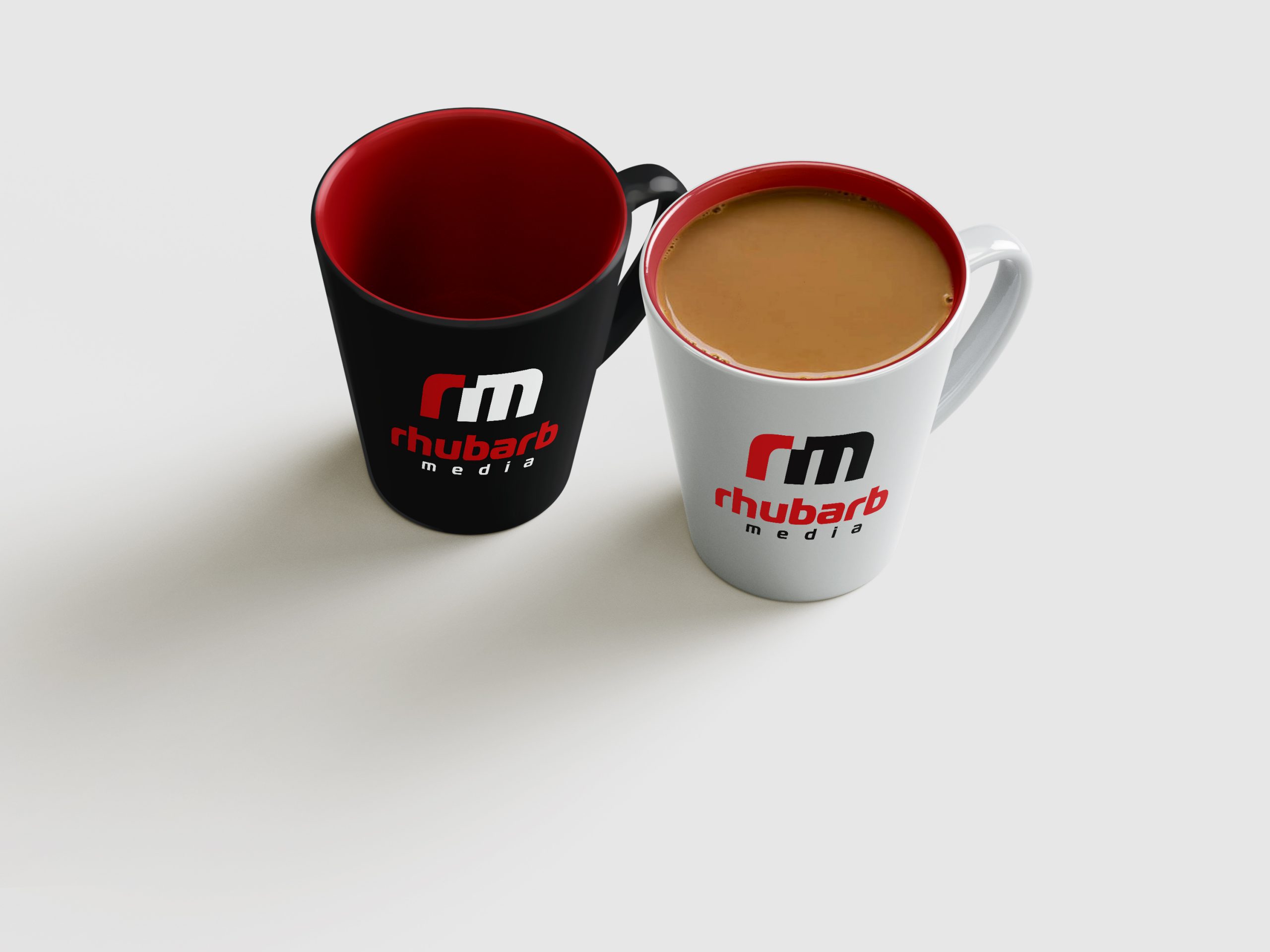
At Rhubarb Media, we believe every brand begins with a story. Your Story. Well Told.
Every lasting identity carries a kind of explanation within it. Not a technical one, but a symbolic one. The shapes, colors, and rhythm of a logo often reflect something deeper about a brand’s history, purpose, or character. They hint at meaning without spelling it out. This kind of explanation belongs to storytelling, not instruction.
When we design a logo, we are not trying to describe what a company makes. We are trying to express what it means. The mark becomes a visual shorthand for the story, a signal that evokes the brand’s essence and emotion. It might draw inspiration from heritage, function, or vision, but it does not attempt to explain the mechanics of the product itself.
This is the heart of story-based brand building. A strong brand communicates through layers of meaning. Its identity gives shape to belief and memory, not a diagram of its offering. The story exists just beneath the surface of the form, inviting people to feel what the brand represents rather than simply see what it does.
Beyond the Product
Every company begins with something tangible: a product, a service, or an invention. These define what a company does, and that story belongs to marketing. Marketing explains through words, imagery, and campaigns. It creates clarity and context.
Branding does something different. It gives the story its emotional signal. Through its mark, color, and tone, the brand allows people to sense what the company stands for without ever saying it outright.
When a logo tries to describe its product, it becomes tied to a single moment in time. When it reflects an idea or feeling, it becomes timeless.
Apple’s apple is not about computers. It represents curiosity and creativity.
Nike’s swoosh is not about shoes. It conveys motion and determination.
Starbucks’ siren is not about coffee. It evokes ritual, connection, and warmth.
Walter Landor once said, “Products are made in a factory, but brands are created in the mind.” A logo lives in that space, where design becomes memory and memory becomes meaning.
The Power of Symbolism
Strong branding works through symbolism. A well-designed mark does not tell the story outright; it opens a door to it.
Paul Rand wrote, “A logo derives meaning from the quality of the thing it symbolizes, not the other way around.” A logo gains its strength from what it represents and how it is lived out.
The designer’s work is to distill, not to describe. The goal is to create a form that carries the spirit of the brand in a way that feels inevitable. When this happens, a logo stops being an image and becomes an emblem of belief.
Marketing Explains, Branding Connects
Marketing and branding serve the same purpose but in different ways. Marketing explains how something works and why it matters. Branding gives those facts a heartbeat.
If marketing speaks with clarity, branding speaks with feeling. The logo becomes a visual cue that connects both voices.
Marty Neumeier once wrote, “People don’t fall in love with products; they fall in love with stories, symbols, and meaning.” That is what a logo does when it is done well. It holds the meaning that marketing later puts into words.
Meaning Over Mechanics
Milton Glaser said, “The function of art is to make the invisible visible.” That idea sits at the center of good identity design. The logo’s purpose is to make the invisible values of a company visible through shape, rhythm, and proportion.
Mechanics may change, but meaning endures. A thoughtful identity can hold that meaning for generations, becoming a familiar mark of trust and belonging.
A logo should not try to show everything a company does. It should signal the larger story that people can feel. Marketing explains the product or service. Branding turns that explanation into something people care about.
When clarity in message meets emotion in identity, a company gains more than recognition. It earns belief.
At Rhubarb Media, this is what Your Story. Well Told. truly means. Design becomes more than an image. It becomes the story’s flag, carrying memory, purpose, and meaning wherever it goes.
Designer’s Notes: The Thinkers Behind the Quotes
Walter Landor
Founder of Landor Associates, one of the most influential brand agencies in history. Landor transformed how companies think about branding, moving it from packaging and production to emotion and perception. His agency built identities for Coca-Cola, Levi’s, FedEx, and BMW.
Paul Rand
A pioneer of modern corporate identity who created the logos for IBM, UPS, ABC, and NeXT. Rand proved that design could be both simple and intelligent, that a mark could be timeless if built on concept rather than style.
Marty Neumeier
Author of The Brand Gap and Zag, and one of the first to connect design thinking directly to business strategy. His work reframed branding as the act of creating meaning rather than simply creating visuals. His ideas guide creative teams at Apple, Google, and Adobe.
Milton Glaser
Designer of I ♥ NY and co-founder of New York Magazine. Glaser believed that design should reveal the unseen—ideas, values, and emotions that words alone cannot express. His philosophy gave design its human depth.
Together, these thinkers shaped the foundation of modern branding. Each believed that a brand’s greatest strength lies not in what it shows, but in what it allows people to feel.
by webteam | Jun 17, 2014 | Design, Web Design, Websites, Wordpress
In the past few weeks we have launched two new e-commerce websites on the increasingly popular Shopify platform.
Under the Shopify Partners program, our team was able to work with clients to configure, populate, train-on and thoroughly test their new online stores.
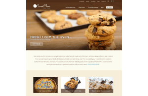
Although this is our 4th major update to sweetflour.ca since first launching it in 2009 using Drupal 6, we consider this an official “version 2” after migrating it from Ubercart 2 to Shopify. In 2012 the site underwent a restructuring and simplification of products and categories to improve UX and SEO.
Since seeing an increase in online sales conversions, we made it a priority to maintain the site’s SEO equity by migrating the structure, maintaining keywords in content, page titles and meta descriptions, configuring 301 redirects and submitting the updated site map to Google Webmaster Tools. Additionally, we made it a priority to ensure the website content is mobile-first and usable on all size of devices with its responsive design. Helpful features such as a “call now” button that is revealed on the mobile-view of the website have been put in place to increase value to the customer experience.
Our client Kim Gans forwarded a note in a support discussion she had with a Shopify Guru Team member:
…I must say that you probably have one of the best put together bakery sites I have seen. The layout, the rules and feel of the site are extremely well done.
Mark G — A Shopify Guru
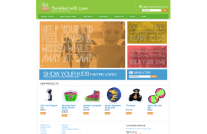 Parcelled With Love was a start-up e-commerce site with the idea of selling toy products to parents and have them delivered as care packages to children while they are away at Summer camp. We worked with Sarah and Josie to give direction on marketing messaging, content development and appropriate photography styles. The logo and brand colours had been kicked-off before we took on the project, but we worked to further refine some of the styles and round out the colour palette to make the site’s presentation fun and kid-friendly without making the site look childish.
We were extremely pleased with the website that the Rhubarb Media team designed using the Shopify platform. Rhubarb was able to successfully choose a theme in keeping with our products and provide us with design concepts that reflect our brand. The structure of the site the team built worked well, incorporating all of our categories and products. Finally, the Rhubarb team ensured that we were well trained to update and navigate changes to our Parcelled with Love website independently. We would happily recommend the professionals at Rhubarb Media.
Sarah and Josie – Parcelled With Love
Let us know if you have an idea for an online business and need some assistance with your marketing efforts!

by webteam | Feb 18, 2014 | Airports, Branding, Design, Drupal, Photography, Web Design
The Northern Rockies Regional Airport (NRRA), being one of the fastest growing airports in Canada, was looking to develop a new website that utilizes the most effective technology to enable the airport to provide a dynamic, interactive and user-friendly website for its passengers.
 In early 2013, the NRRA had selected Rhubarb media through a competitive public FRP process due to their great deal of attention put forward into their proposal and their forward thinking in order to achieve the goals of the NRRA.
Rhubarb Media’s objective was to produce a website that would support the airport’s overall strategic vision of attracting additional routes and airline partners to serve domestic regional markets not currently represented at NRRA. Equally important was this project’s ability to attract new business and investment through e-marketing and the publication of pertinent airport economic development information and links on the website.
Here’s what they had to say:
“Throughout the entire process, Rhubarb Media was thoroughly organized and extremely easy to work with. They were able to compile all of our requests and produce a product that not only functioned extremely well, but went above and beyond to ensure the site not only matched our vision, but exceeded it far beyond our expectations.
Rhubarb was continuously looking out for the NRRA’s interest, and was innovative in finding solutions to our unique operations of a busy northern airport. Their approach to customer service, although very professional, came off as working with a friend than a typical client/business relationship which was easily helpful at putting us at ease during meetings and troubleshooting scenarios.
Rhubarb Media were an absolutely joy to work with, and I highly recommend their services.” (Eric Desnoyers, Business Manager, Northern Rockies Regional Airport)
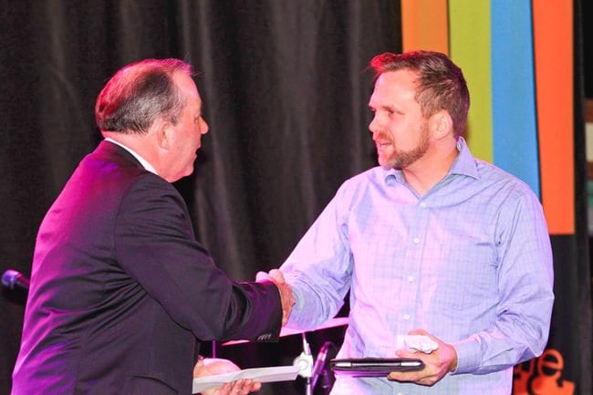
by webteam | Nov 27, 2013 | Art, Awards, Design
(From the Barrie Examiner, November 27, 2013) “The Barrie Arts Awards celebrated some of the city’s artistic best in front of a standing-room only crowd at the Southshore Centre November, 26, 2013.
Five awards were presented in between performances representing a cross-section of the arts community.”
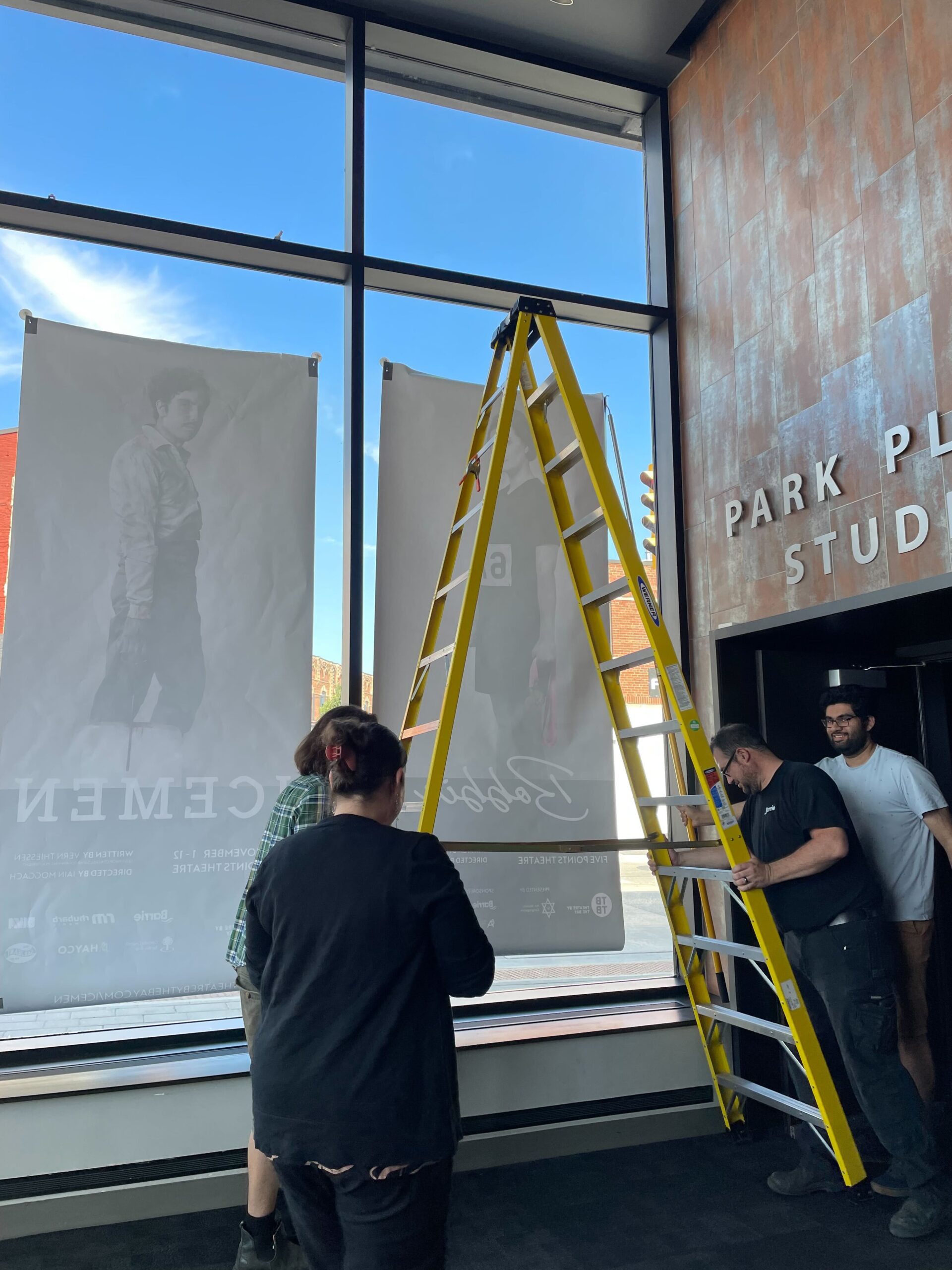
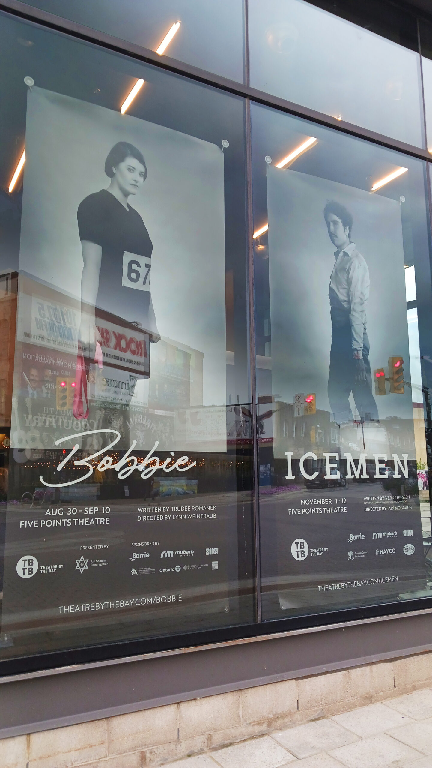
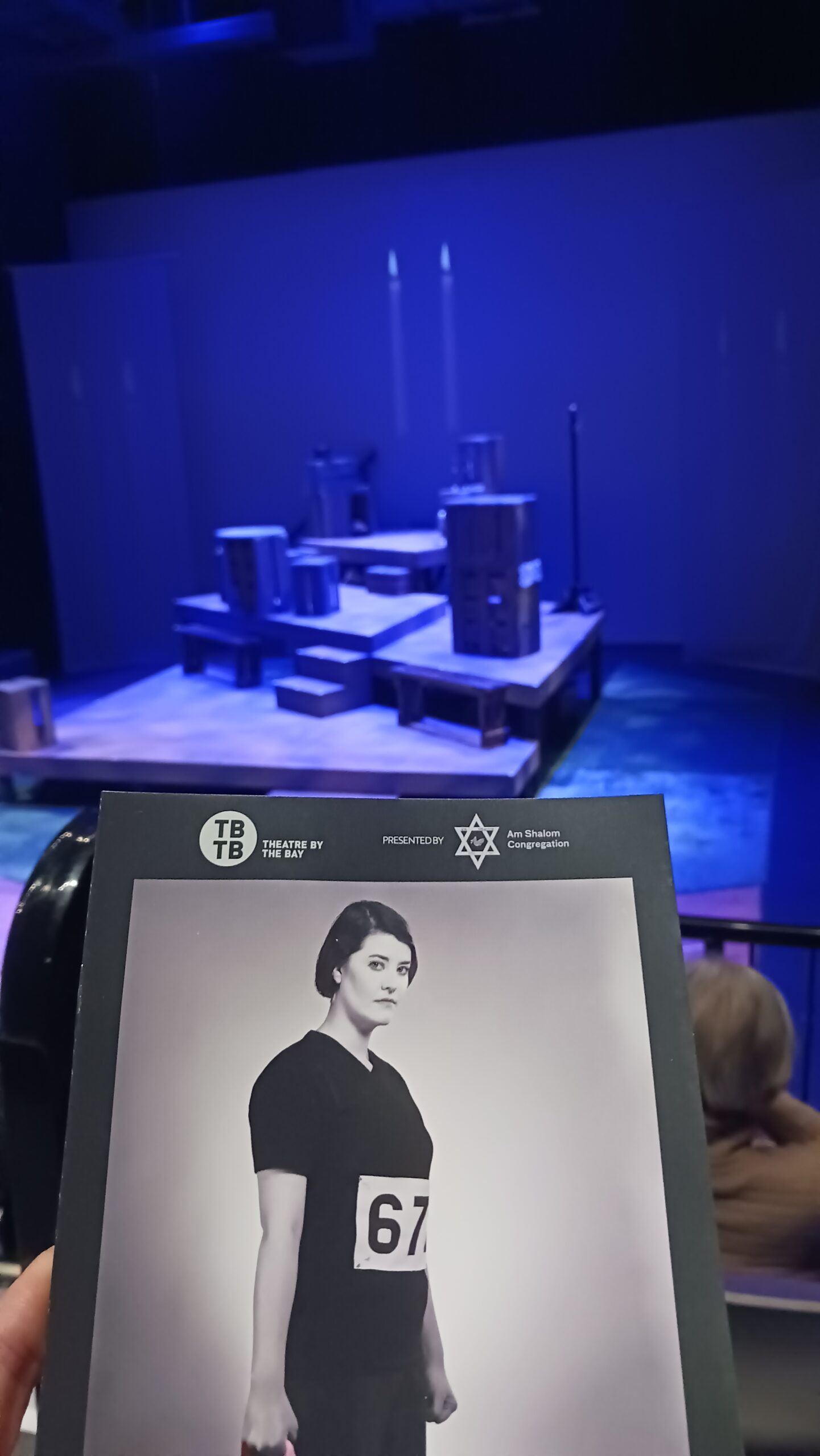
“Chad Ballantyne picked up the business award for his long time support of the arts, both as a volunteer, a parent of kids who have interest in the arts and as the creative director of Rhubarb Media, which operates out of a unique co-work environment, he started in downtown Barrie called The Creative Space.”
Rhubarb Media has been a strong supporter of arts and culture in Barrie since they launched in 2006. They have sponsored or offered expertise to the MacLaren Art Centre, Kempenfelt Community Players, Moving Art, The Loft Art Space, Talk is Free Theatre, Cingolani Arts, Arts ce Soir, Barrie Arts and Culture Council, The Green Room News and the Barrie Arts Awards. They believe that “the arts are one of the biggest contributors to positive and cultural transformation”. Rhubarb’s generosity has clearly demonstrated a sustained support and investment in helping to make the Barrie arts community thrive.