by webteam | Dec 16, 2025
BACKGROUND
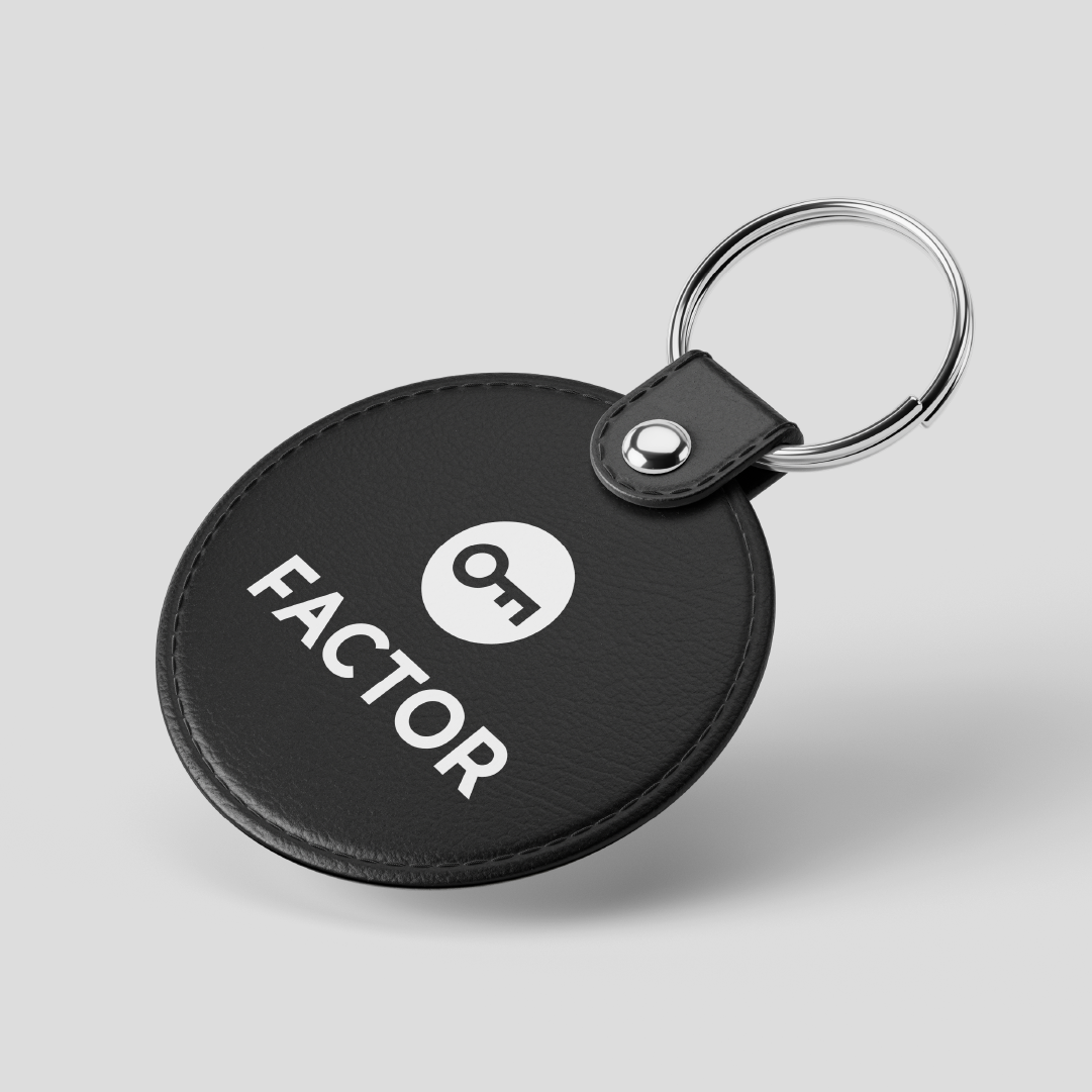
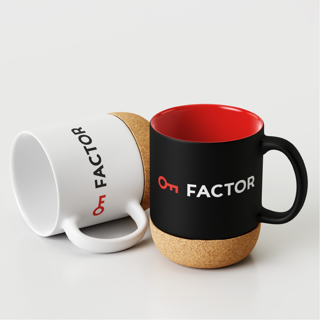
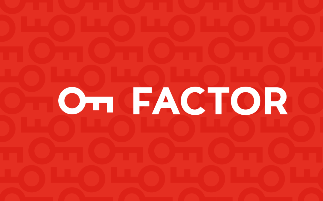
Factor is the key that turns the impossible into the accessible. Like the teeth of a lock, its algorithms unlock mathematical complexity to reveal what is behind the number. In a world where security depends on complex, secure hidden factors, this symbol reminds us that Factor is the one that can unlock it, or prove it infallible, providing the security we all need.
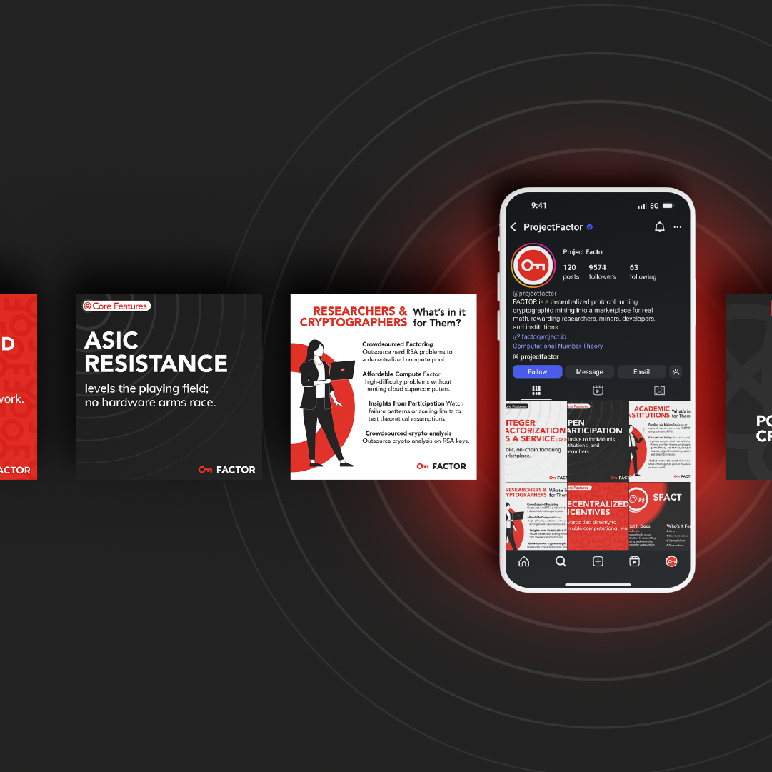
FACTOR is a decentralized infrastructure protocol that rewards real mathematical problem-solving through useful proof of work. It transforms cryptographic mining into an open marketplace for integer factorization, accessible to researchers, miners, developers, and institutions.
Things we worked on:
BRANDING, WEBSITE
WEBSITE
by webteam | Dec 16, 2025
BACKGROUND
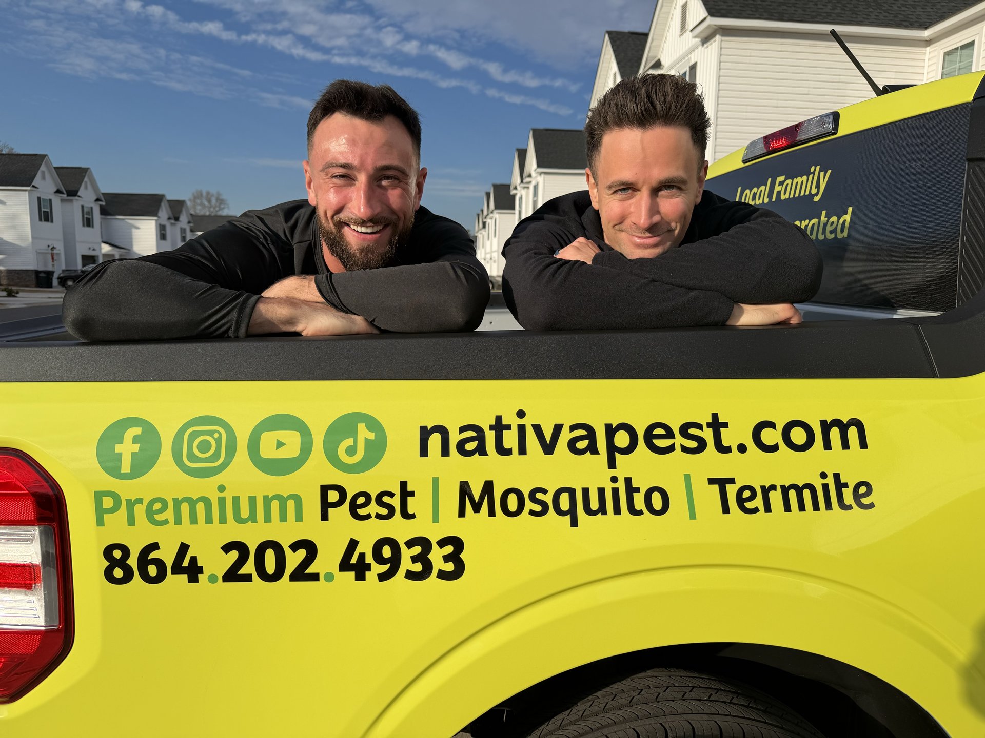
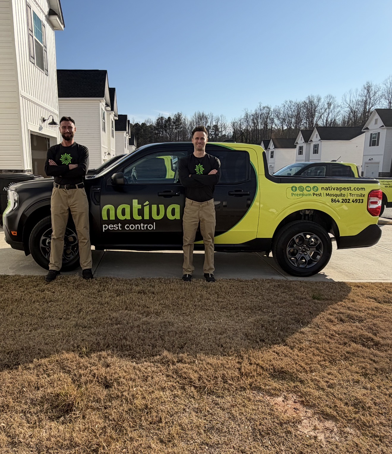
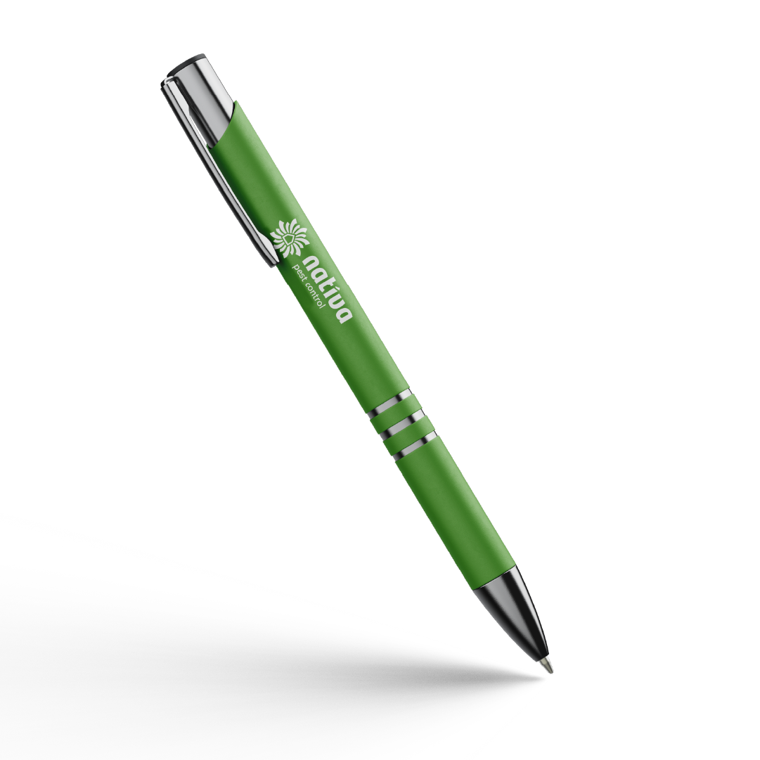
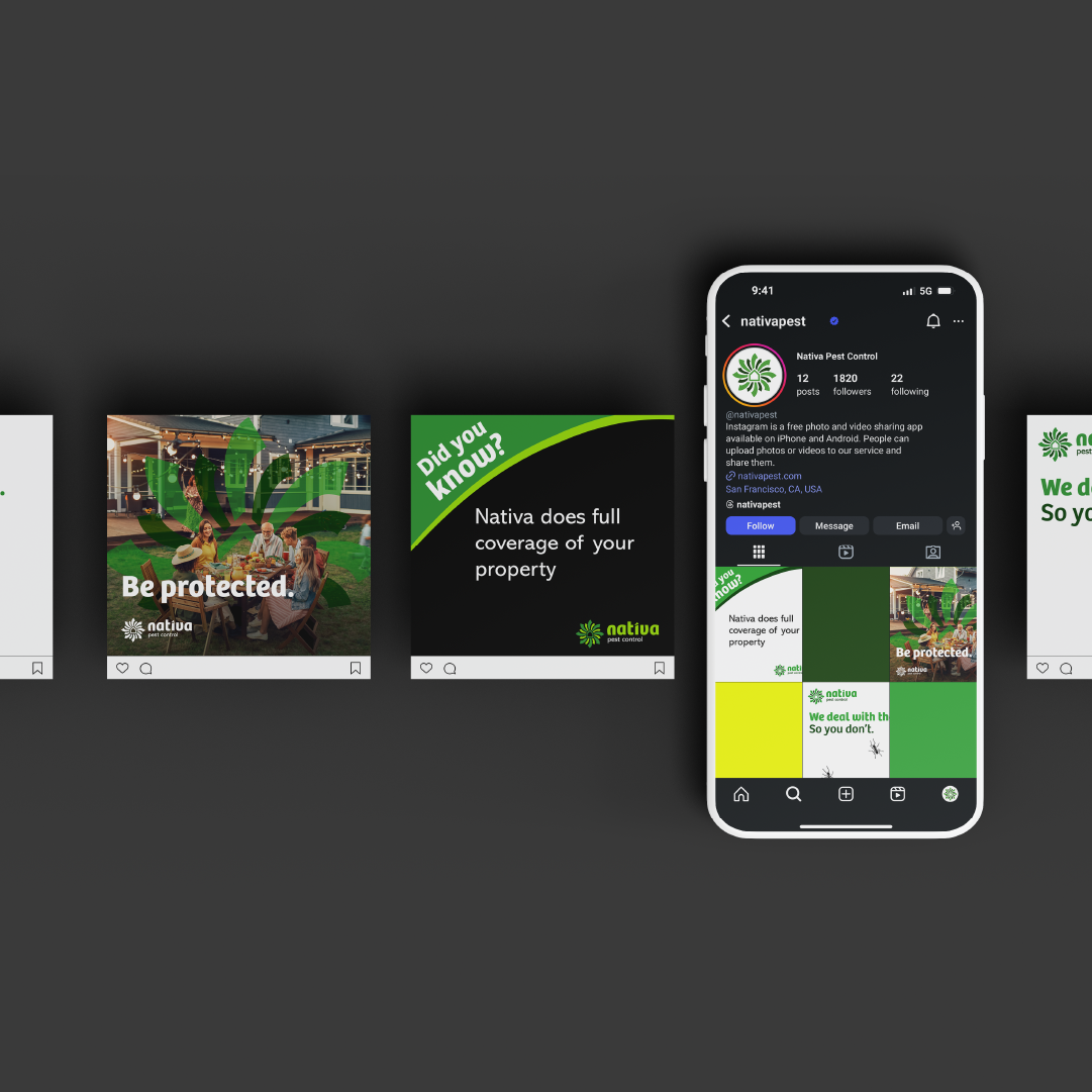
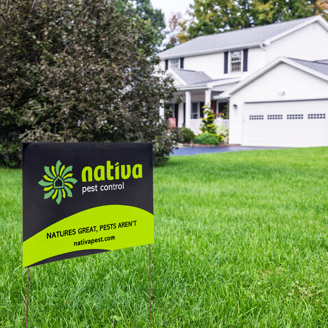
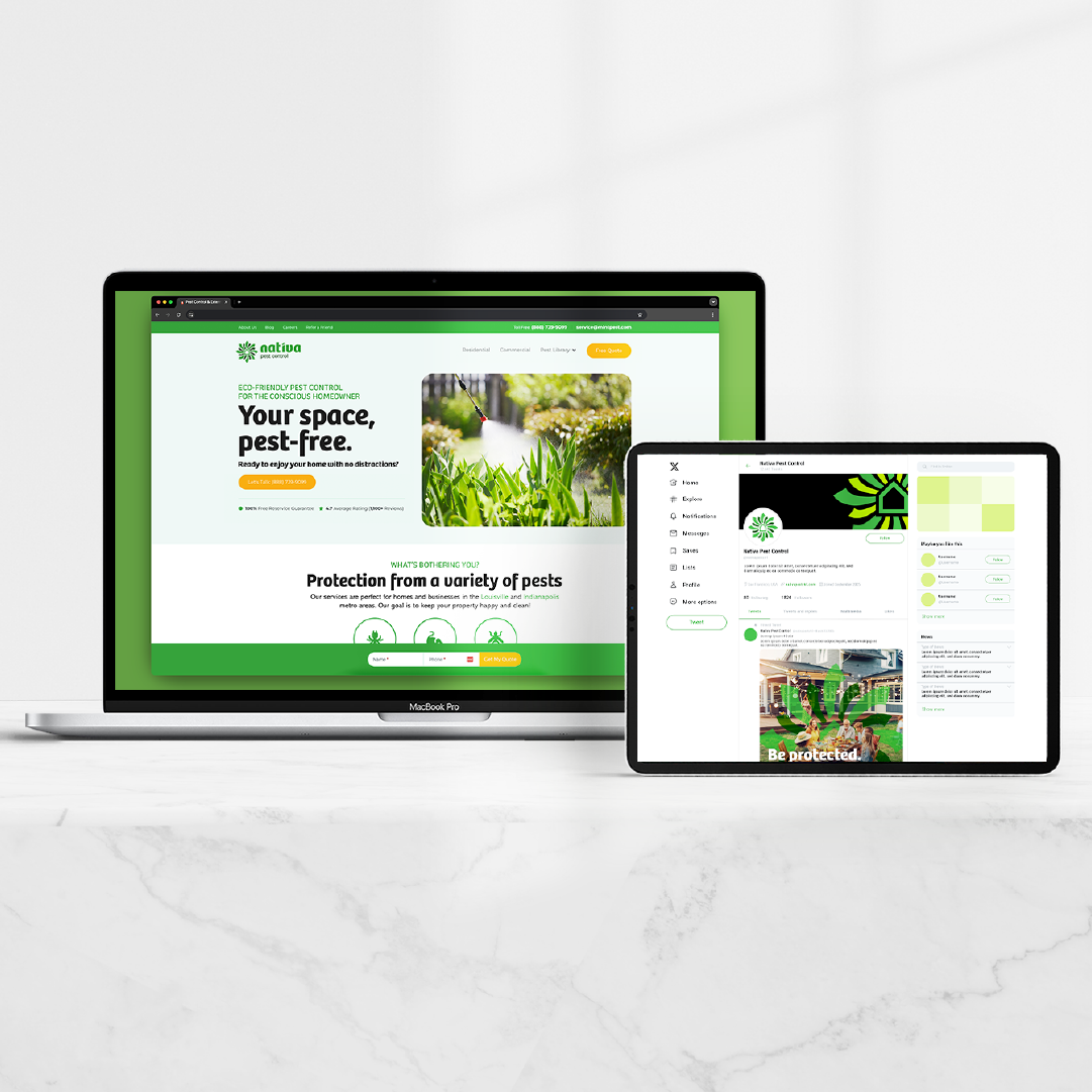
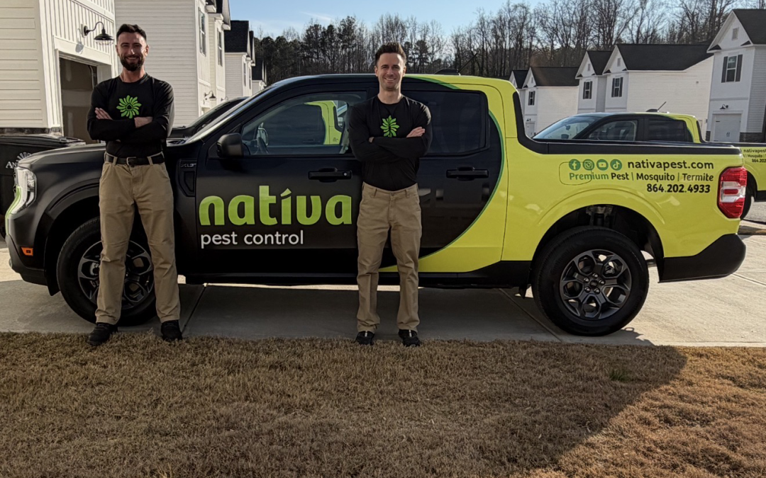
The Latin word Nativa derives from the verb nasci, meaning “to be born”. The roots connect to the core concepts of birth, nature, and origin, and directly tie into Nativa’s approach to using the most premium products derived and re-engineered from the chrysanthemum flower. Nativa is locally rooted; born and originating from foothills to service the greater Seneca and Anderson areas.
Things we worked on:
BRANDING, PRINT MEDIA, WEBSITE
WEBSITE
What They Said:
“Rhubarb Media did an exceptional job with the Nativa brand. I couldn’t have dreamed that the finished product and website would turn out this good and we have already received dozens of complements on our brand. They took the extra time to make sure we were completely satisfied and I really enjoyed the entire process. I absolutely would never use anyone else again and Rhubarb has earned my business for life.”
~Christian Ludwig (Owner)
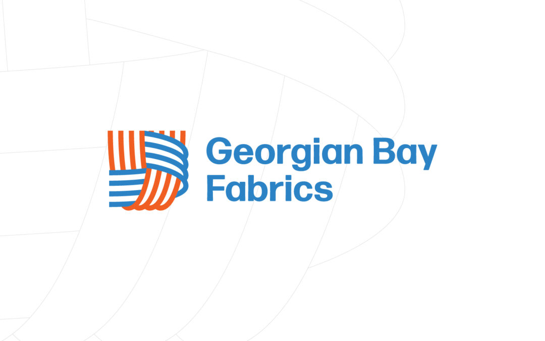
by webteam | Oct 16, 2025
BACKGROUND
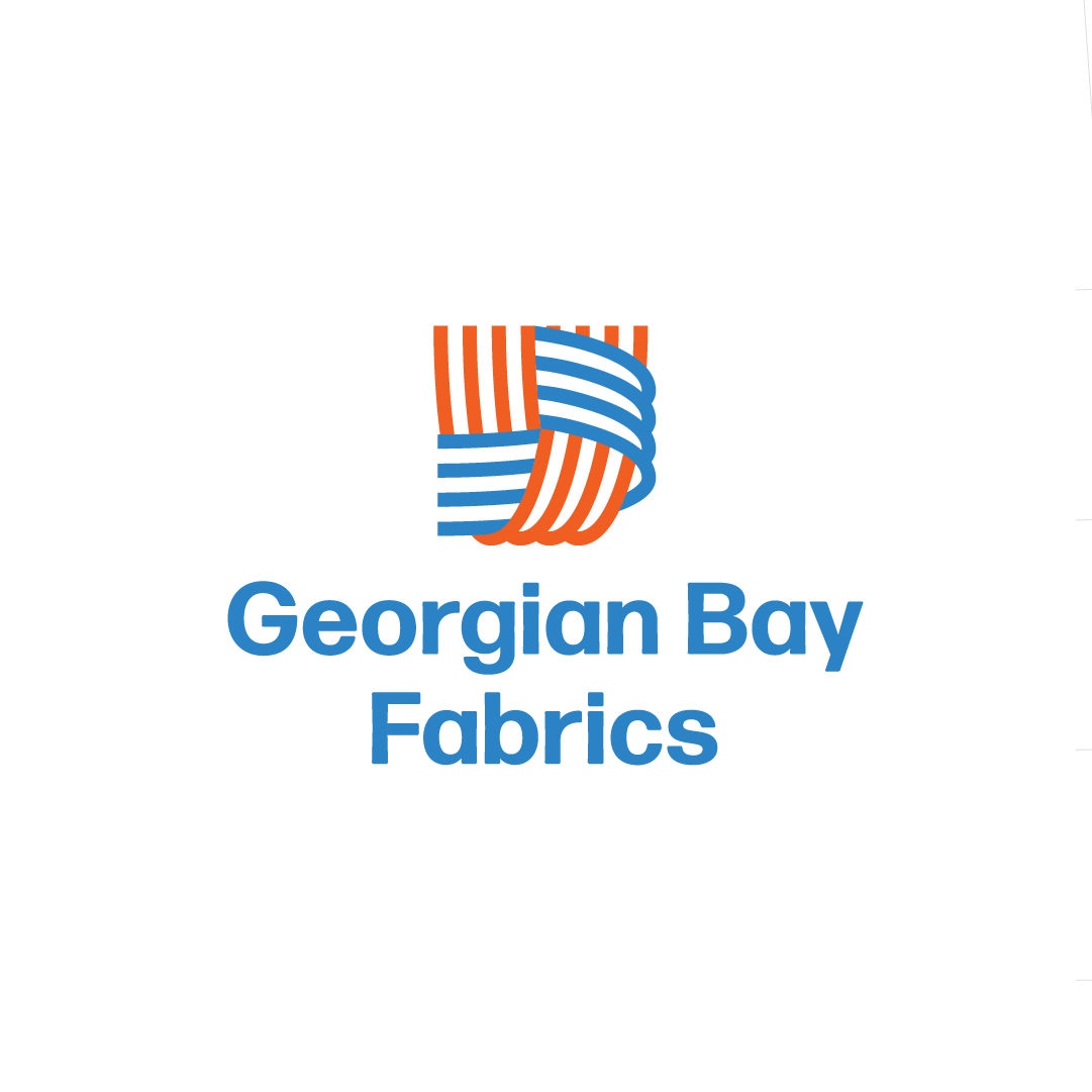
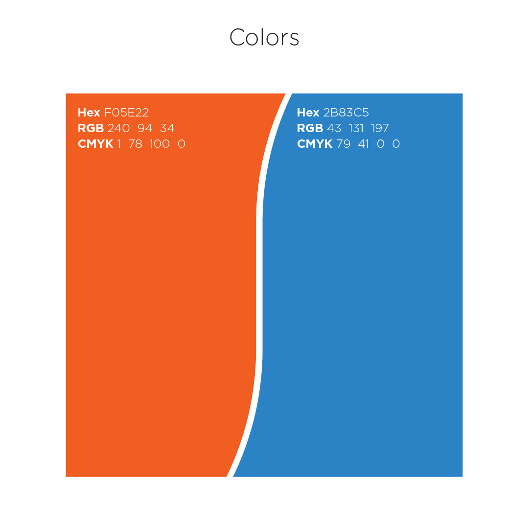
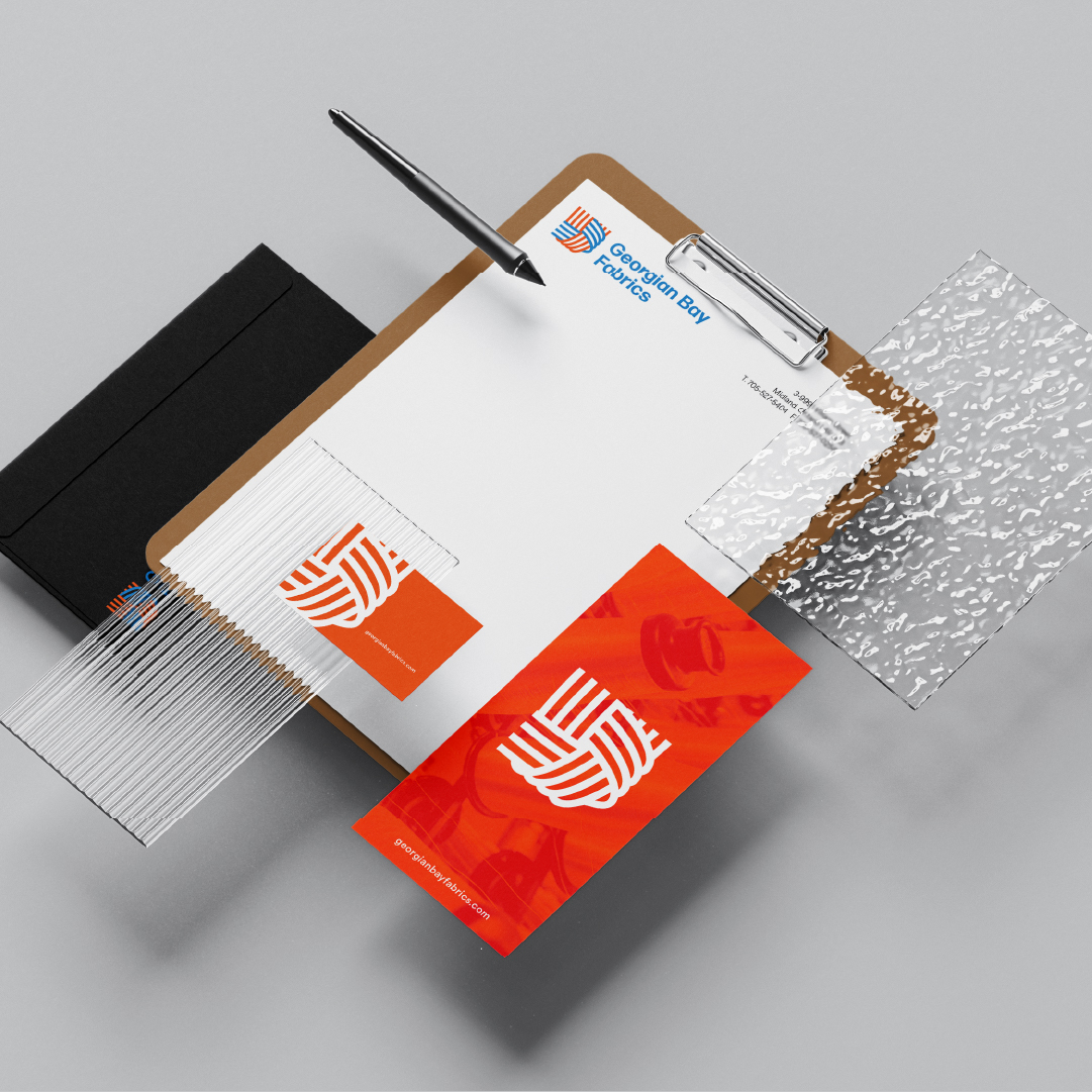
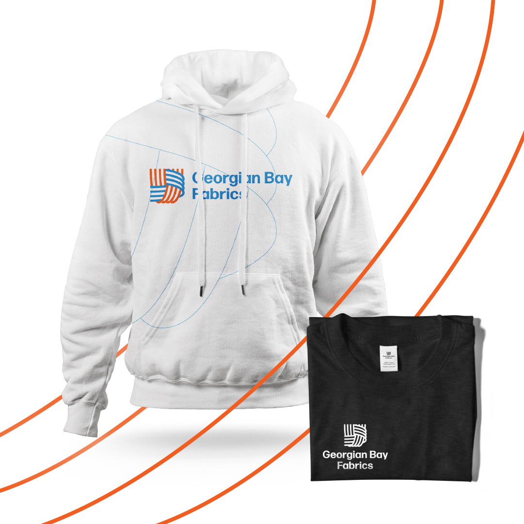
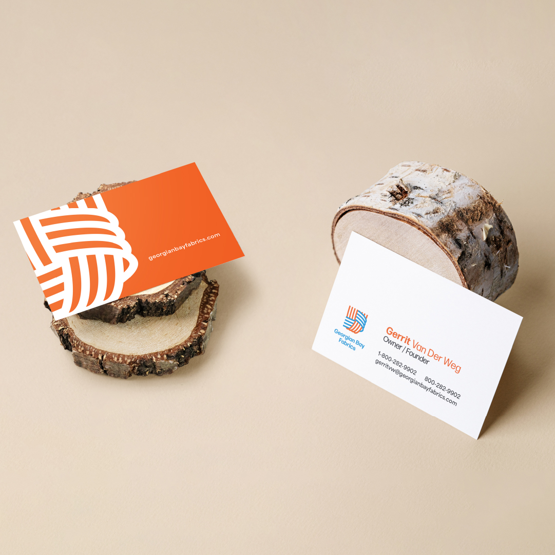
Georgian Bay Fabrics is a proudly Canadian-owned manufacturer of high-quality fibreglass woven tape. The brand draws inspiration from the intricate beauty of the product in production and when examined up close. We also wove three main ideas into the brand. Connection The logo emphasizes strong connections, both as a product and company ethos. The threads coming together creates an interlocking of hands, forming the real strength of the brand… its people. Family/Company History The colours and shapes were heavily influenced and inspired by the owner’s Dutch family heritage. The orange and blue are a nod to the Netherland flag. Nature With their location and love for the Georgian Bay region, we imagined the threads as waves, the blue, as water, and the orange emulating the setting sun.
Things we worked on:
BRANDING, WEBSITE
WEBSITE

by webteam | Sep 16, 2025
Brief
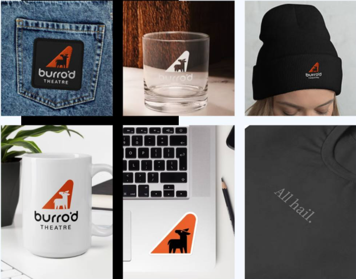
Burro’d Theatre creates unique and accessible theatrical productions and training opportunities supporting a stronger community – both for audiences in our own backyard, and for the theatre community across Canada.
For theatre production audiences, we’re the only classical theatre company in the Barrie area, and the only indie-level theatre company as well. So far Burro’d has been extremely well-received almost-sold out runs of Shakespeare plays. Our unique origin story of starting with “a scrappy group of friends who decided to put on a play in their backyard” is a compelling narrative and doing plays in unique spaces is often a strong audience draw.
Things we worked on:
BRANDING, LOGO ANIMATIONS