

BACKGROUND
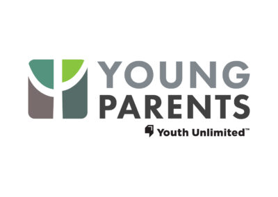
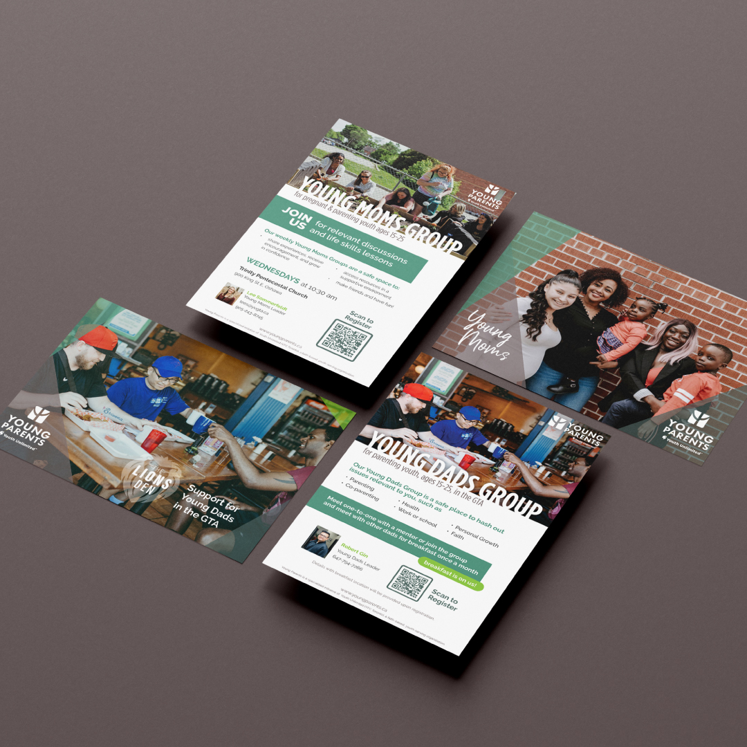
We love working with people who help others in need, which is why we were so excited to work with Young Parents GTA. Young Parents is an organization which offers help and hope for parents ages 15-25, and their children, and is part of Youth Unlimited Toronto. They wanted to create their own unique brand, separate from the YU brand, to promote their amazing services and support for young families.
When we heard the vision a picture came to mind and evolved into their visual identity, as well as a teaching tool, to express the YP vision and mission.
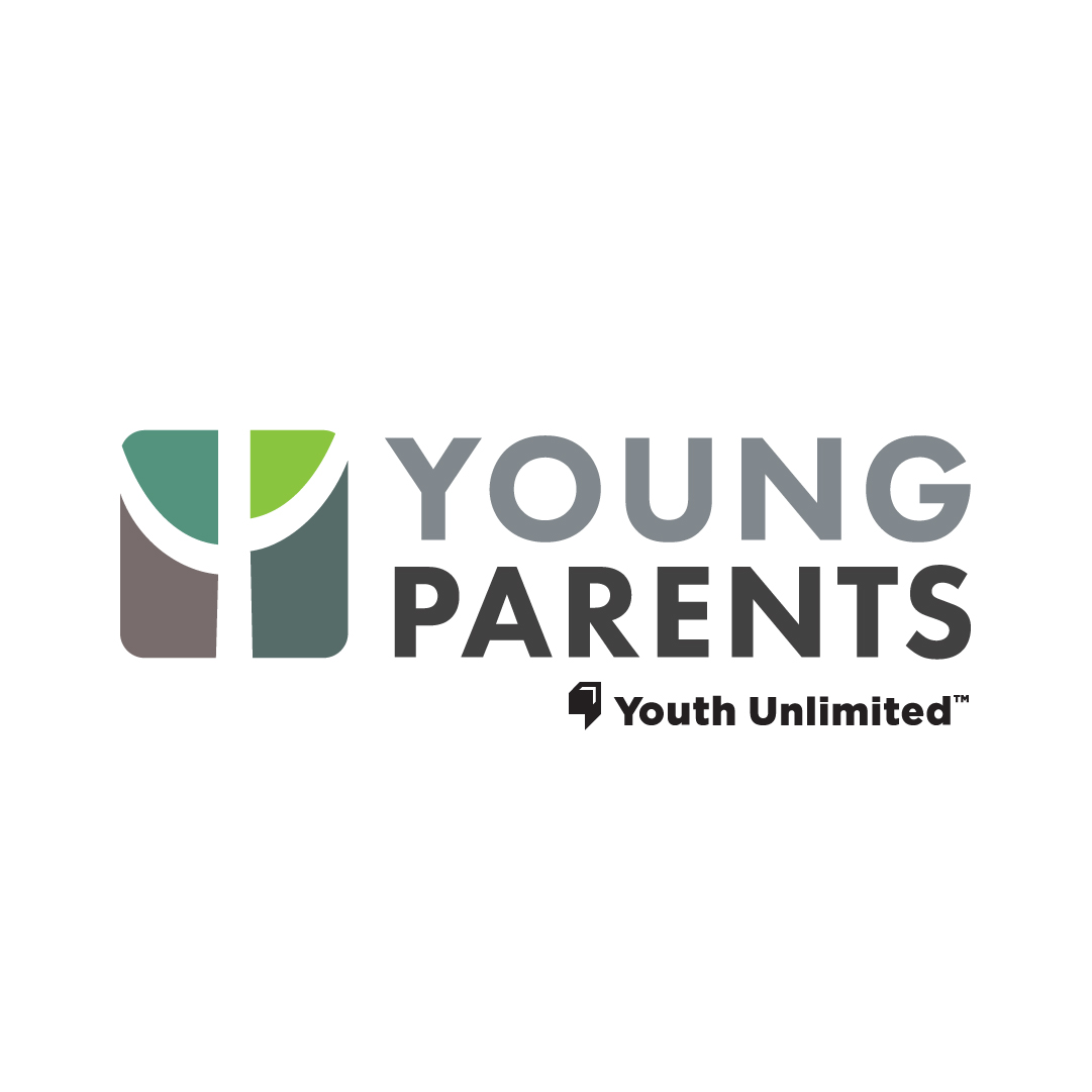
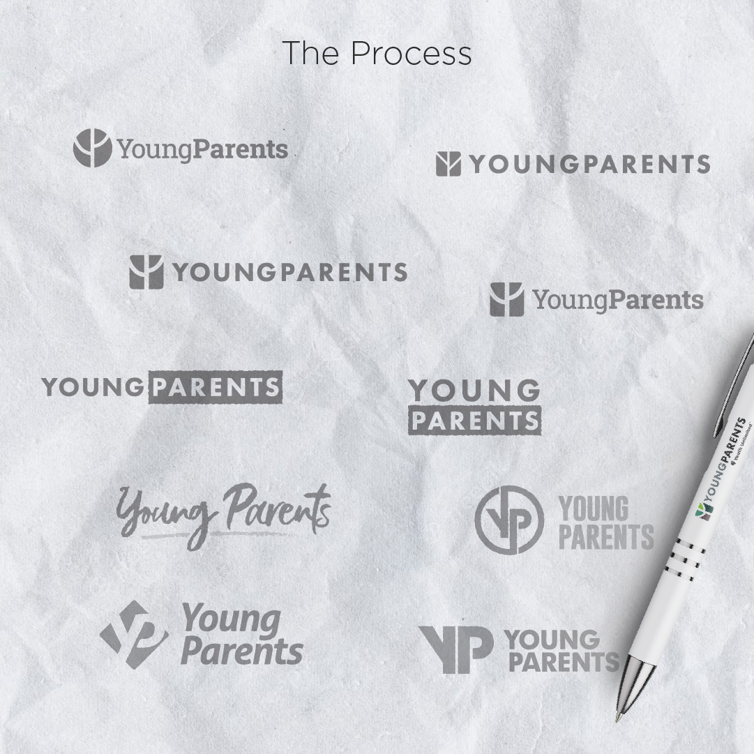
They needed a full branding package and website which would allow for them to have a strong visual identity and an online hub to provide resources and information. The logo was designed using the letters Y + P to form a tree; a symbol of strength, shelter, play and nourishment and these four themes reflect common goals in their organization.