by webteam | Dec 16, 2025
BACKGROUND
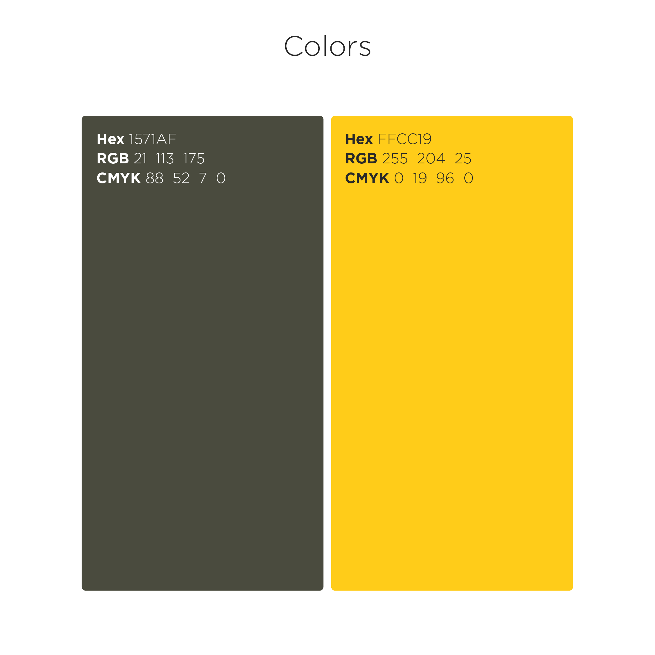
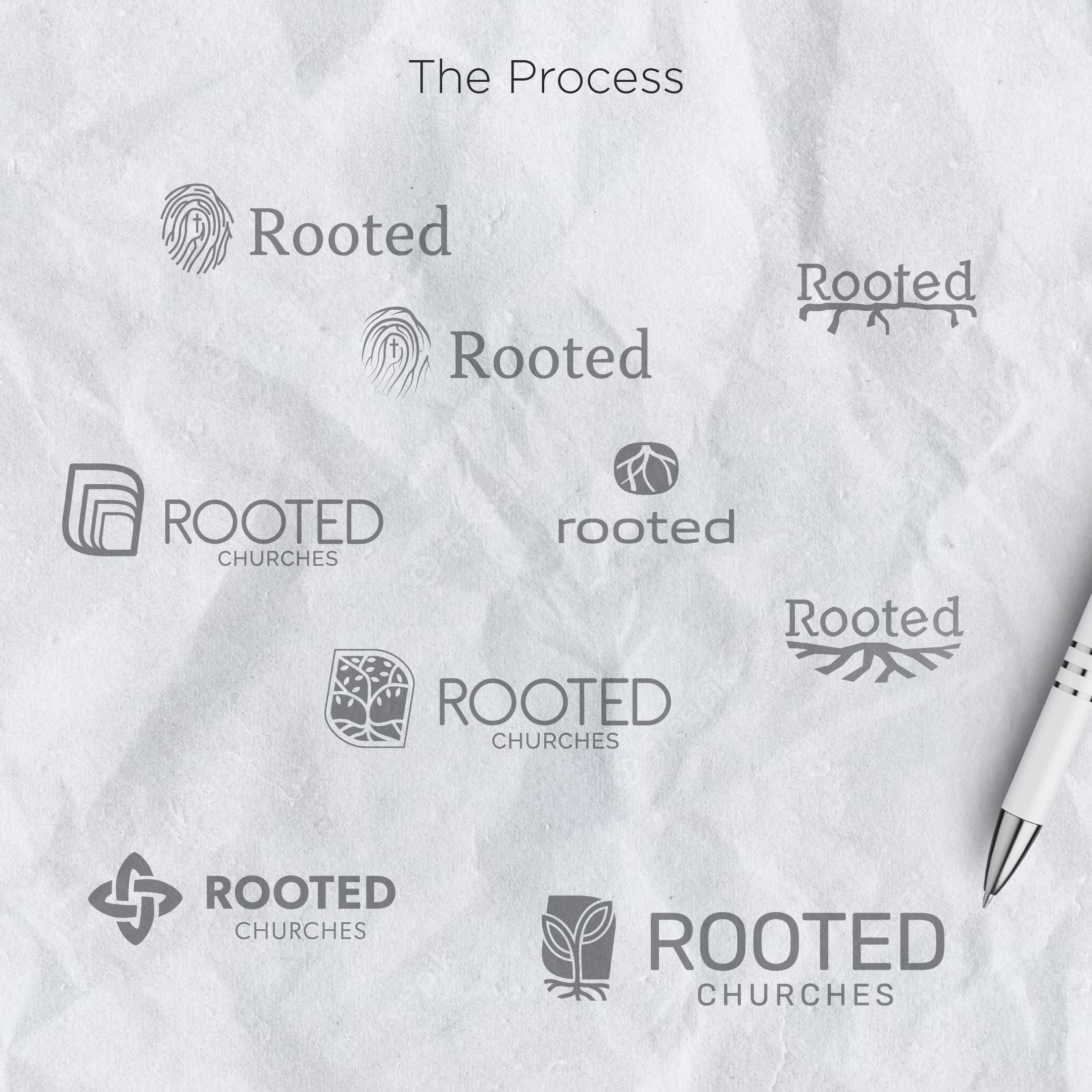
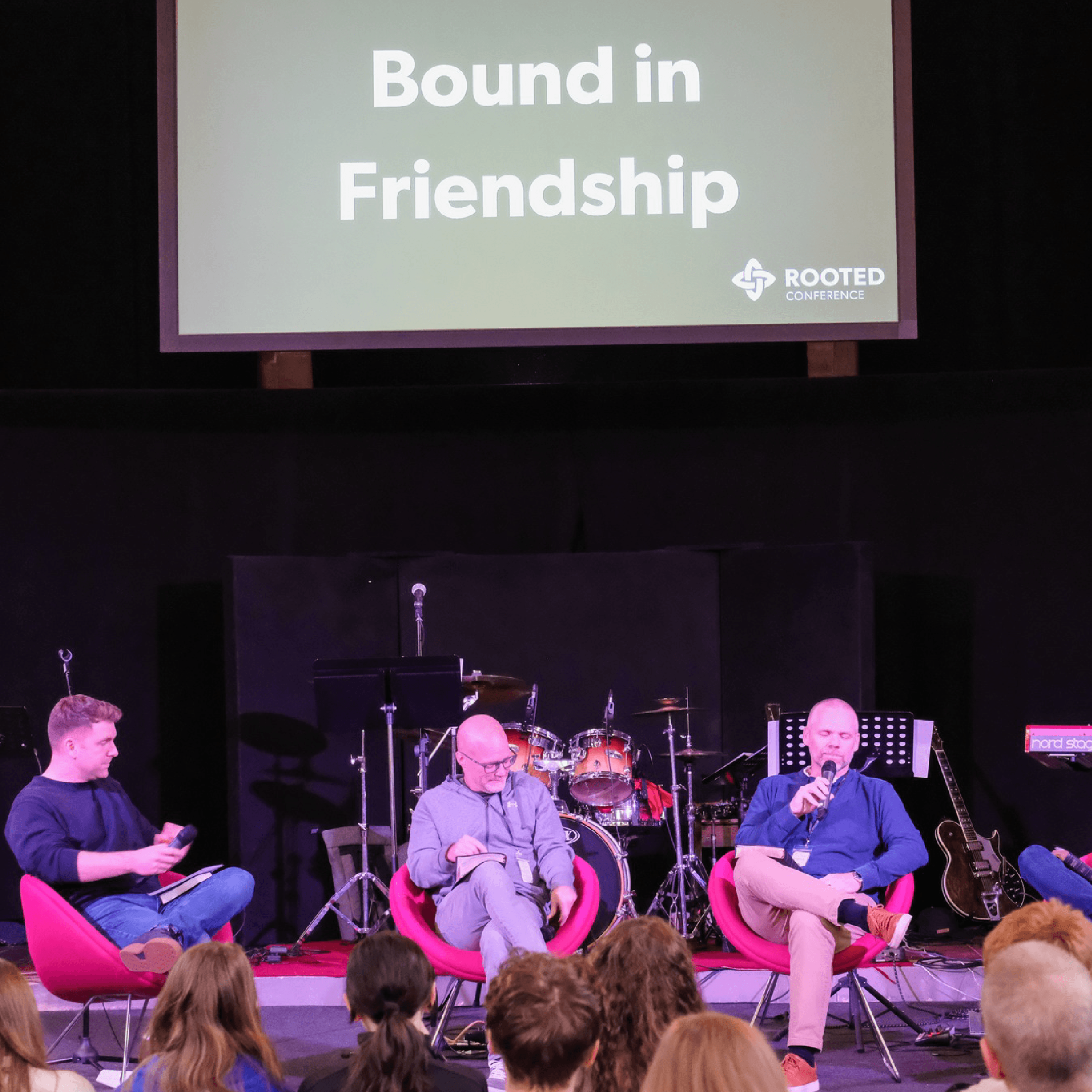
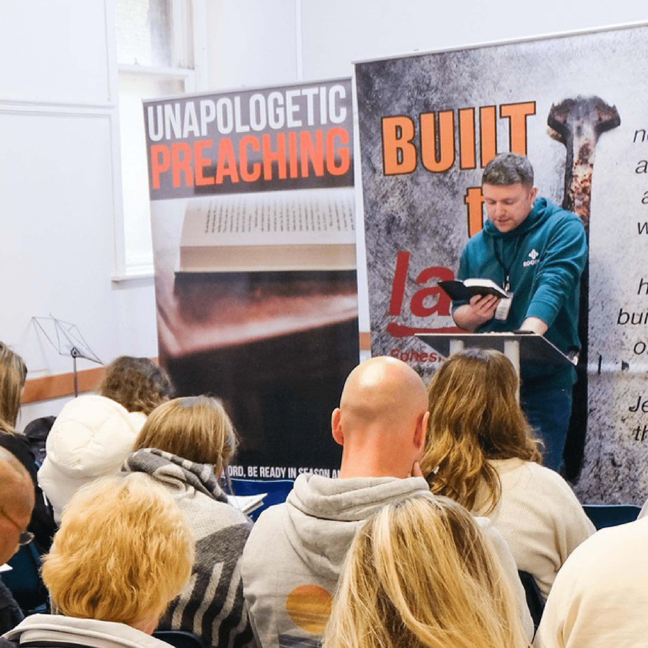
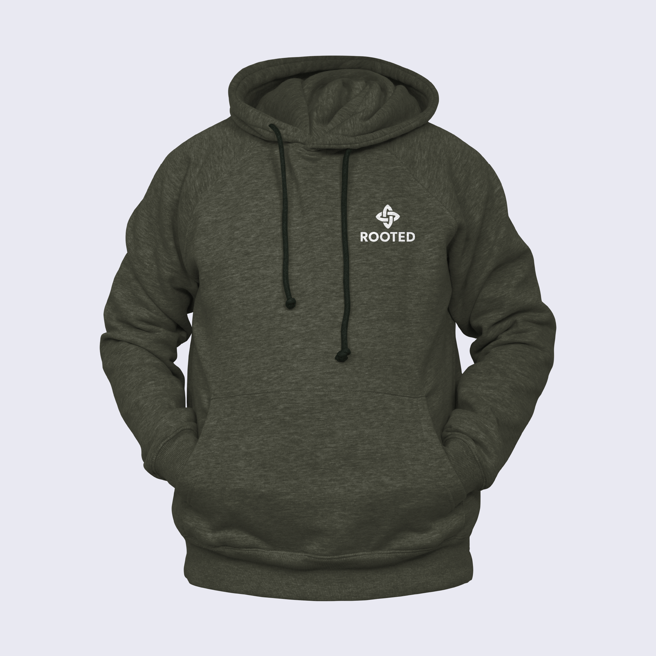
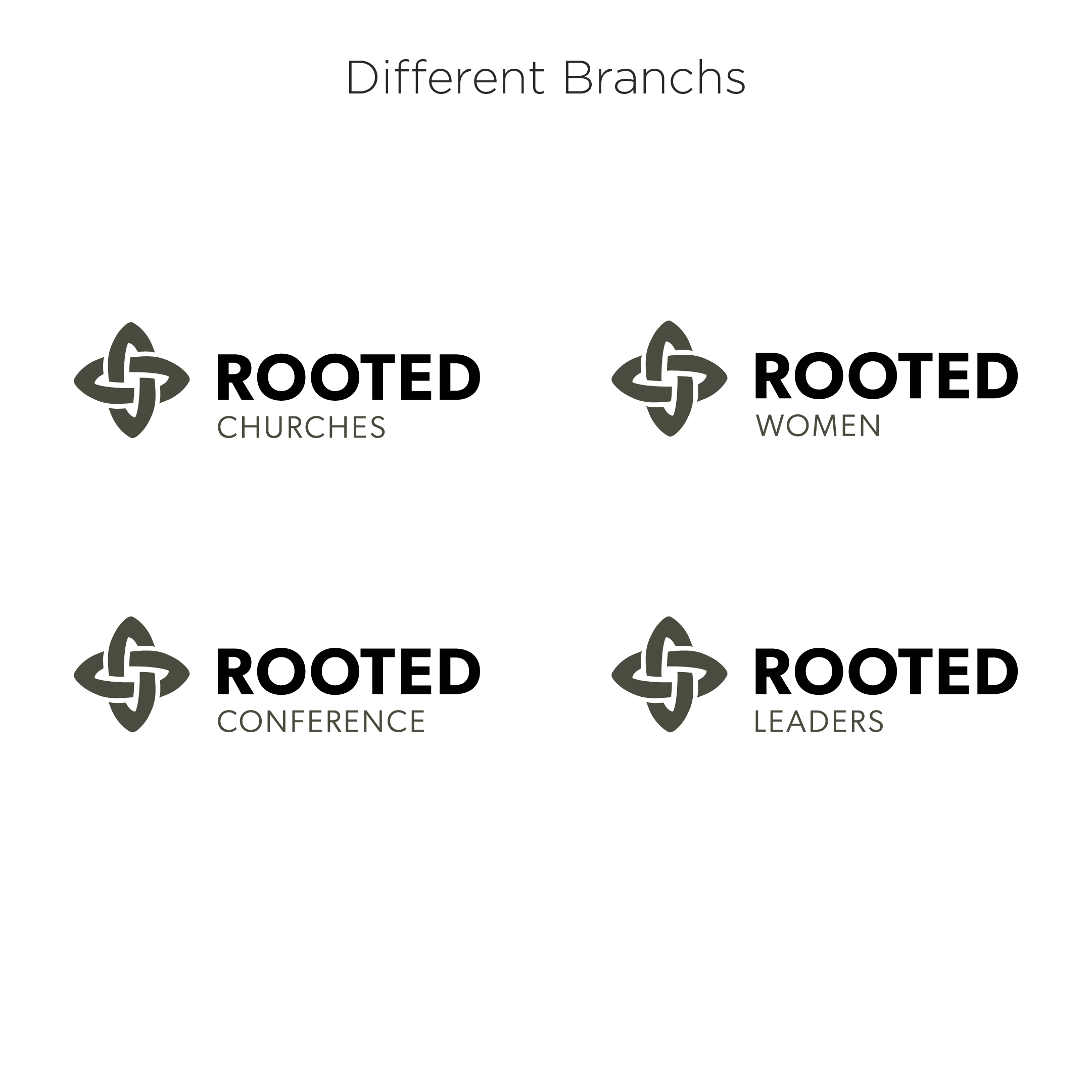
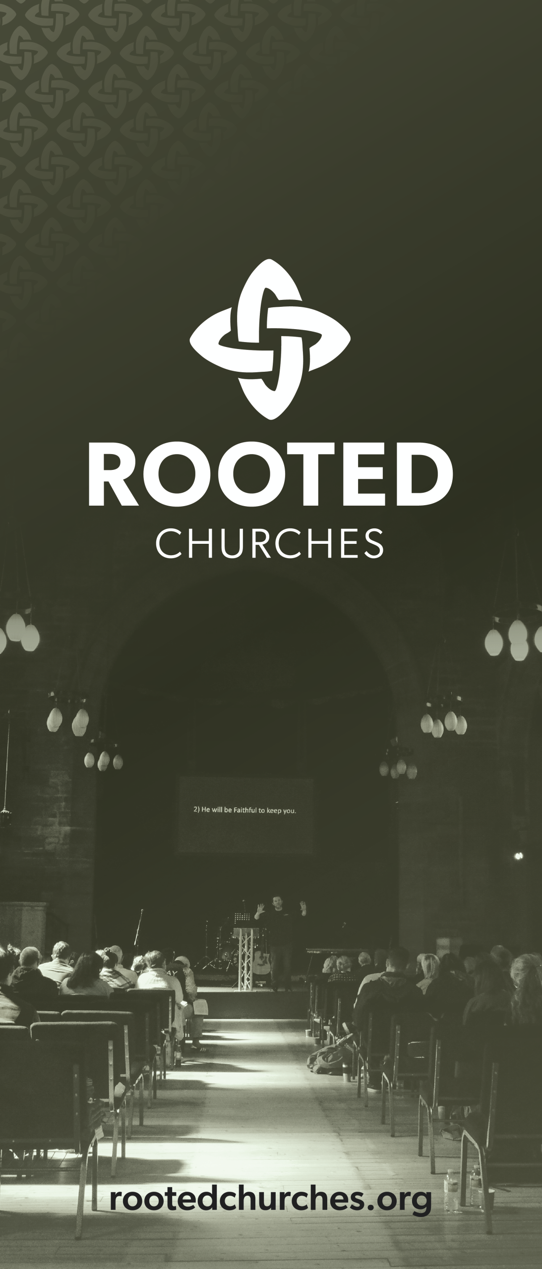
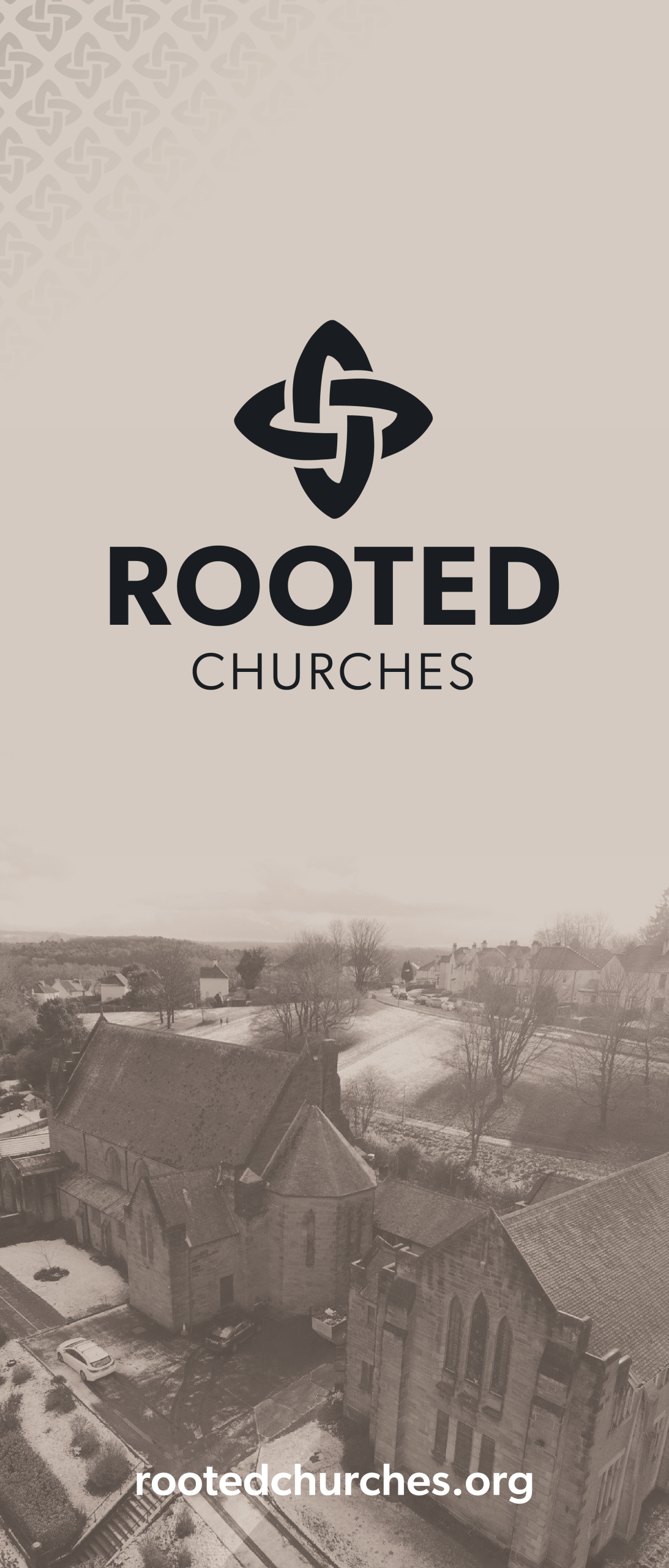
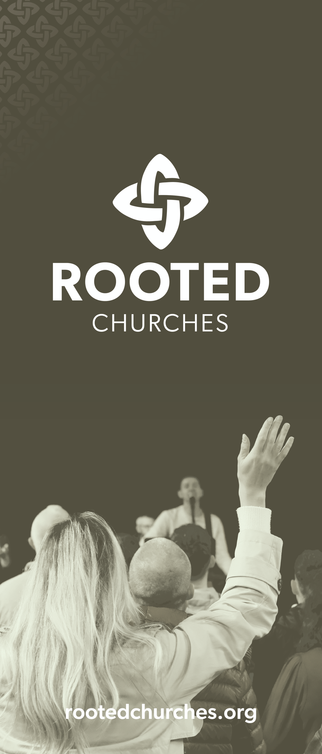
Rooted Churches exists out of a desire and passion to see more churches in Scotland and the UK that are gripped by, growing in, and grateful for the gospel of Jesus Christ.
Things we worked on:
BRANDING, EVENTS, PHOTOGRAPHY, MERCH
by webteam | Dec 16, 2025
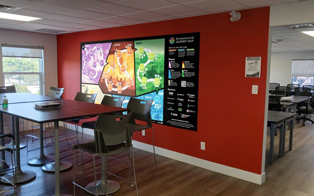
Brief
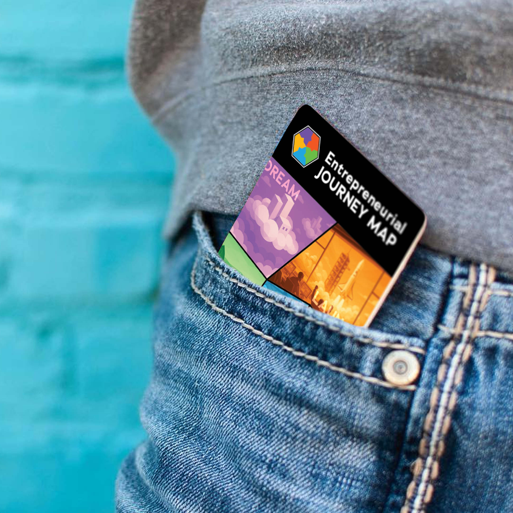
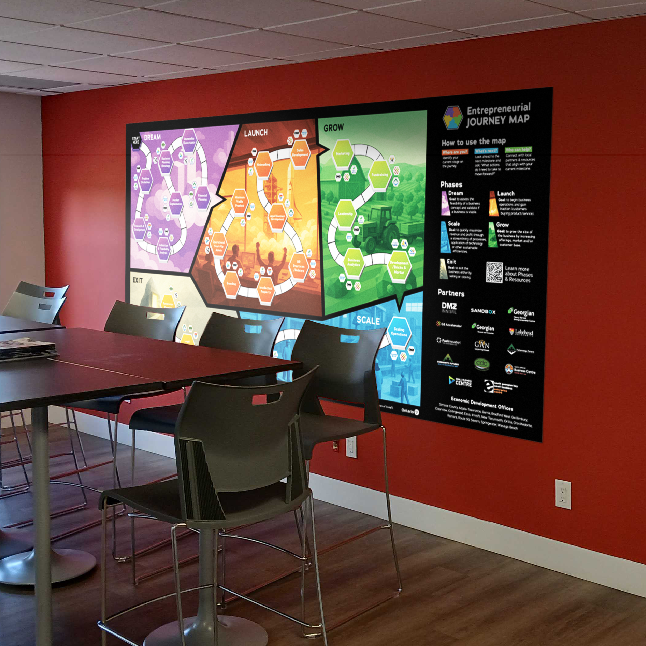
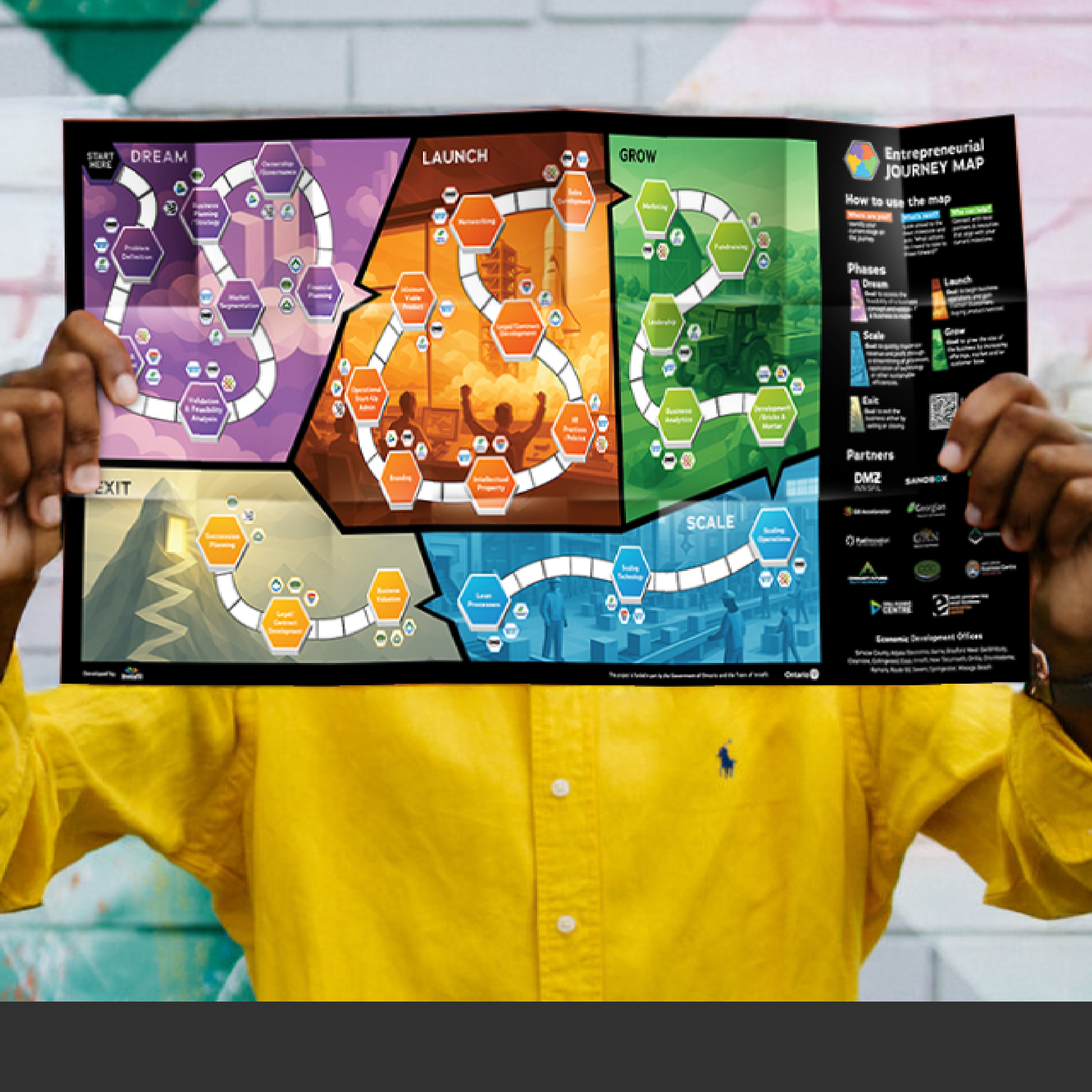
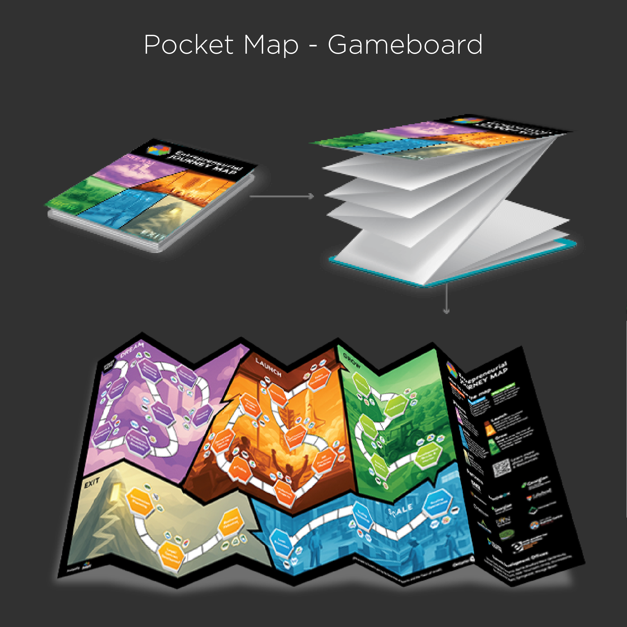
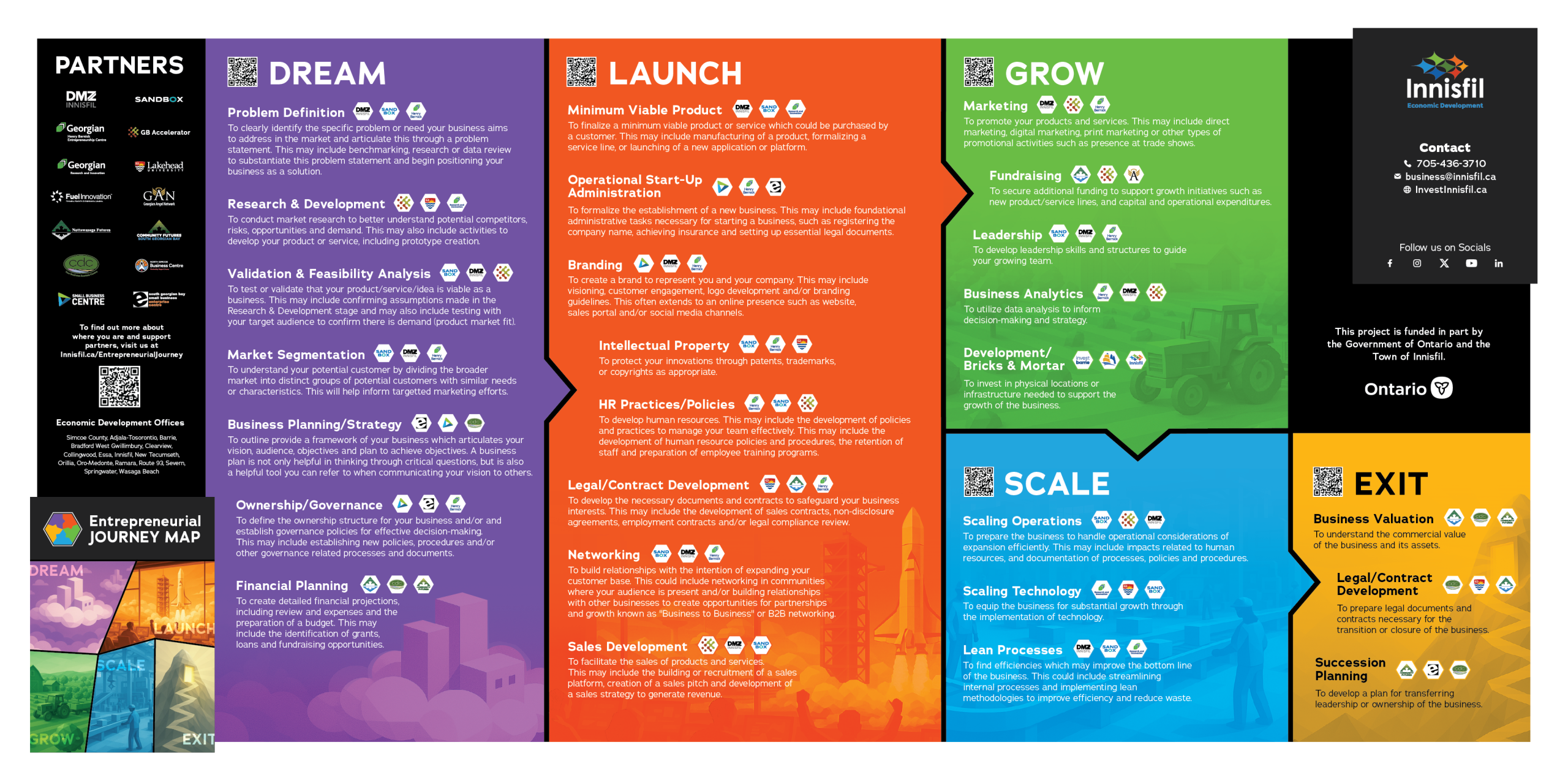
The Town of Innisfil supports thousands of entrepreneurs every year. With their services expanding beyond the area of Innisfil through DMZ Innisfil. They needed a way to help entrepreneurs understand where they are in their journey, who to contact, and what their next steps should be.
To achieve this, the Town of Innisfil envisioned an interactive map for entrepreneurs; accessible both in person and online. The map allows users to navigate common stages and milestones, providing guidance on how to overcome sticking points, suggestions for next steps, and connections to local partners who can help.
Things we worked on:
Pocket Map Design, Mural Design, Branding & Website design support
What They Said…
“We hired Rhubarb Media to support us with a complex map design project, and Chad and Josh were exceptional every step of the way. They brought a perfect combination of creativity, strategic thinking, and technical skill. Their communication was clear, their timelines were reliable, and they consistently went above and beyond to make sure the final product was exactly what we envisioned. If you’re looking for a team that truly cares about quality and client satisfaction, we highly recommend Rhubarb Media.” ~ Jelmer Stegink
by webteam | Oct 16, 2025
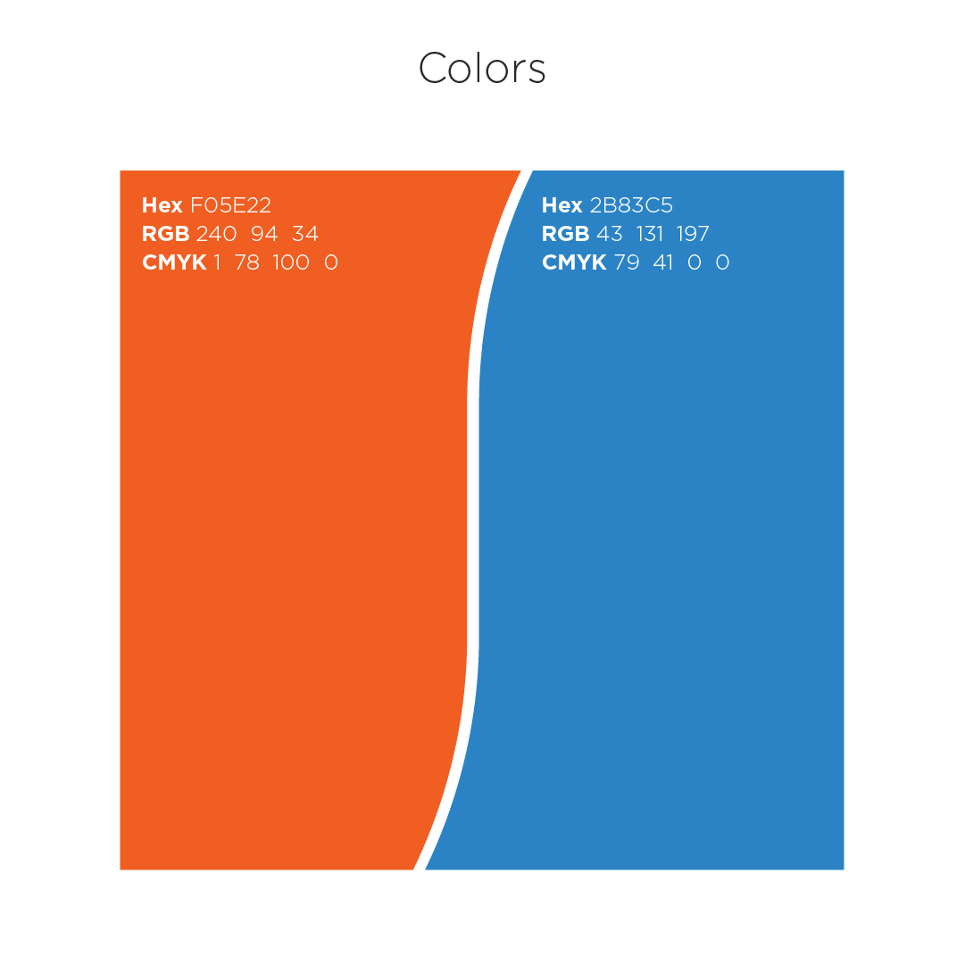
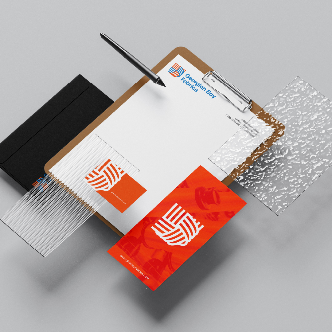
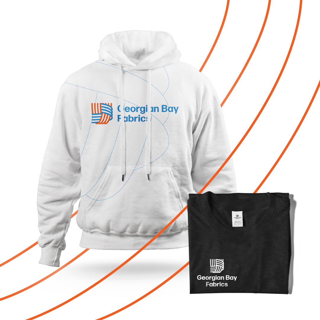
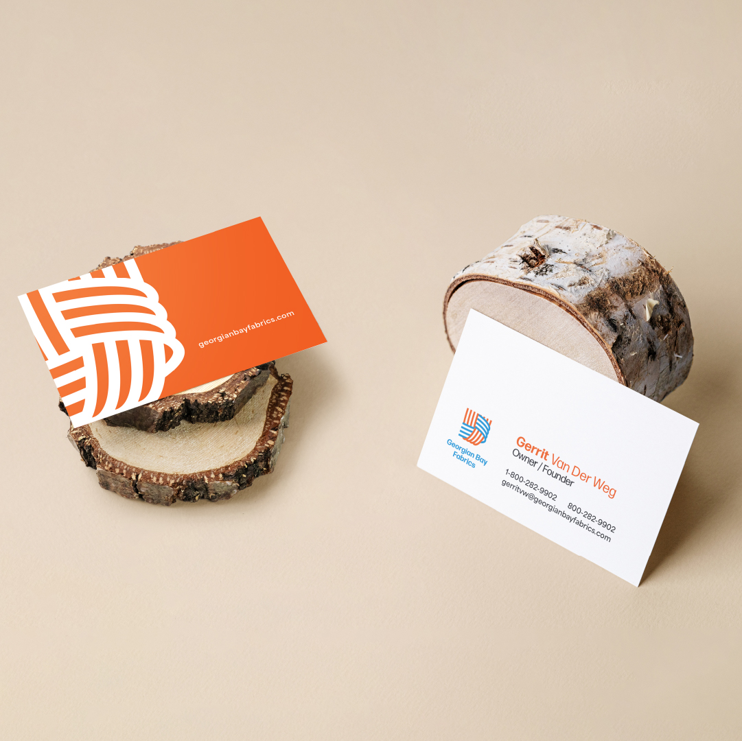
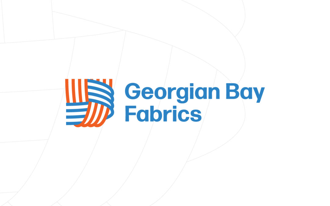
BACKGROUND
Georgian Bay Fabrics is a proudly Canadian-owned manufacturer of high-quality fibreglass woven tape. The brand draws inspiration from the intricate beauty of the product in production and when examined up close. We also wove three main ideas into the brand. Connection The logo emphasizes strong connections, both as a product and company ethos. The threads coming together creates an interlocking of hands, forming the real strength of the brand… its people. Family/Company History The colours and shapes were heavily influenced and inspired by the owner’s Dutch family heritage. The orange and blue are a nod to the Netherland flag. Nature With their location and love for the Georgian Bay region, we imagined the threads as waves, the blue, as water, and the orange emulating the setting sun.
Things we worked on:
BRANDING, WEBSITE
WEBSITE
by webteam | Jun 22, 2023
BACKGROUND
As a new business experiencing rapid growth, Rhubarb Media was an outstanding partner to flush out ideas and concepts with. Chad and his team are true professionals and their experience partnering with dynamic brands shows through in the questions they ask and the ideation they generate.
When it comes to execution, everything was first class and ahead of schedule allowing our team to deliver a compelling and consistent brand messages that attracted on target customers, suppliers and investors.
We will definitely be working with Rhubarb again!
— Michael Villeneuve, CEO
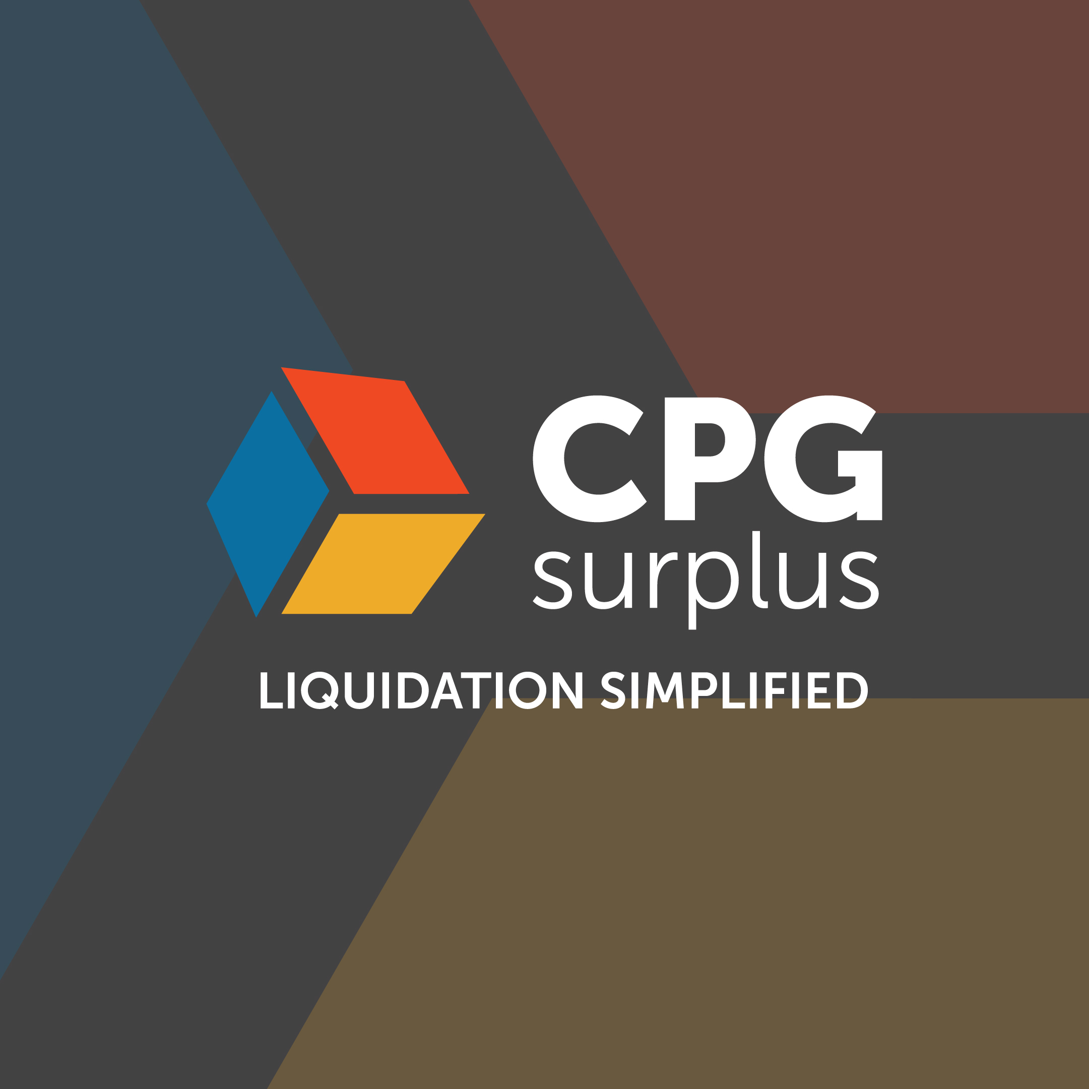
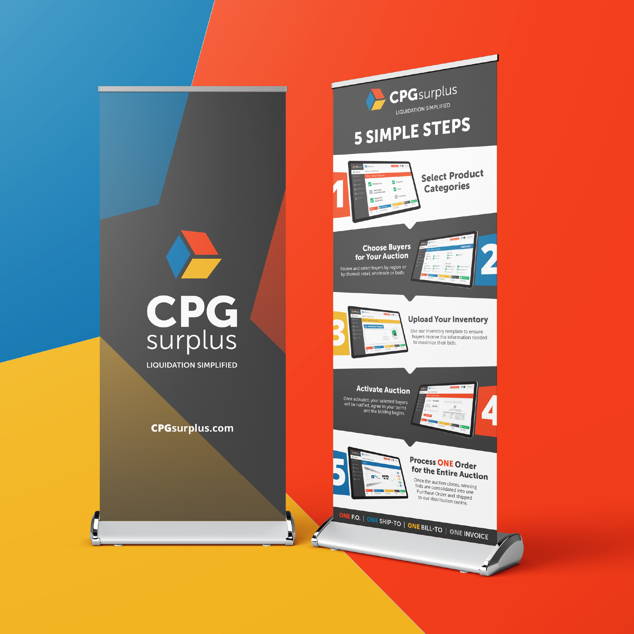
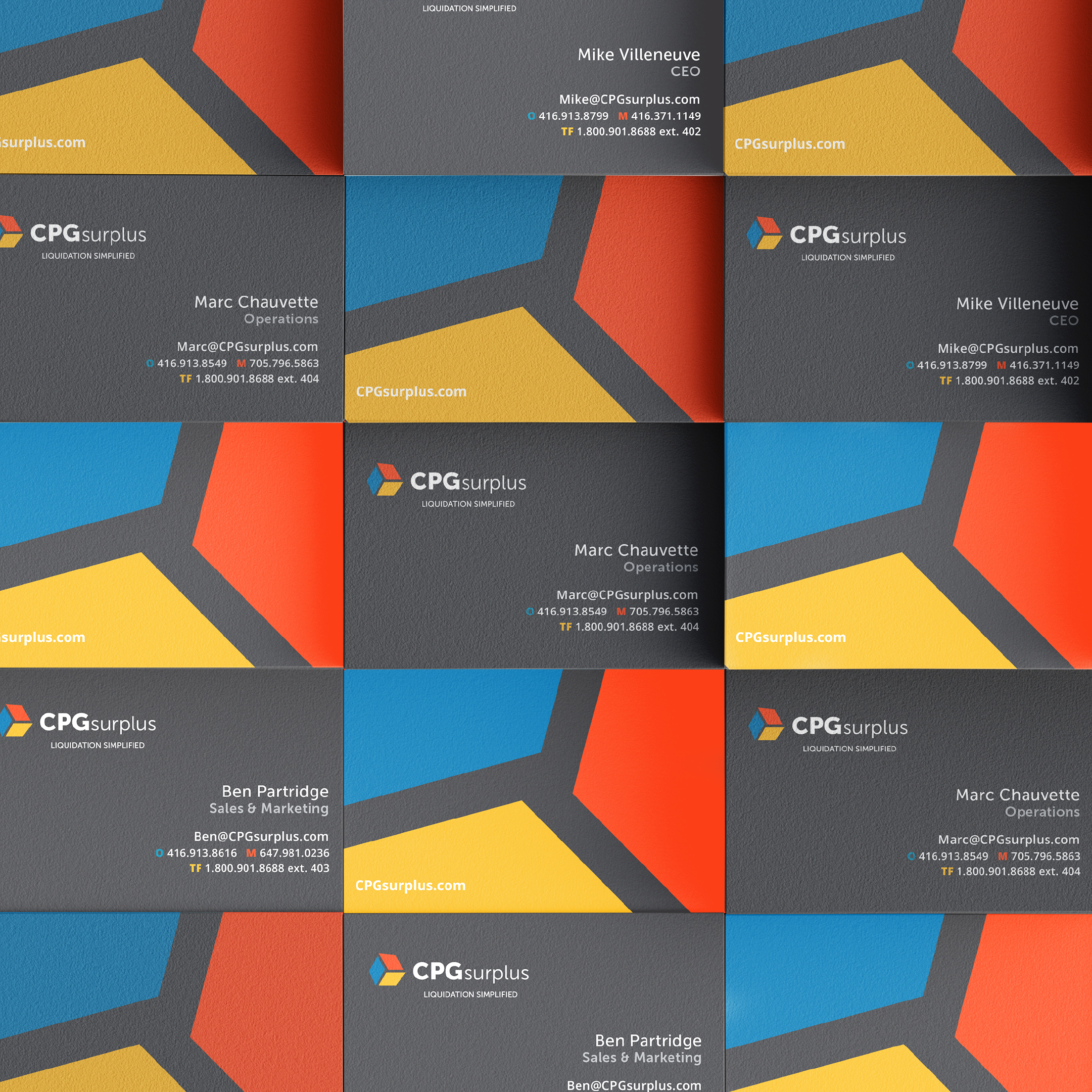
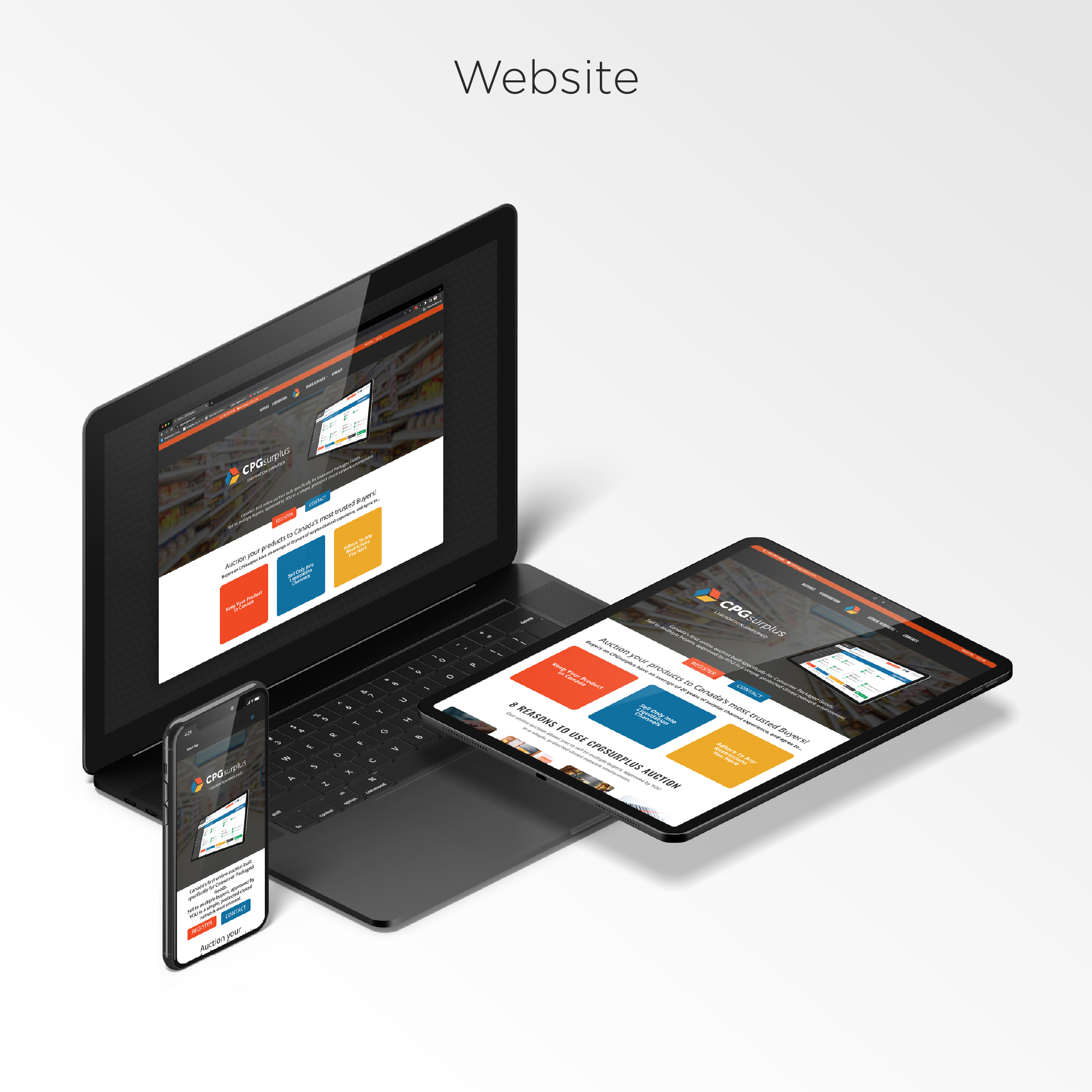
Newtown Enterprises/CPG Surplus
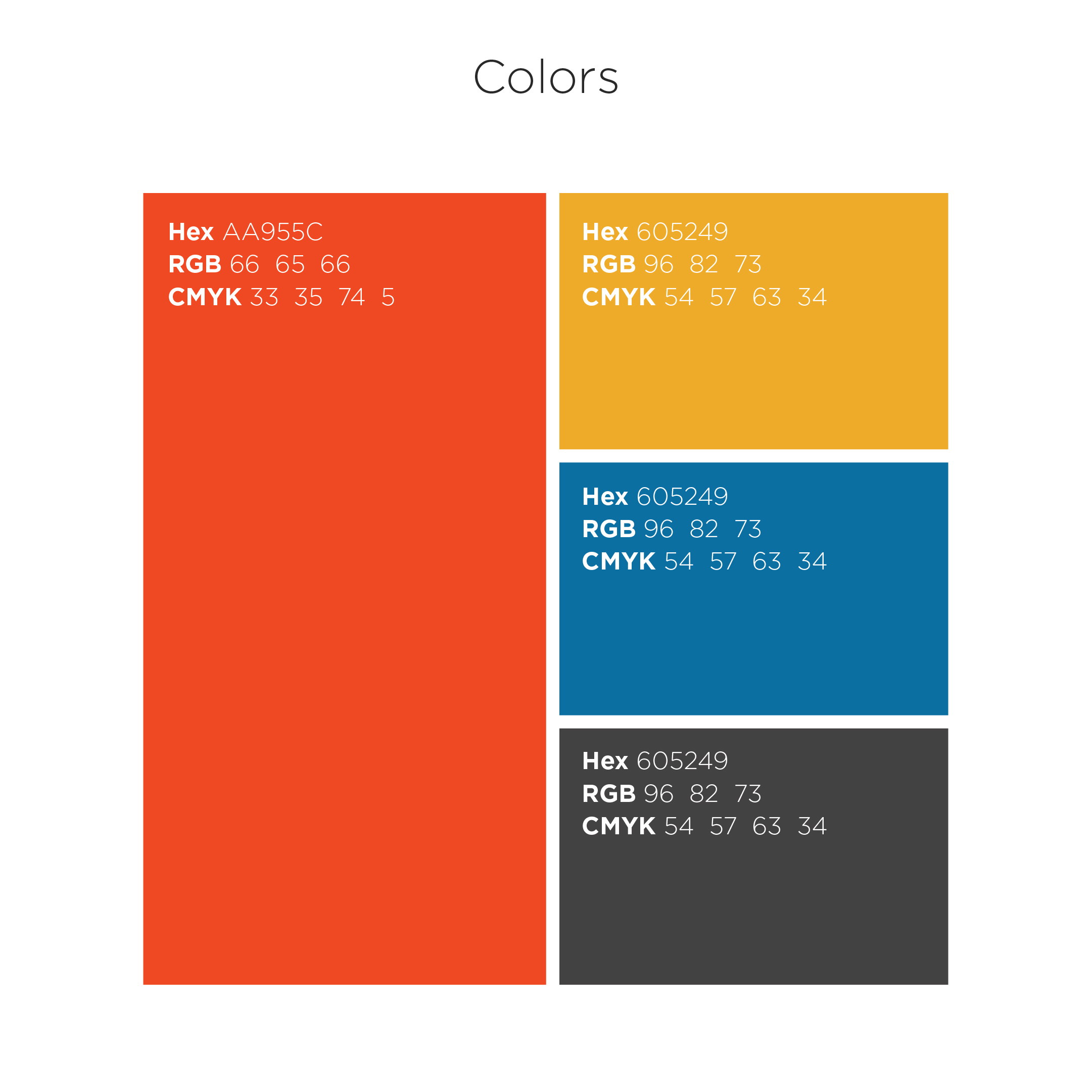
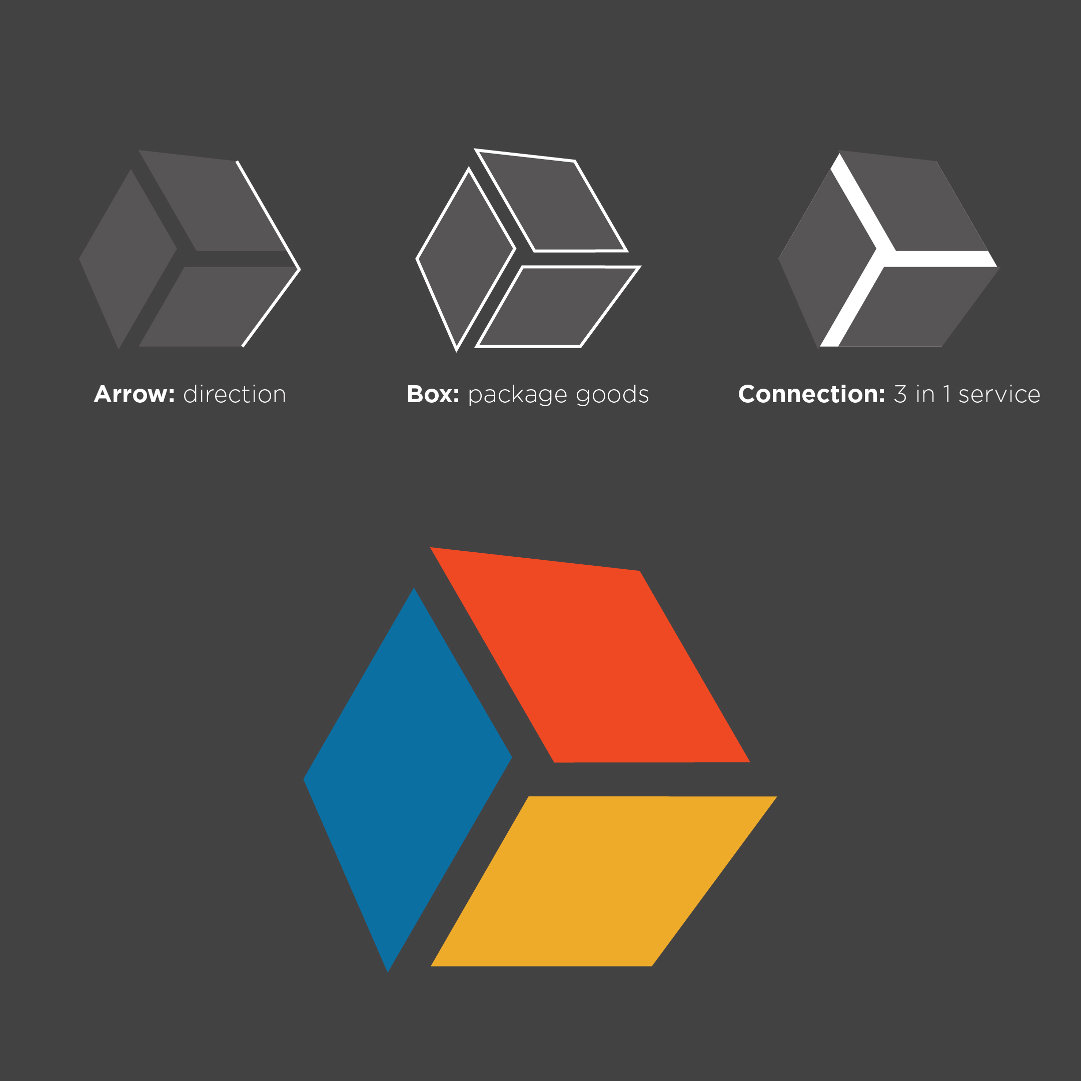
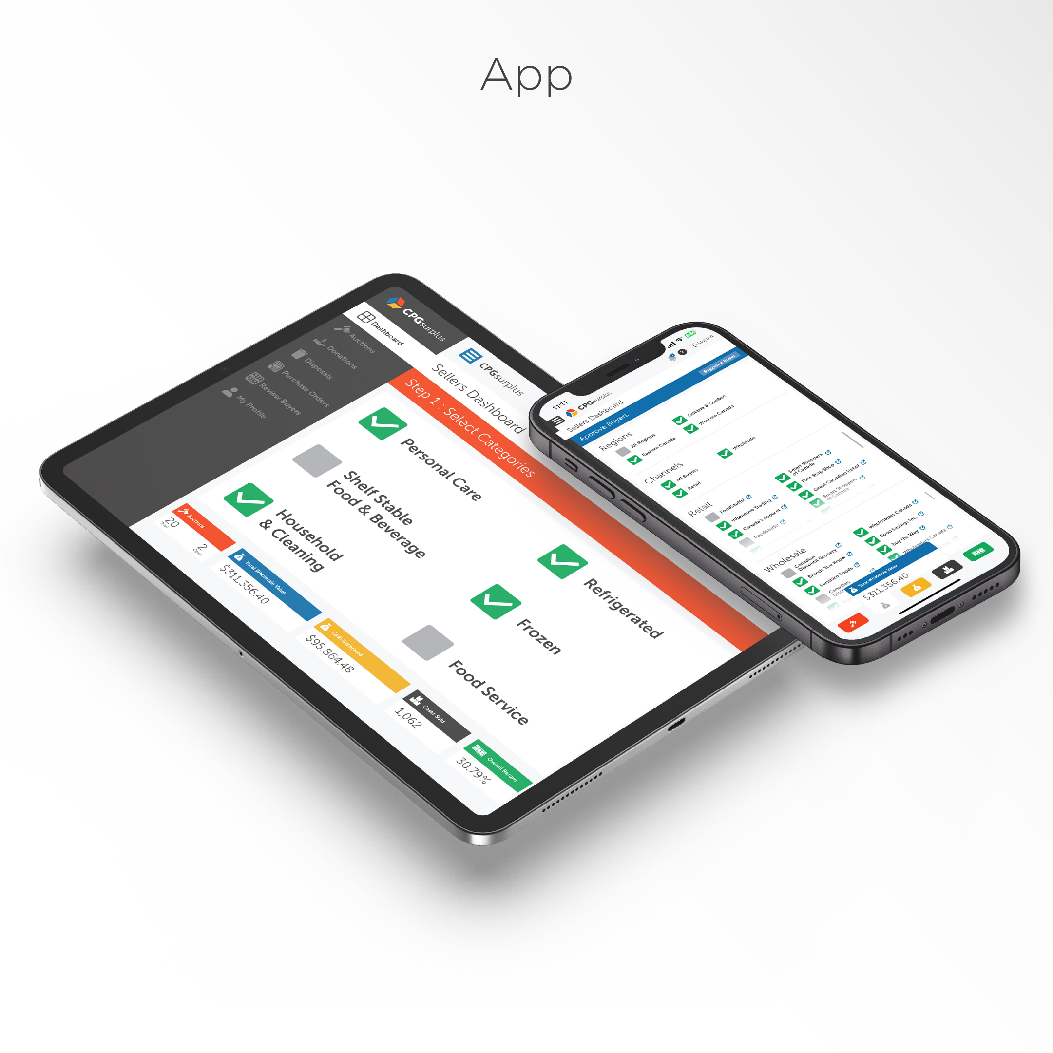
Things we worked on:
BRANDING, LOGO ANIMATIONS, WEBSITE, VIDEO, PRINT, TRADE SHOW ASSETS
VIDEO: Directed/Shot/Edited by Stature Films – Produce by Rhubarb Media
WEBSITE
What They Said…
“As a new business experiencing rapid growth, Rhubarb Media was an outstanding partner to flush out ideas and concepts with. Chad and his team are true professionals and their experience partnering with dynamic brands shows through in the questions they ask and the ideation they generate.”
When it comes to execution, everything was first class and ahead of schedule allowing our team to deliver a compelling and consistent brand messages that attracted on target customers, suppliers and investors.
We will definitely be working with Rhubarb again!”
~ Michael Villeneuve
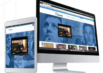
by webteam | Jan 26, 2023
BACKGROUND
“Our message is a simple one. “Make a difference in someone’s life by making tomorrow better than today”. Our services to our community began in 1956 in the lobby of the Evangelical Church of the Deaf on Wellesley Street and that desire to make a difference is just as strong now as it was then. We are not done. As we reach out across the country we will overcome many challenges and break through countless obstacles. We will meet the needs of those we serve. One person at a time, one life at time.”
— Derek Rumball, President
Bob Rumball Canadian Centre of Excellence for the Deaf
Mission: To provide care and opportunities in a communication-rich environment that enhances the quality of life of those we serve.
Things we worked on:
BRANDING, PRINT COLLATERAL, WEBSITE