

BACKGROUND
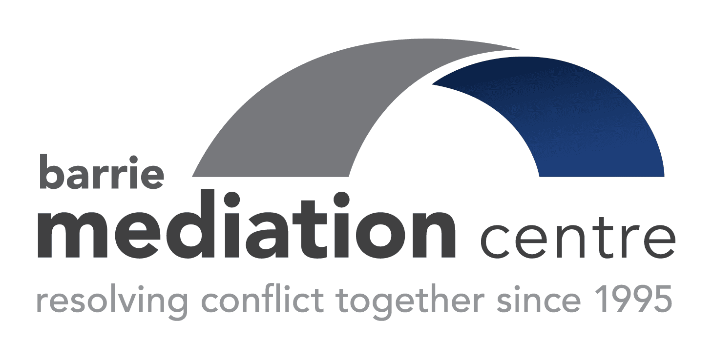
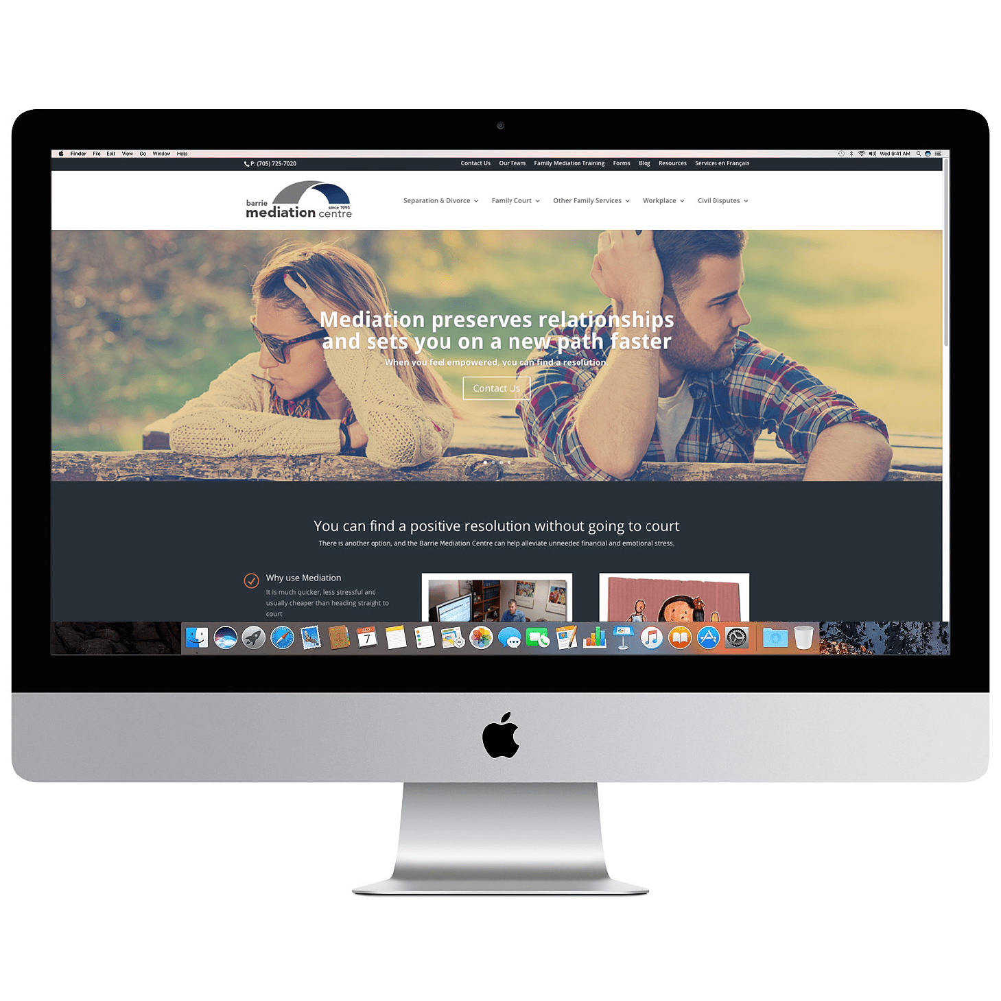
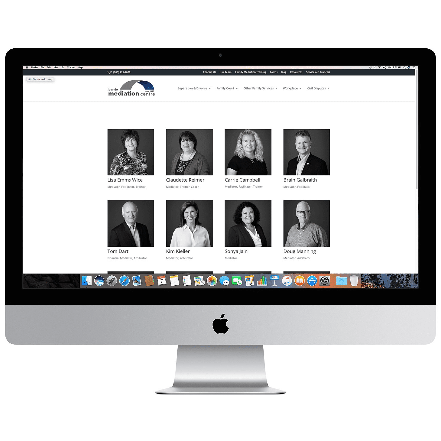
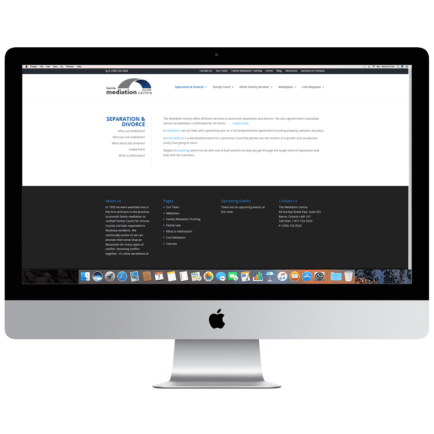
We created the branding and website for The Mediation Centre. It was an interesting project, conveying through the visuals, what the company represents. The icon shows a bridge between two points, essentially representing mediation and connection. The blue with large amounts of white space, creates a feeling of professionalism, trust, and confidence as a business.
In 1995 they were awarded one of the first contracts in the province to provide family mediation to ‘unified’ Family Courts for Simcoe County and later expanded to Muskoka residents. They continually evolve so they can provide Alternative Dispute Resolution for many types of conflict.
Mediation is open to anyone affected by family breakdown including separation, divorce and common-law.