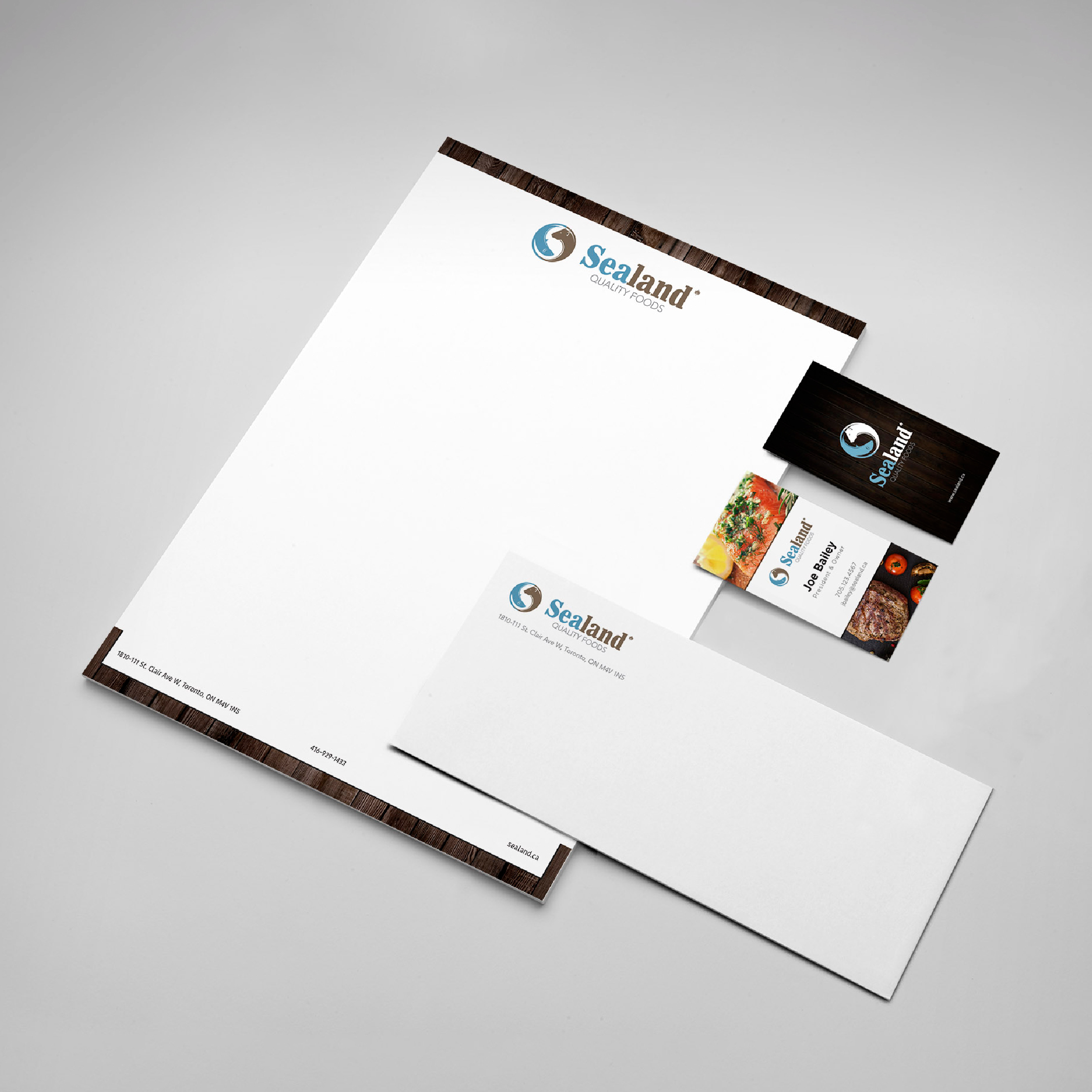
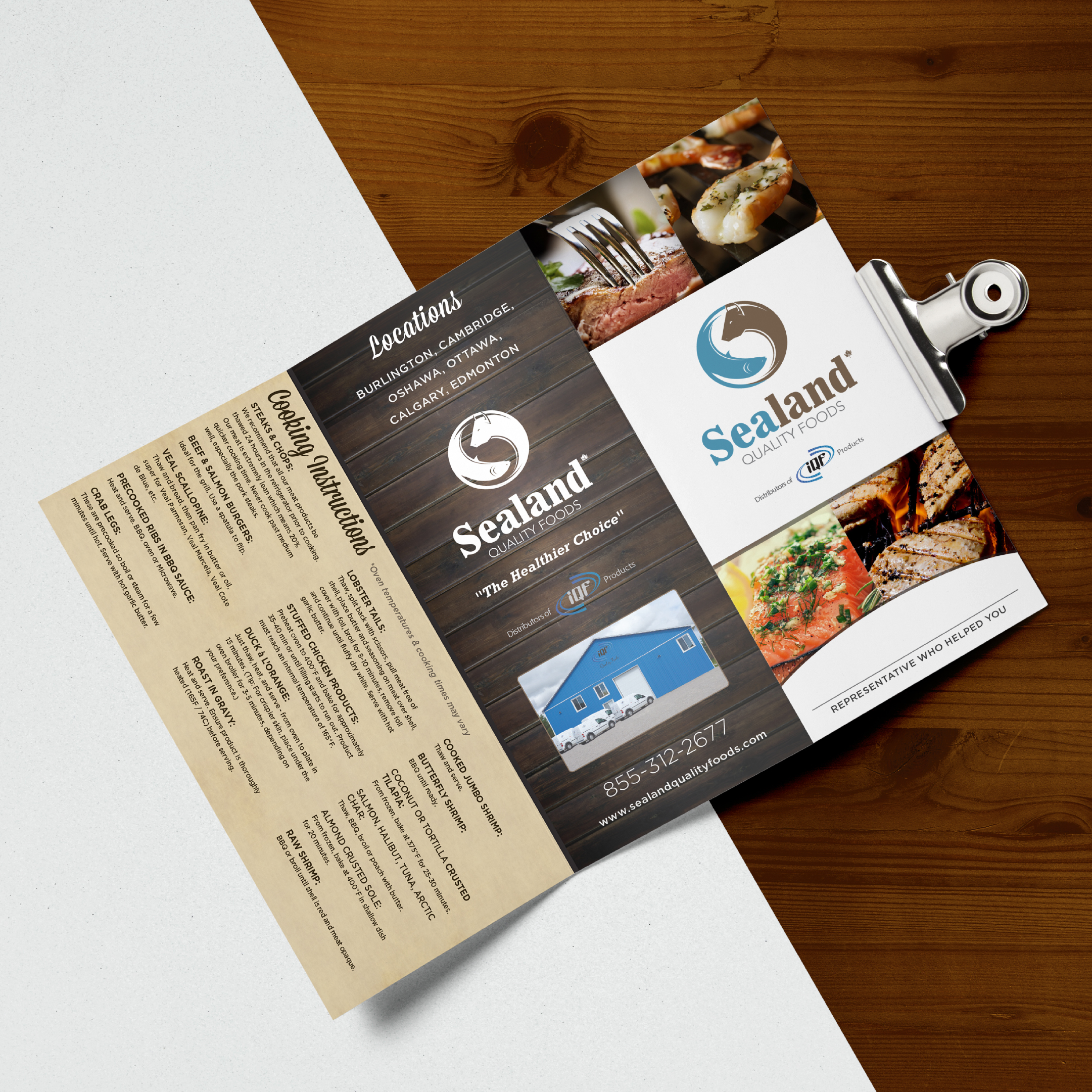
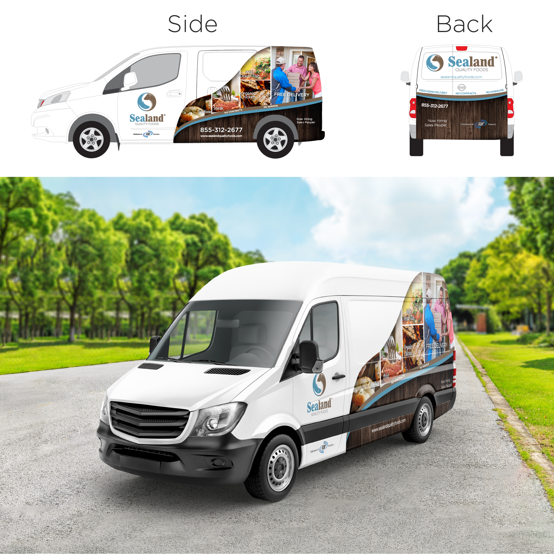

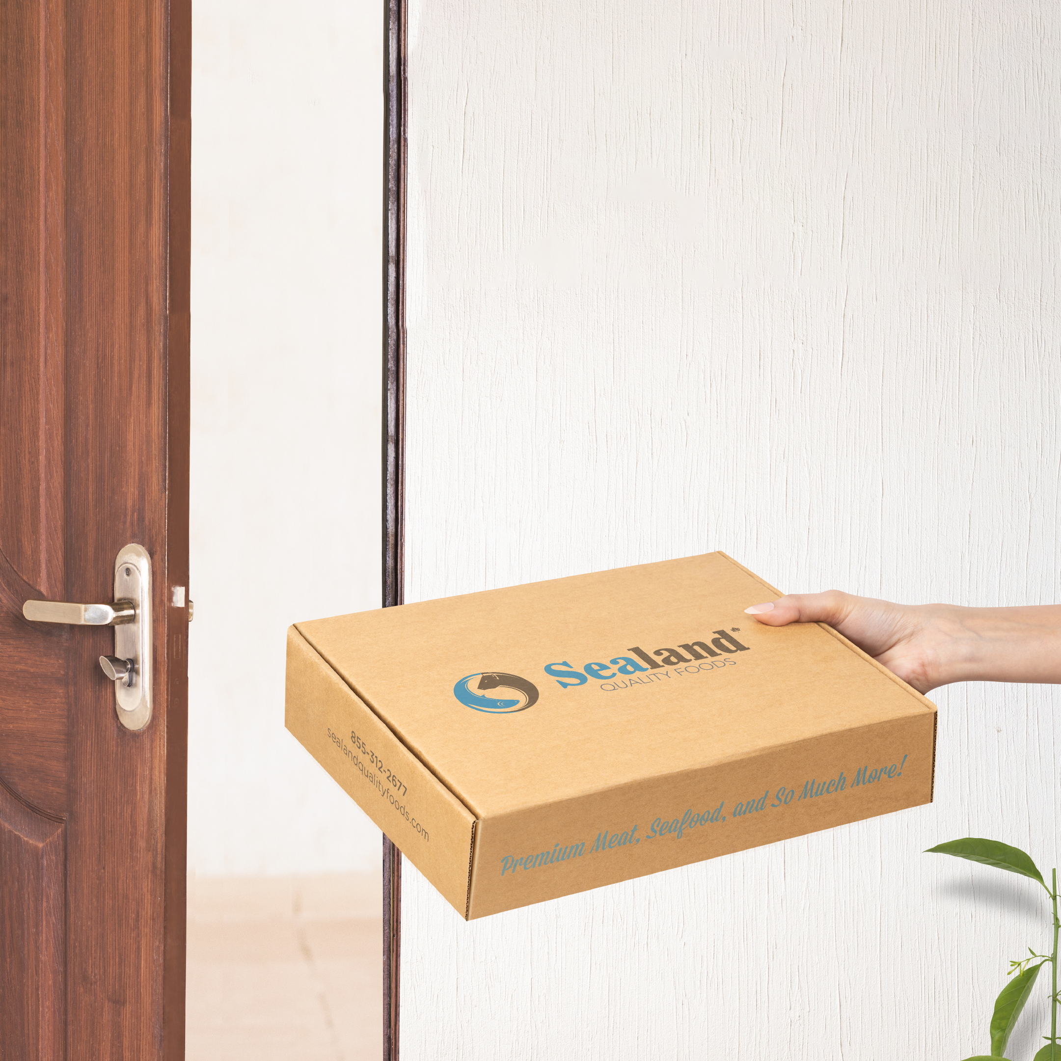
We were approached by IQF Quality Foods to rebrand to Sealand Quality Foods. We melded the mix of field and water animals, using the cow and fish for the icon. The icon has white space of an ‘S’ in between the cow and fish. The colours used are cool version of brown and blue, to symbolize freshness and professionalism. This has paired very well with photography of fresh food and attractive woodgrain backgrounds (we made a consistent part of the brand).
With a history of over 30 years, Sealand Quality Foods deliver iQF (individually Quick Frozen) Products directly to your home at a fraction of the cost that you would pay at a fine dining restaurant. Our products are not readily available on retail store shelves which is why you don’t see fine dining restaurant chefs shopping at a retail establishment either.
BRANDING, TRADESHOW BANNERS/BOOTHS, PRINT DESIGN, VEHICLE WRAPS