

Rhubarb Rhebrand
Rhubarb Rhebrands
After 16 years we decided it was time to rebrand our mark.
When I first embarked on this journey in 2006 as an entrepreneur having to provide for my family in a moment of necessity, I launched a design company and our design focus offering was mostly logos. Branding was where we started. I eventually picked up some skills, gear and staff and started doing video production, photography, websites, marketing plans, etc. We did it all. But over the years we’ve slowly re-focused our offerings, letting go of some of the other “media” forms and got back to our roots – naming and branding. We also seemed to be getting back to our origin story with the birth of the name Rhubarb.
When we were looking for a name for the company that wasn’t “Ballantyne Design”, I had certain criteria in mind.
We wanted it to be one word.
We wanted it to evoke emotion and story, which, at the time I didn’t understand, are the pillars of any great brand.
(I never went to school for this…Shhh)
We wanted it to be simple and memorable.
We wanted it to be personal, to mean something to me and my family.
I had pages of sample names I tested out but nothing rose to the surface. One day while browsing in a kitchenware shop downtown Barrie, we came across a plain white set of dishes and we loved them. We turned over the plate and saw the name of the company… Rhubarb. 🙂
It jumped out at me and Sandra said, “What about calling our company ‘Rhubarb’”. I agreed. I tested the name out with my bank teller, random strangers, friends and family. Since I didn’t want to taint anyone’s response as to what the name was for, I asked a very specific question.
What comes to mind when you hear the word, “rhubarb?”
The response?
Some started to salivate on the spot, eyes went big and they gushed, “I love, love, love rhubarb!” and they rattle off their faves… “Rhubarb pie, strawberry rhubarb jam, rhubarb crisp, cobbler, raw rhubarb with a glass of sugar to dip it in, rhubarb on ice cream, fritters, squares, rhubread, coffee cake, chutney, tea and so on. My grandma, my mom, my auntie made this and that…I remember the taste just thinking of it… sour, sweet, stringy, smooth, yum!”
Others were very quick and direct.
“Terrible stuff! Gross. Too sour. Hate it.”
Some referenced golf! “I lost my ball in the rhubarb!”
Others mentioned, baseball. A “rhubarb” is a fight between coaches and umpires.
In theatre, it’s a word actors say when they are pretending to speak in the background of a scene “rhubarb, rhubarb, rhubarb, rhubarb, rhubarb…”
It’s a verb, a noun an adjective.
It’s a fruit… no a vegetable… a stock? a plant? Bah!
We knew found something special. One word that evoked so much emotion, story and memory, tied to moments in time with family and friends, celebrations, events, etc. Even the negative response was emotional and strong. Memories of torture of having to not upset grandma and eat the entire piece of disgusting rhubarb pie! Rhubarb seems to have created a soul tattoo on so many!
The rhubarb on top of it all (cherries are over-rated) is that Sandra makes jams and jellies and we thought we could make Strawberry Rhubarb jam and give it to our clients.
We found our word. We found our name. And the design followed soon after.
Fast forward: It was on my mind for a few years to consider a re-boot on the logo, but it seems the pandemic and a return to the basics of our work created enough momentum to finally take the leap. Although we do this with client work, I didn’t do a bunch of research, poll our clients or do any competitive analysis. As with much of my work and creative expressions, it just felt right. To be honest, the new brand mark was going to be a one-off logo for a new sports sponsorship; something fun and recognizable from a distance, but as we started working with it, I sort of fell in love with it.
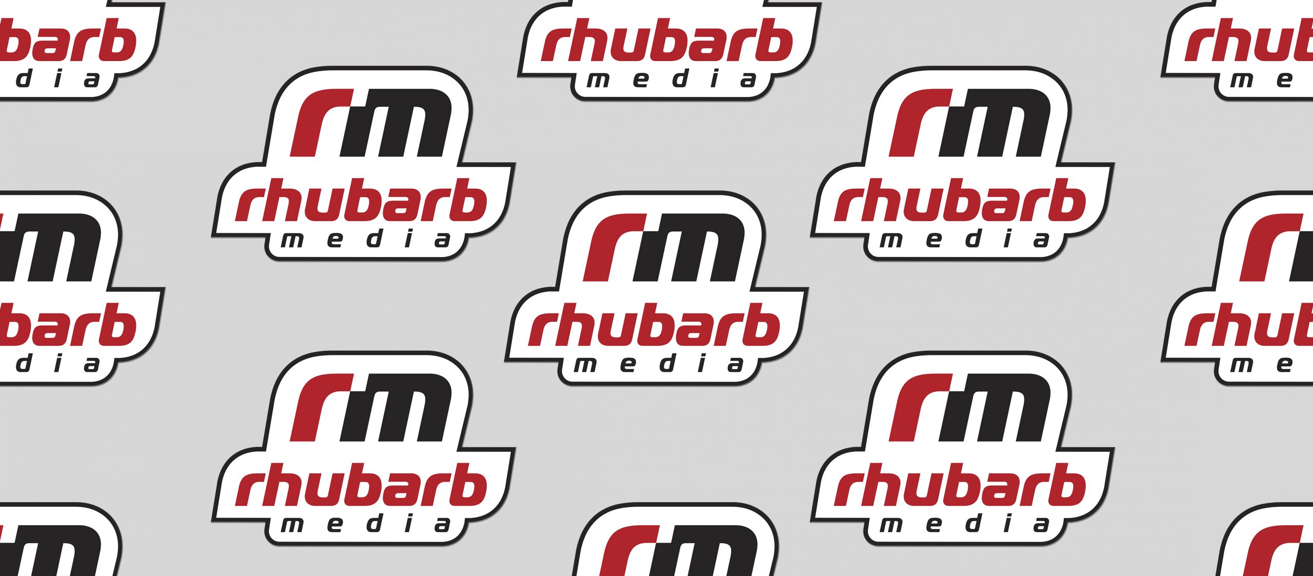
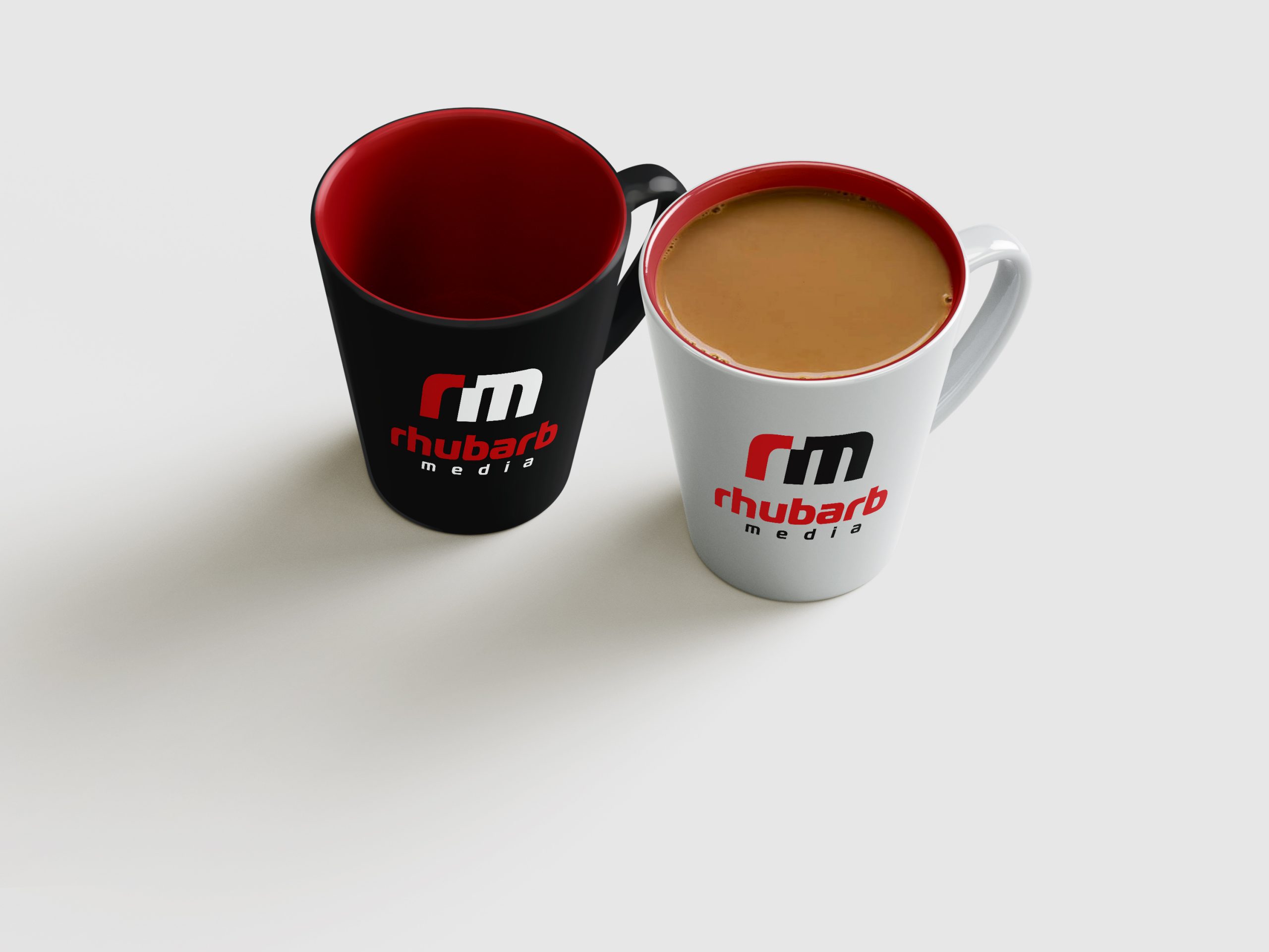
The new mark is a nod to three things we see as classic Rhubarb style:
Simplicity. As Steve Jobs said, “Simple can be harder than complex.” But it’s always the simple marks that last.
Logotypes. If you look through our archive of brands, you will notice a strong bent on font-based branding.
Space. I love white space. And the rm displays this in the spacing of the letters and the single space in the corner of the “m” that leaves room for something… it offers a window to new things and is the space for the “r” to snap into…. or did it break free? 🙂 I liked the artistic tension of this simple space element.
I also wanted to enhance a few things we thought the original logo was missing. I wanted something to symbolize our namesake. So the red “r” is the rhubarb. 🙂
I wanted the RM to be recognizable and for the word Rhubarb to stand out on its own since most people call us “Rhubarb.” We were batting around the idea of losing “media” in the brand name use but decided against it for now.
It does have a slightly retro vibe which adds nostalgic energy I tend to lean towards, as well as a sporty boldness which symbolizes how I feel coming out of these last 16 years and especially these past few years of business and life wonkiness. We’re ready to play! We’re ready to have fun!
With any rebrand, there’ll be lovers and haters. We get that, but whether you like, love, hate or are ambiguous, what doesn’t change is our overall brand philosophy to tell great stories through creative design, never compromise on quality and care for our clients. We care deeply about our clients because we know that the effects of our work go beyond the project. It impacts your company’s well-being and we want you to be able to live well and be stress-free. That’s why we’re always looking for new and better ways to treat our clients right.
We hope you like the new look, but more so we hope this re-vibe of the logo signifies a new chapter in our own story and we look forward to helping you tell yours.
Rhubarb (Media)
Your story. Well told.