No Results Found
The page you requested could not be found. Try refining your search, or use the navigation above to locate the post.

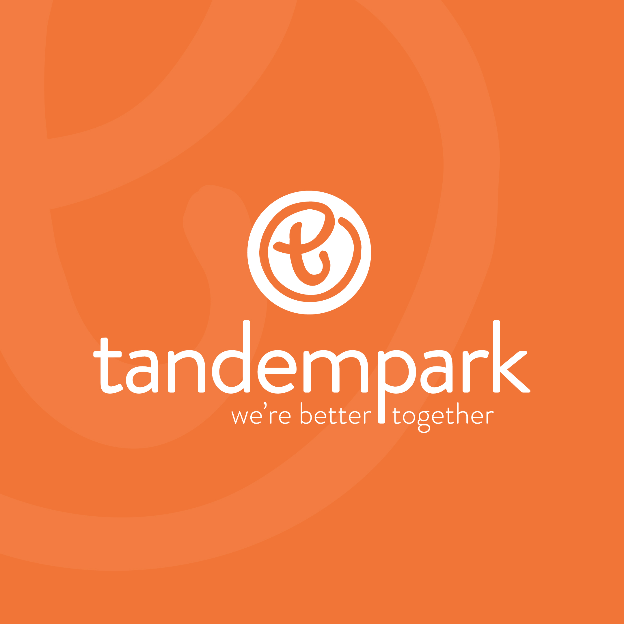
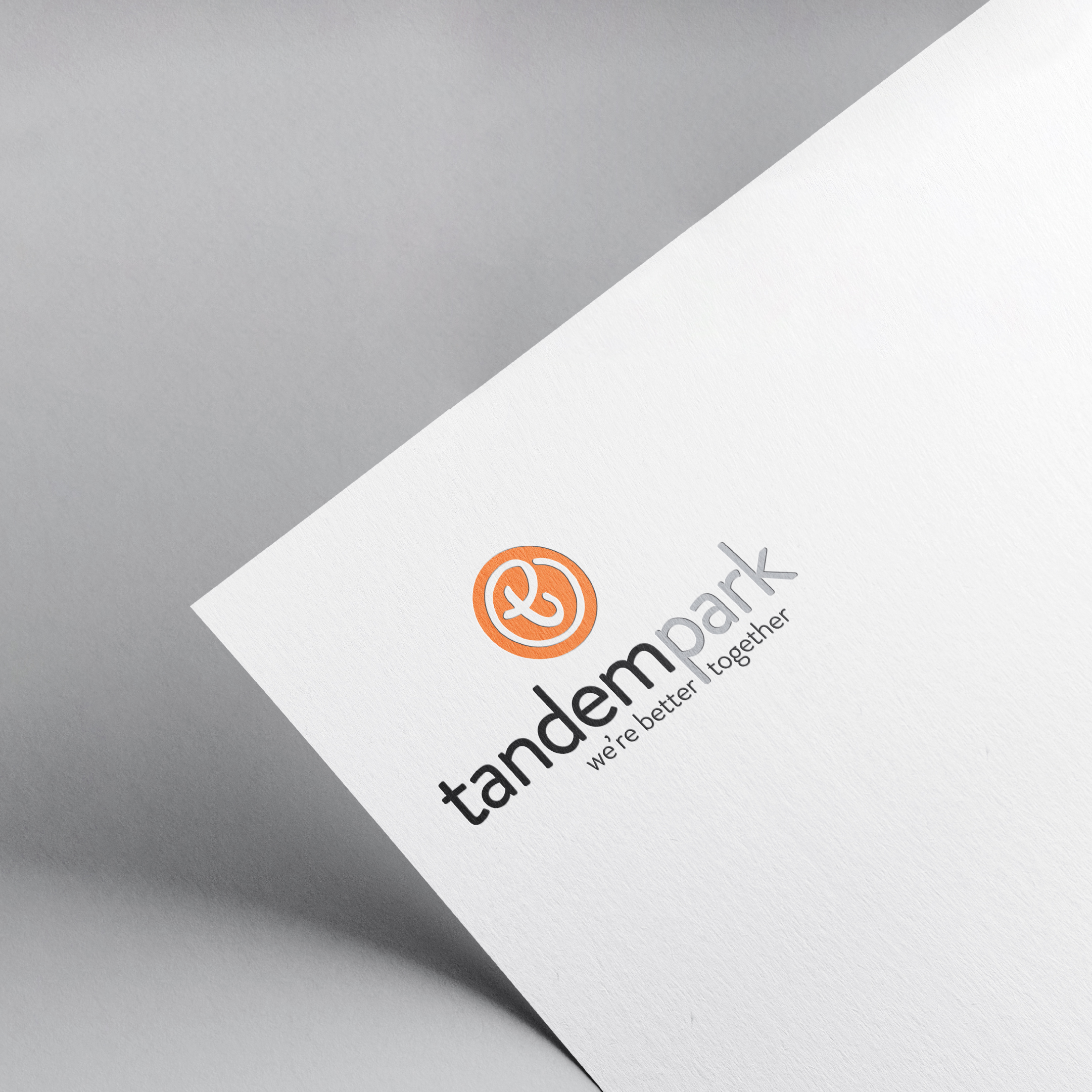
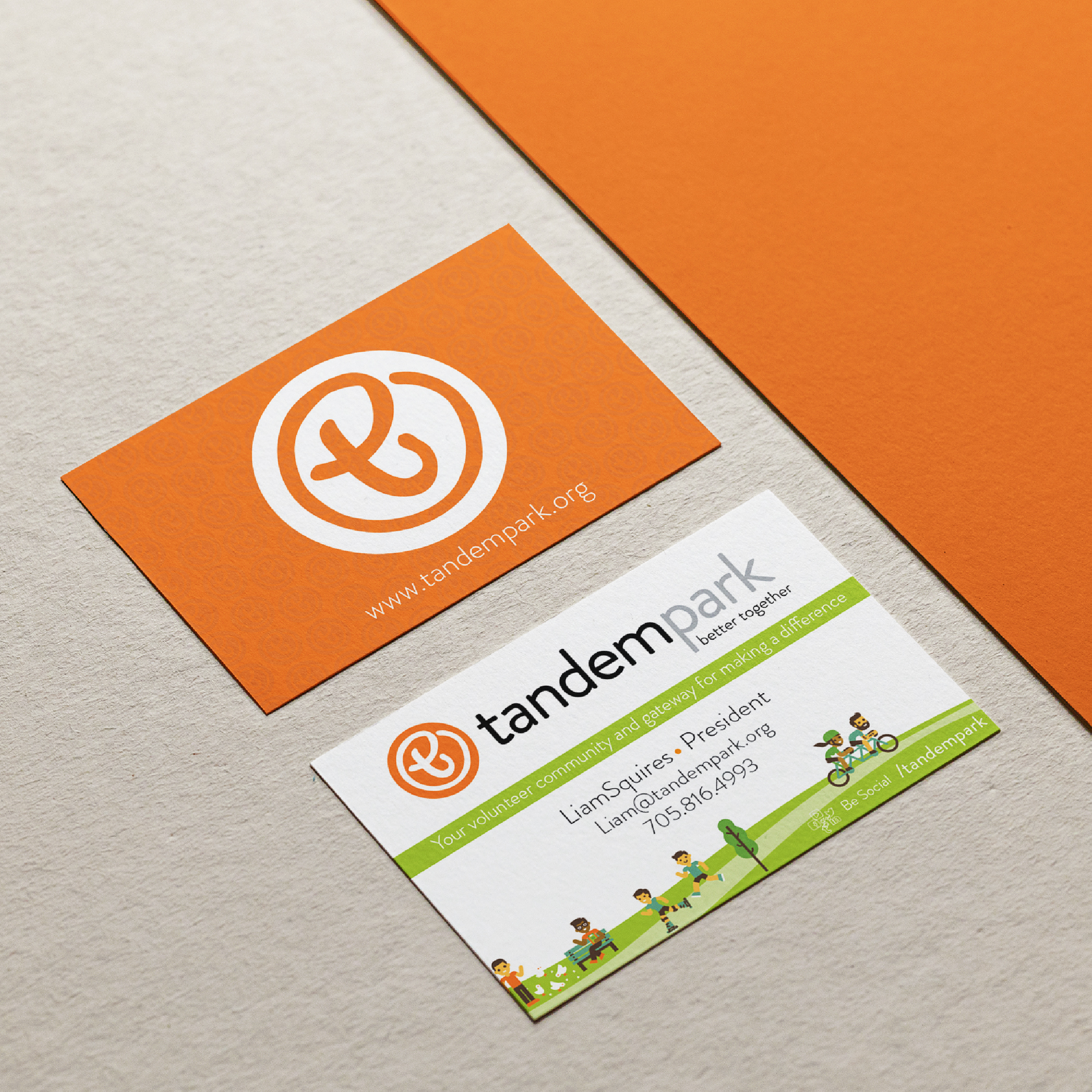
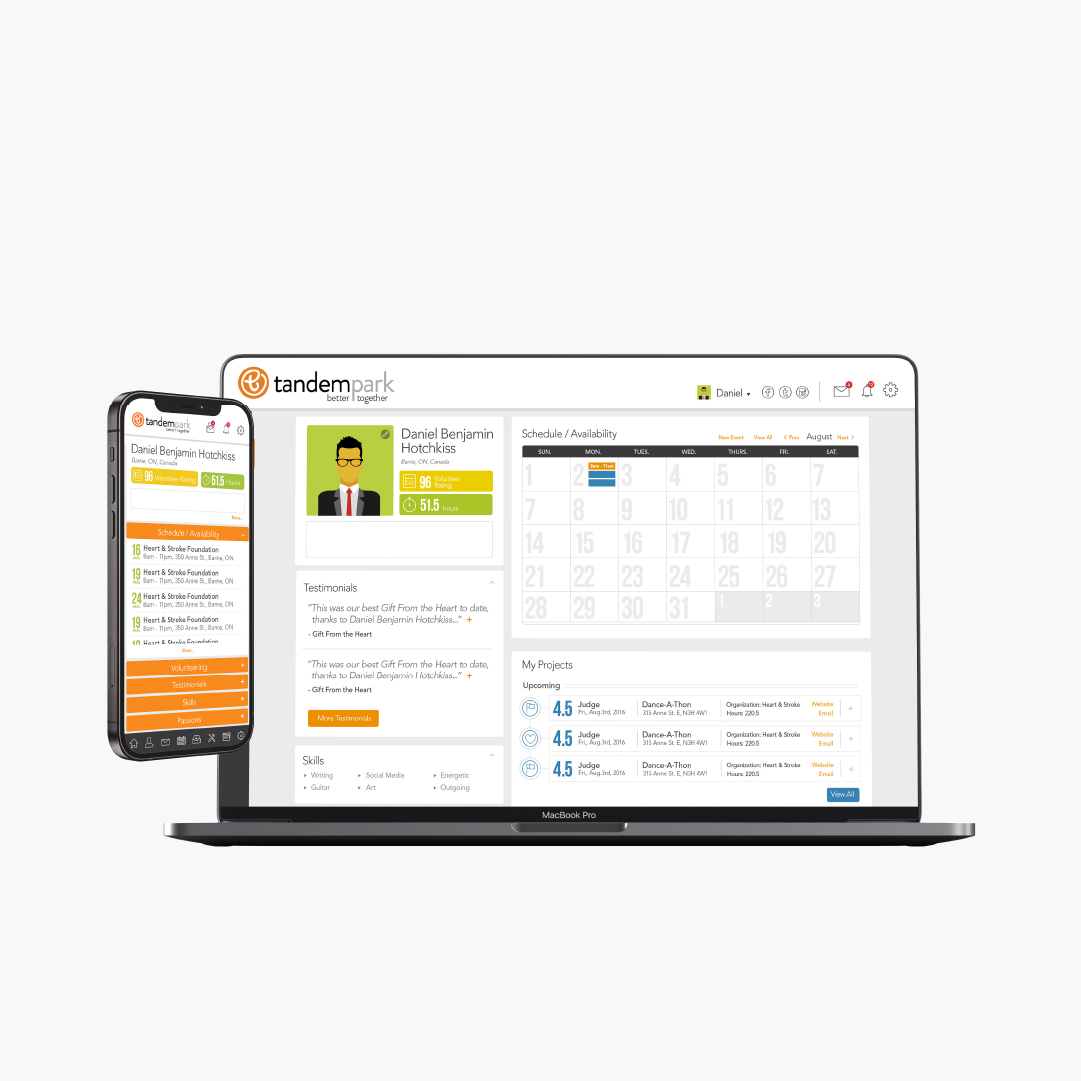
BACKGROUND
“Our message is a simple one. “Make a difference in someone’s life by making tomorrow better than today”. Our services to our community began in 1956 in the lobby of the Evangelical Church of the Deaf on Wellesley Street and that desire to make a difference is just as strong now as it was then. We are not done. As we reach out across the country we will overcome many challenges and break through countless obstacles. We will meet the needs of those we serve. One person at a time, one life at time.”
— Derek Rumball, President
Bob Rumball Canadian Centre of Excellence for the Deaf
Mission: To provide care and opportunities in a communication-rich environment that enhances the quality of life of those we serve.
Things we worked on:
BRANDING, PRINT COLLATERAL, WEBSITE
More Work
The page you requested could not be found. Try refining your search, or use the navigation above to locate the post.

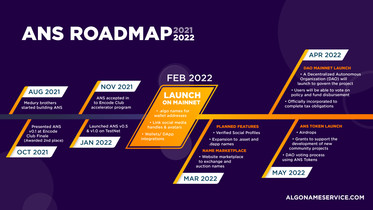

BRANDING | SOCIAL POSTS | MARKETING | ANIMATION
Sai Medury – Co-Founder
More Work
The page you requested could not be found. Try refining your search, or use the navigation above to locate the post.
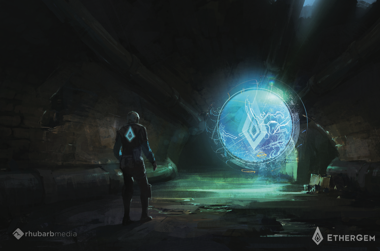
BACKGROUND
Ethergem is a fully functional Proof-of-Work primary blockchain originally based on Ethereum. Ethergem was created as a community-based coin with no pre-mine or ICO. We used the tested and proven ethereum (ETH) core technologies as a base and have added our own masternode technology with other upcoming innovative developments due to be released.
EGEM is a community supported project, which means its members are the backbone. We offer a custom node reward system that pays dividends to node holders, and a robust discord community with a bot that helps management of daily tasks for node holders and members.
More Work
The page you requested could not be found. Try refining your search, or use the navigation above to locate the post.

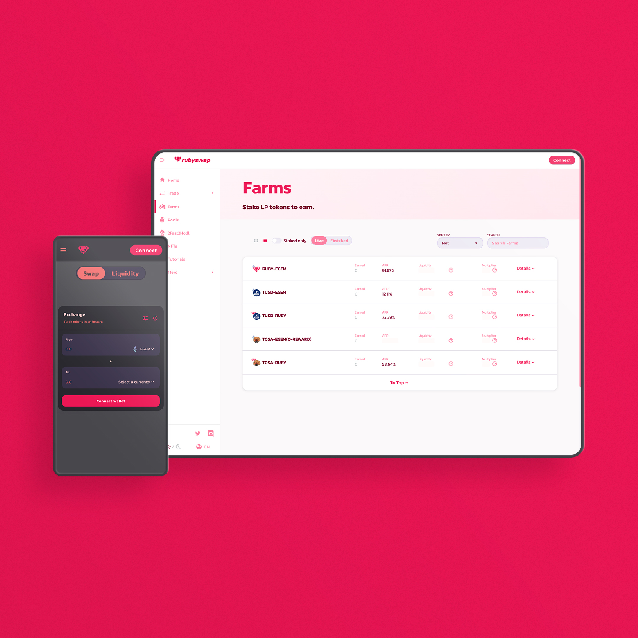

BACKGROUND
Based on popular AMM dexes like UniSwap and PancakeSwap, RubySwap allows users of the Egem network to create custom trading pairs and provide liquidity for any pair of tokens on the Egem network.
More Blockchain Work
The page you requested could not be found. Try refining your search, or use the navigation above to locate the post.
BACKGROUND
Bidify aims to be the premier tool for auction listing and selling NFTs on the Ethereum network and beyond. It will achieve this by using a unique incentive system which allows the listing website and a separate selling website to both collect a percentage of the final sale value. This totally decentralises the sale process and allows anybody to list or sell any NFT. This also allows anybody anywhere in the world to create an auction website and have a ready stream of NFTs for sale, including you!
More Blockchain Work
The page you requested could not be found. Try refining your search, or use the navigation above to locate the post.