No Results Found
The page you requested could not be found. Try refining your search, or use the navigation above to locate the post.

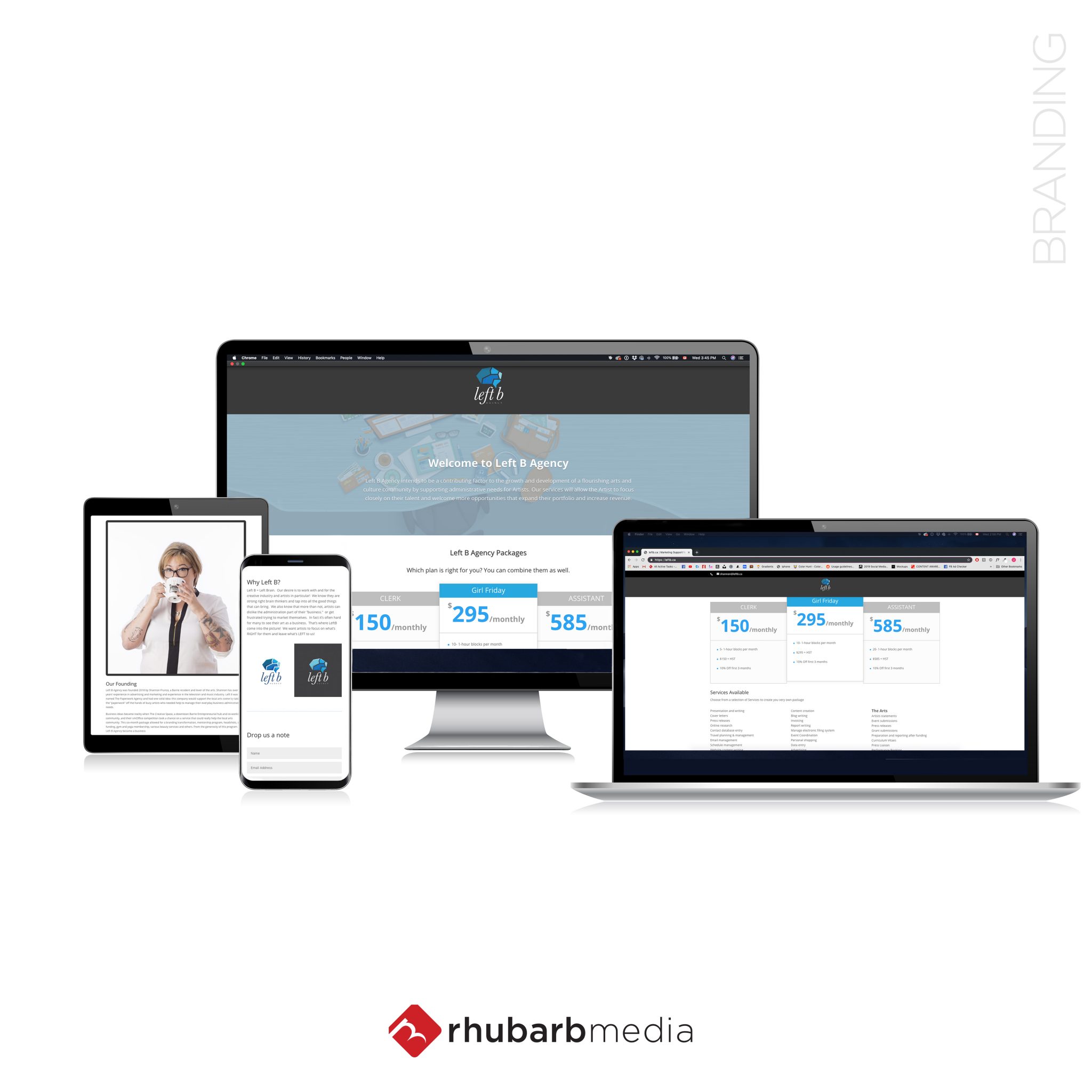
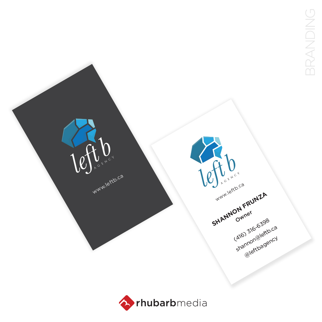
Left B Agency intends to be a contributing factor to the growth and development of a flourishing arts and culture community by supporting administrative needs for Artists. Their services allow the Artist to focus closely on their talent and welcome more opportunities that expand their portfolio and increase revenue.
Things we worked on:
BRANDING, WEBSITE, PRINT COLLATERAL
More Work
The page you requested could not be found. Try refining your search, or use the navigation above to locate the post.


As a new church in a highly creative community, we understand the importance of good design. Pastor Pixel has helped us with sermon series branding, signage, banners, space design, invitations, and more. I’ve worked with both volunteers and professionals before, but Pastor Pixel stands above them all. They do great work and have a passion for the message we’re communicating. Highly recommended.
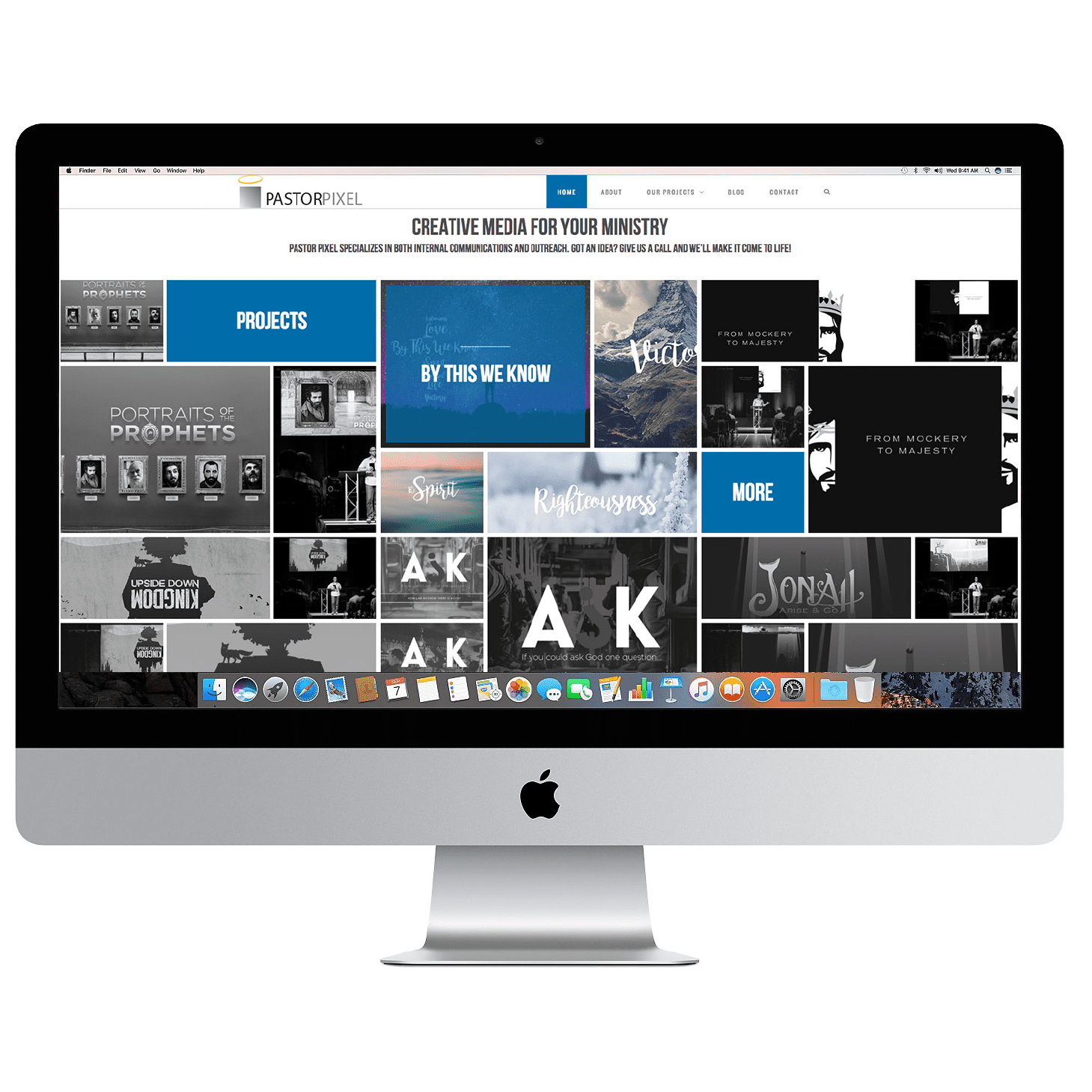
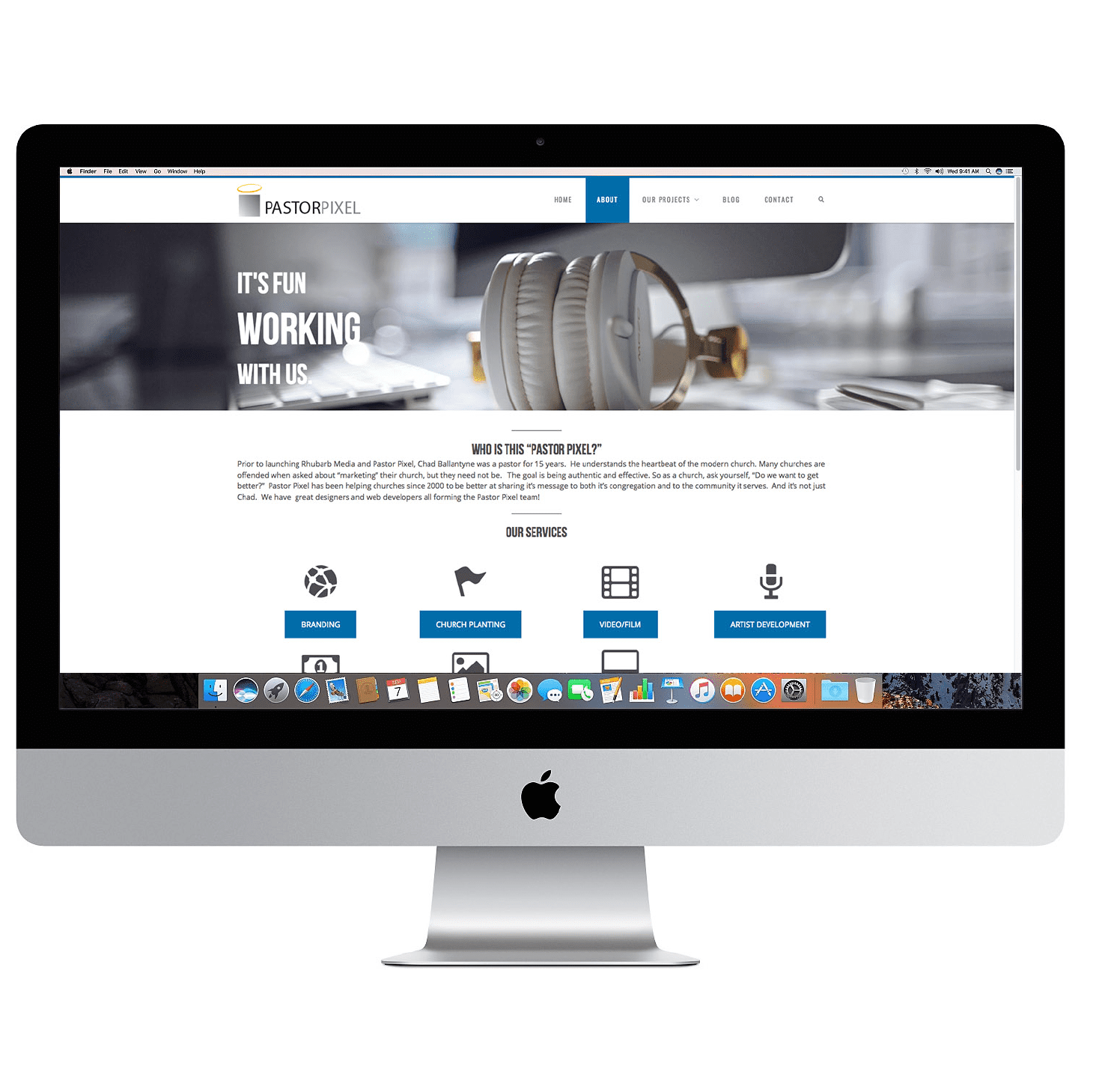
Prior to launching Rhubarb Media and Pastor Pixel, Chad Ballantyne was a pastor for 15 years. He understands the heartbeat of the modern church. Many churches are offended when asked about “marketing” their church, but they need not be. The goal is being authentic and effective. So as a church, ask yourself, “Do we want to get better?” Pastor Pixel has been helping churches since 2000 to be better at sharing it’s message to both it’s congregation and to the community it serves. And it’s not just Chad. We have great designers and web developers all forming the Pastor Pixel team!
BRANDING, ILLUSTRATION, TRADESHOW BANNERS/BOOTHS, PRINT DESIGN, VIDEOGRAPHY, PHOTO MANIPULATION, WEB DESIGN, MARKETING, & SOCIAL MEDIA.

You tied everything together beautifully. You were able to pull out the personality of our campaign by just listening to stories and our hearts.
It’s hard to explain but you were able to show the “need” of our campaign without actually focusing on it.
The second part of our campaign was the need for “branding”, as well as a website, marketing material, brochure etc.
Again, we ended up with a refreshing complete package. In short, the Pastor Pixel team was extremely professional, with an attention to detail and the uncanny ability to pull everything together within an extremely tight timeframe.

Background
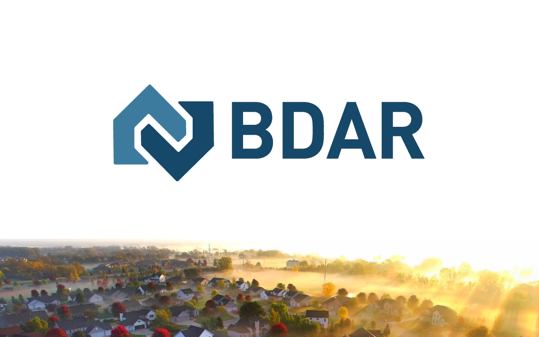
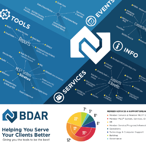
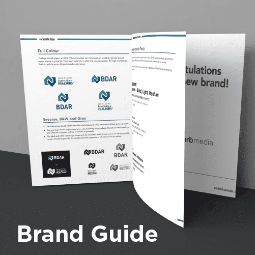
We had the pleasure of working with The Barrie & District Association of REALTORS® creating their brand identity. Through much deliberation, we designed a brand that reflects real estate, professionalism, and trustworthiness.
Things we worked on:
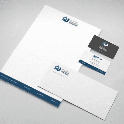
BRANDING, MARKING COLLATERAL, TRADE-SHOW BANNERS, ILLUSTRATIONS, PACKAGING DESIGN, WEB DESIGN
Your Team has been a huge part of the BDAR Reinvention journey, and we hope to continue building on you and your team’s expertise with some of our upcoming projects in the new year!
We met the Rhubarb team at a crucial transitional time for our organization. We were taking our beginning steps in our reinvention journey. To do that, we needed to start at the beginning – our brand. After meeting with Rhubarb, we know we were in good hands with our future direction. The creative team knew what BDAR was: innovative, forward-thinking, and moving in a new direction. The logo they designed, along with the formal branding, reflected who we were as an organization.
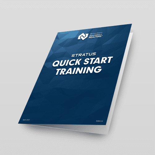
Since that time, we have worked with Rhubarb on a multitude of projects – each one delivered with high-quality branding and imagery. The projects are always met with a positive response from our members and instills a strong sense of professionalism within our community. This public image helps to increase confidence in our members as go-to real estate experts in the region.
Working with the Rhubarb team has been easy and enjoyable. We have developed a process that makes projects smooth from inception through edits to completion. We work fully as a team, resulting in beautiful graphics, annual reports, posters, and other marketing materials.
BDAR highly recommends working with Rhubarb – they are creative, able to communicate complex ideas simply, and professional yet fun! .
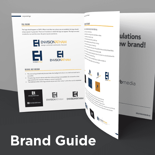
Background
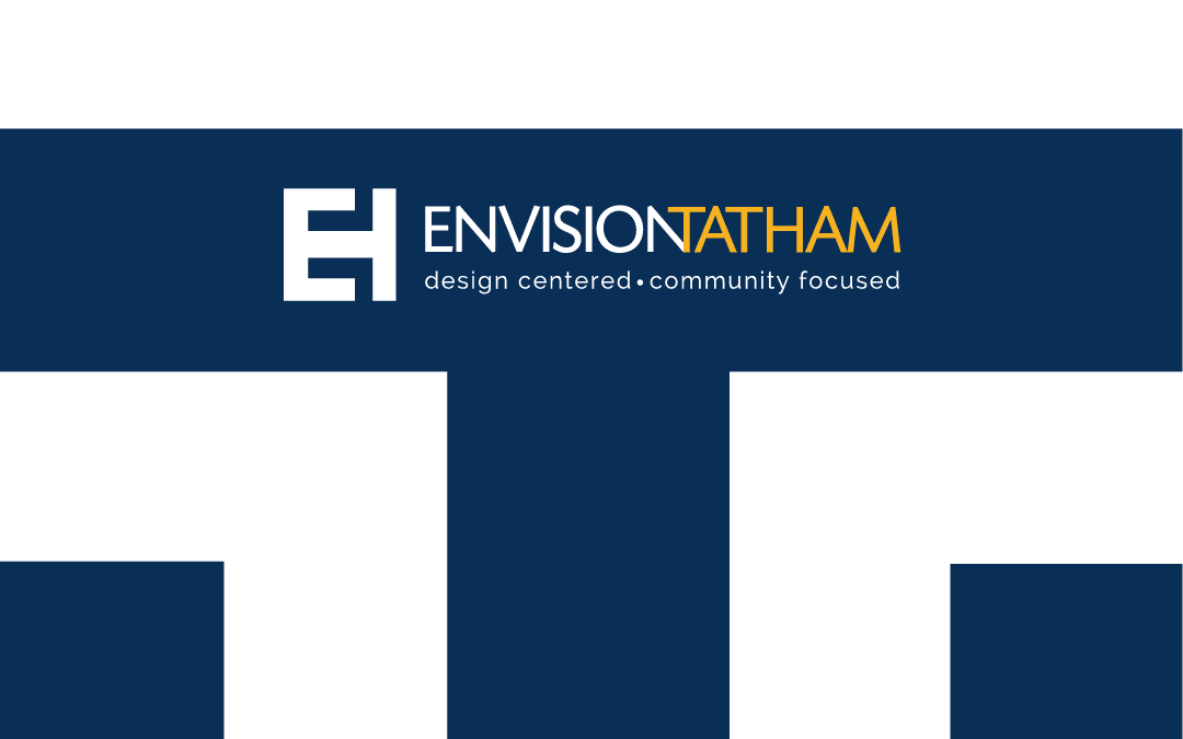
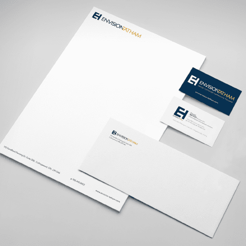
We were overjoyed when Envision Tatham approached us to do their branding – matching their branding quality to their product quality.
Envision Tatham are highly skilled in landscape architecture, urban design, site planning and arboriculture for a broad range of public and private sector clients across Ontario.
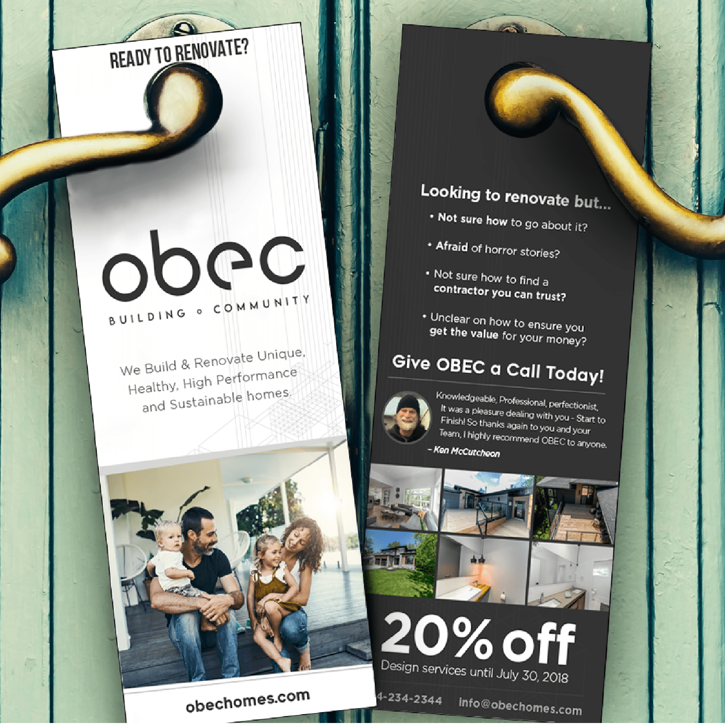
BACKGROUND
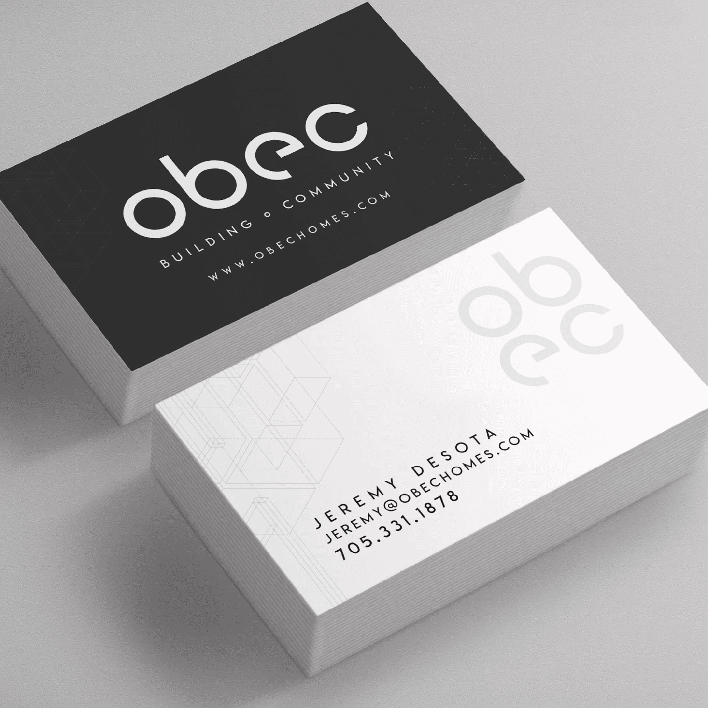
It was a pleasure working alongside Obec to create their new brand. Obec was founded on a passion to build & renovate unique, healthy, high performance and sustainable homes.
In keeping with the architectural design focus, we designed a modern and minimalist style brand to represents their focus on aesthetically pleasing form, while expressing the function of being structurally sound and perfect in design.
Things we worked on:
BRANDING, PRINT DESIGN