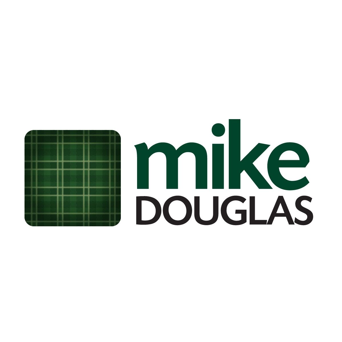


BACKGROUND
Mike came to us to brand him as a different kind of realtor. Through research, meetings, and surveys we came up with this unique traditional-looking logo. We research the Douglas family heritage and found it’s Tartan. Mike wanted to be known for being trusted and passionate about family, heritage, and home.
The tartan swatch evokes these characteristics while setting him apart from the plethora of same old colours traditional seen in real estate brands.