No Results Found
The page you requested could not be found. Try refining your search, or use the navigation above to locate the post.

BACKGROUND
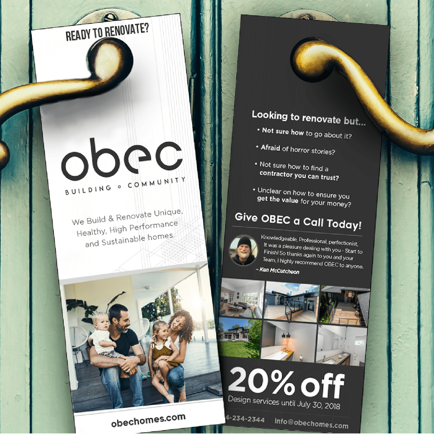
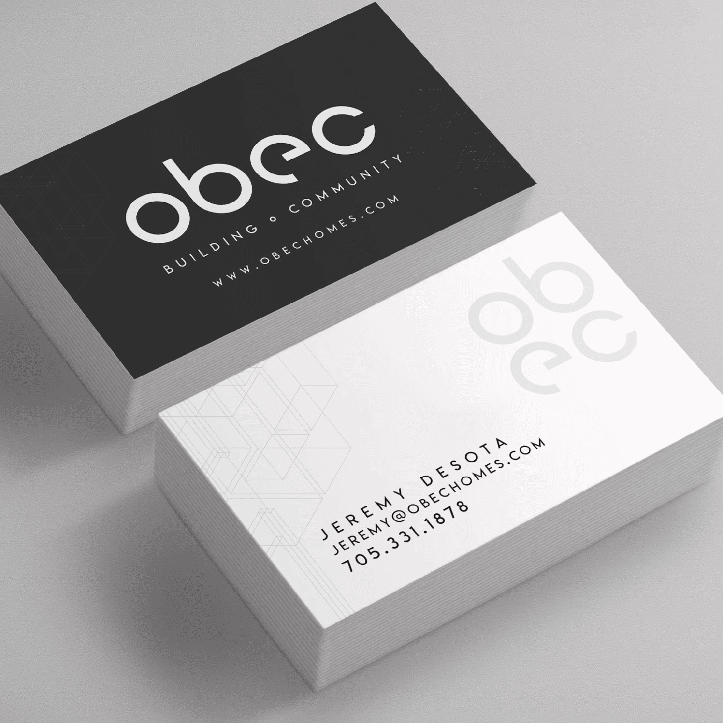
It was a pleasure working alongside Obec to create their new brand. Obec was founded on a passion to build & renovate unique, healthy, high performance and sustainable homes.
In keeping with the architectural design focus, we designed a modern and minimalist style brand to represents their focus on aesthetically pleasing form, while expressing the function of being structurally sound and perfect in design.
Things we worked on:
BRANDING, PRINT DESIGN
More Work
The page you requested could not be found. Try refining your search, or use the navigation above to locate the post.

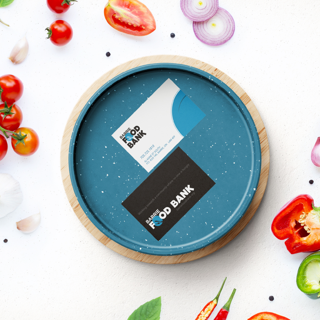

Background
The Barrie Food Bank’s mission is: to provide temporary food relief to individuals and families of our community who are in need, and to serve as a resource to guide them along the road to self-sufficiency. Their policies are designed to achieve this mandate. To this end they seek to encourage self-sufficiency. In their service of those who come to them for assistance, they strive to demonstrate compassion and respect for their dignity, and to serve as a source of encouragement.
How we served
In 2011, Barrie Food Bank realized they could better achieve their goals by better communicating with their supporters. Up until then, their interactions had been through traditional channels like radio and newspapers. Rhubarb Media sponsored the logo, website and other design needs for Barrie Food Bank, which helped the Food Bank increase funding exponentially. This improved the Food Bank’s ability to meet the 48% increase in usage over the past two years, with more than 32,000 families being served in 2013. The immediate positive impact of families being fed will also have an immeasurable impact on how well these families can function and then give back to the community in the long-term.
More Work
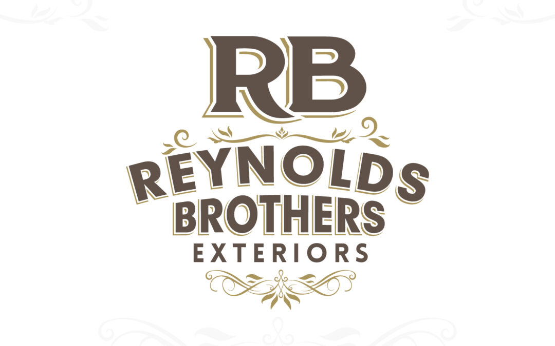

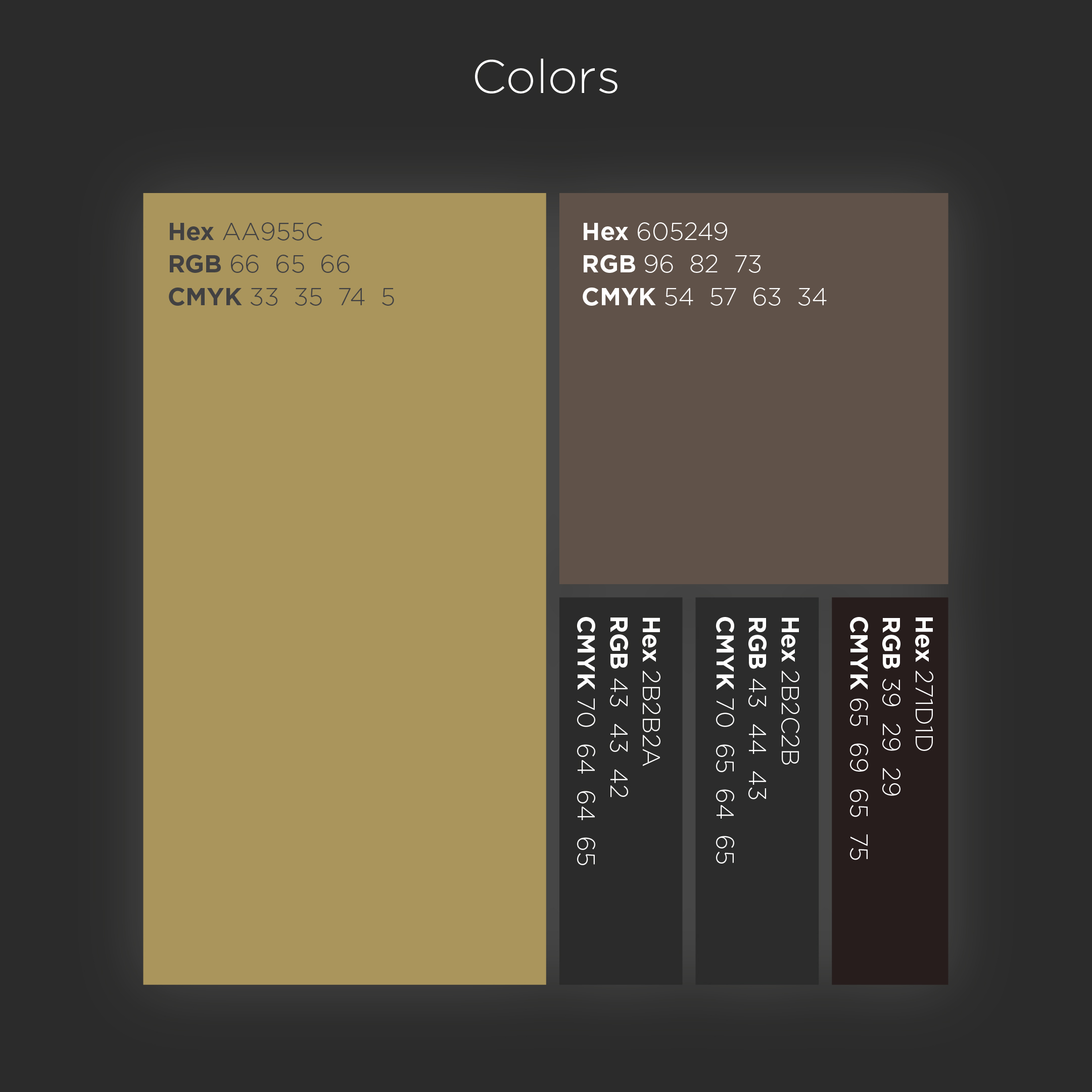
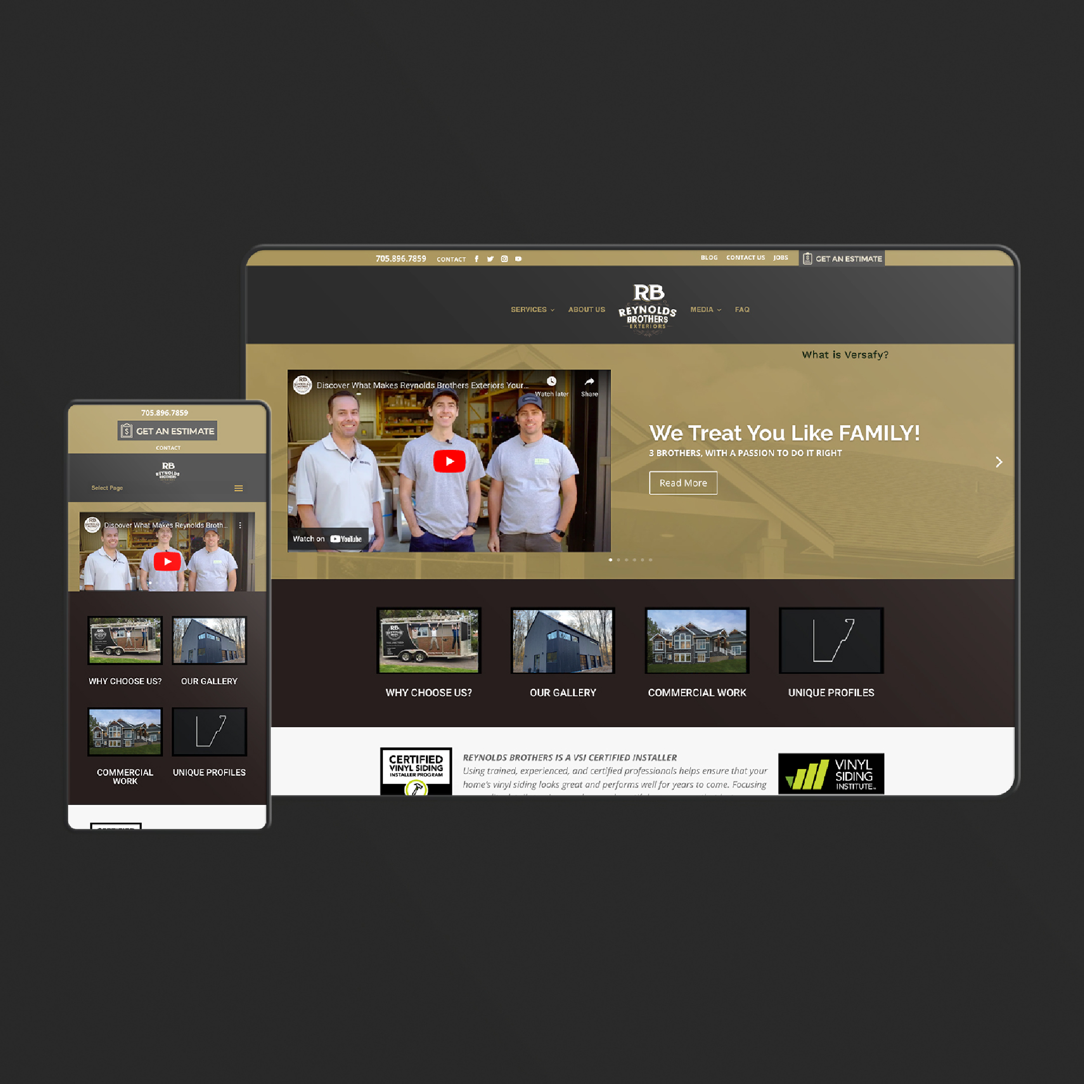
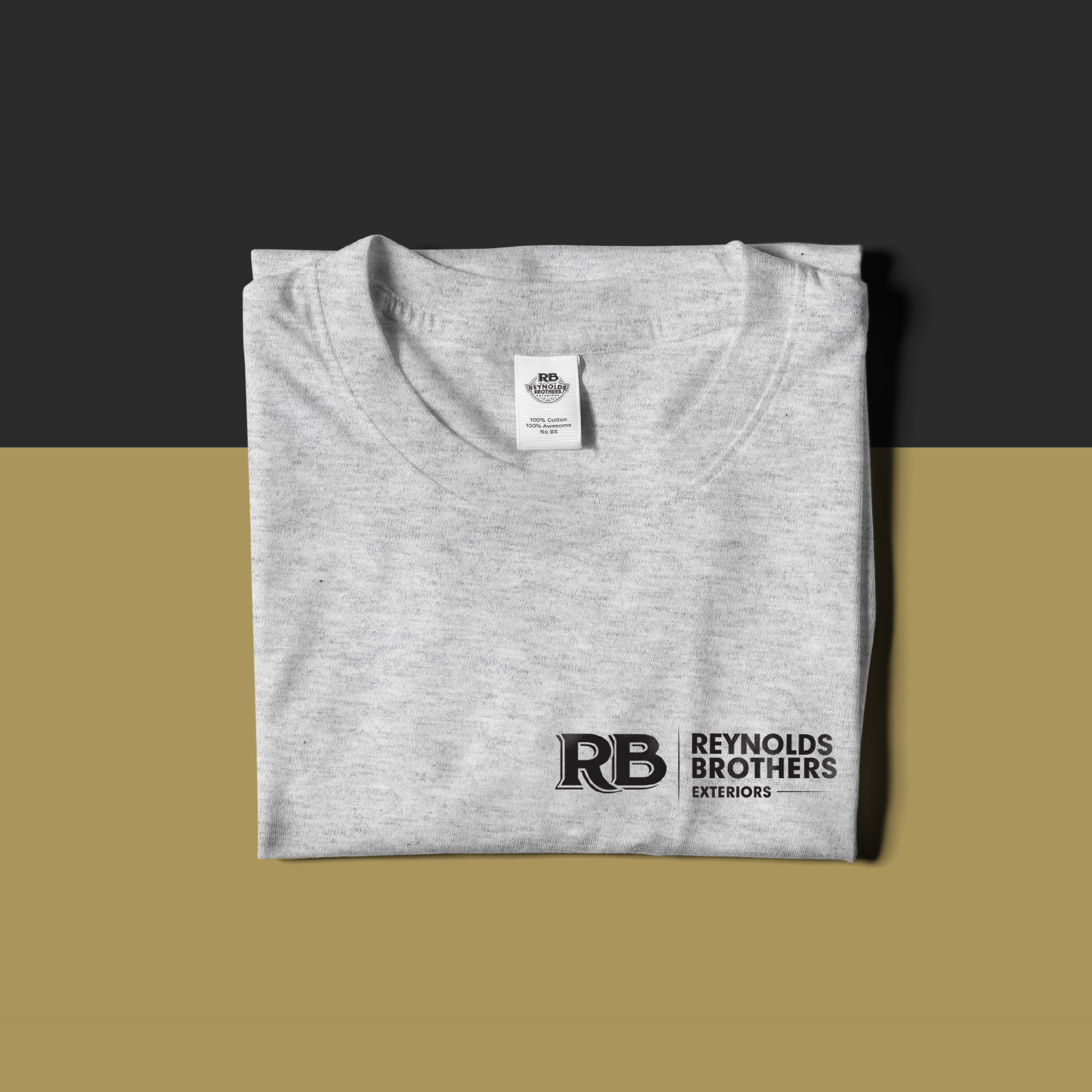
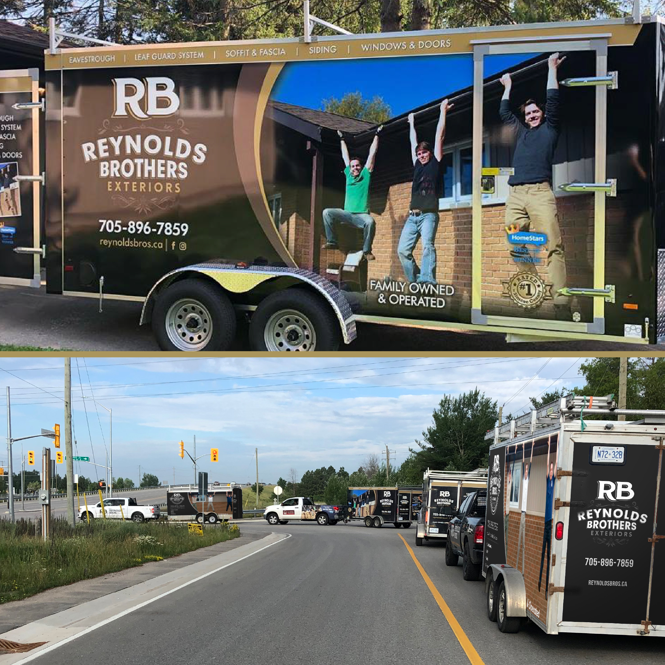
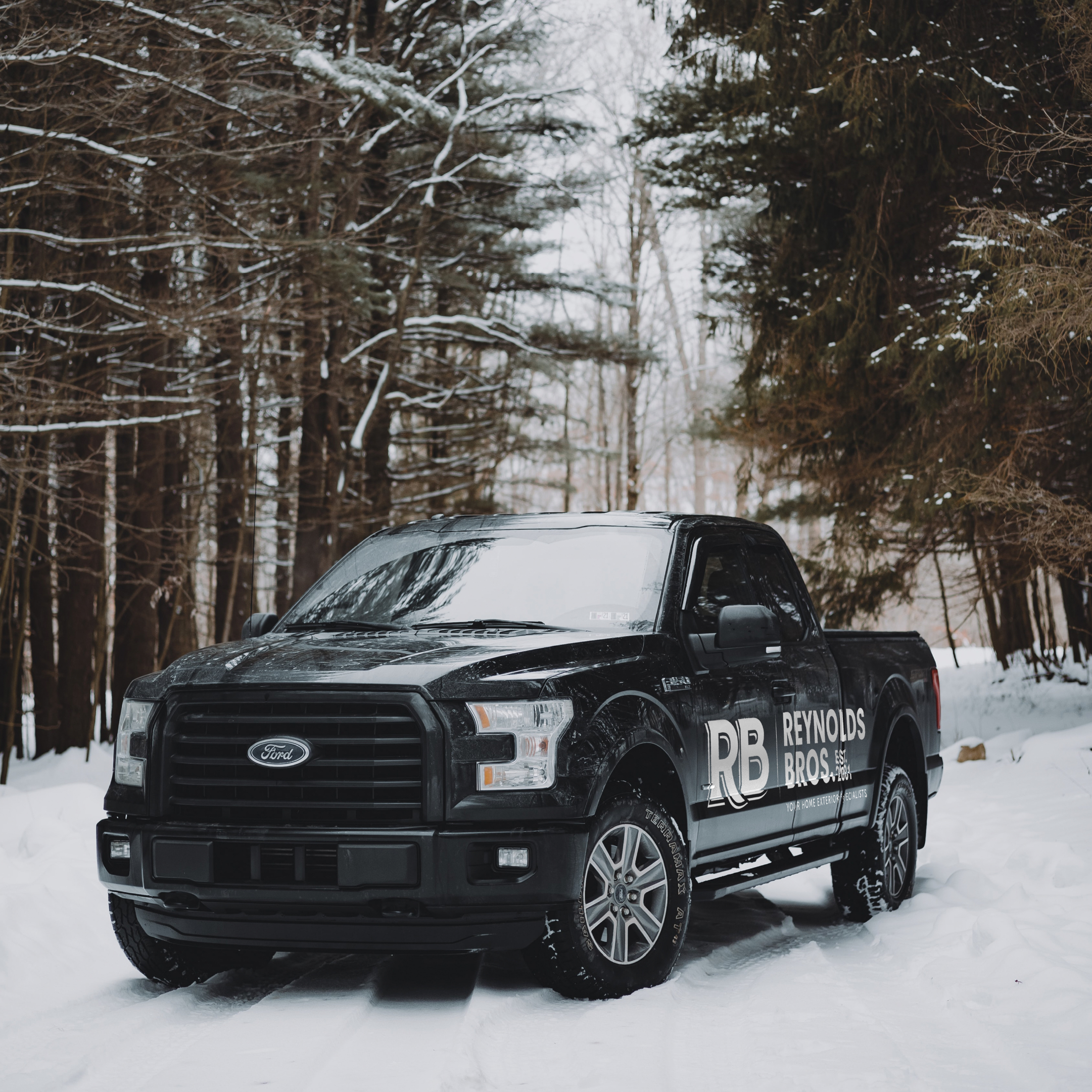
The Reynolds Brothers logo was an interesting project. They wanted it to look current and attractive, but at the same time convey a sense of tradition and heritage. We feel like we created just that. We provided a couple variations of the logo – simplified ones to the full one with the flairs. These all match with brand well.
“We are Shawn, Neil and Ryan Reynolds, three close-knit brothers who joined together to start up our own family owned and operated eavestrough & exteriors company. Each of us are also homeowners, thus Reynolds Brothers Exteriors can relate to how much your home means to you. There are so many options out there it is difficult to know who to trust when it comes to working on your home.”
—Reynold’s Brothers
BRANDING, VEHICLE WRAP, PHOTO MANIPULATION, WEB DESIGN
More Work
The page you requested could not be found. Try refining your search, or use the navigation above to locate the post.


BACKGROUND
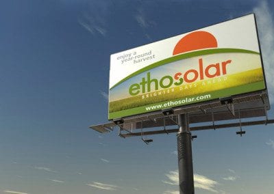
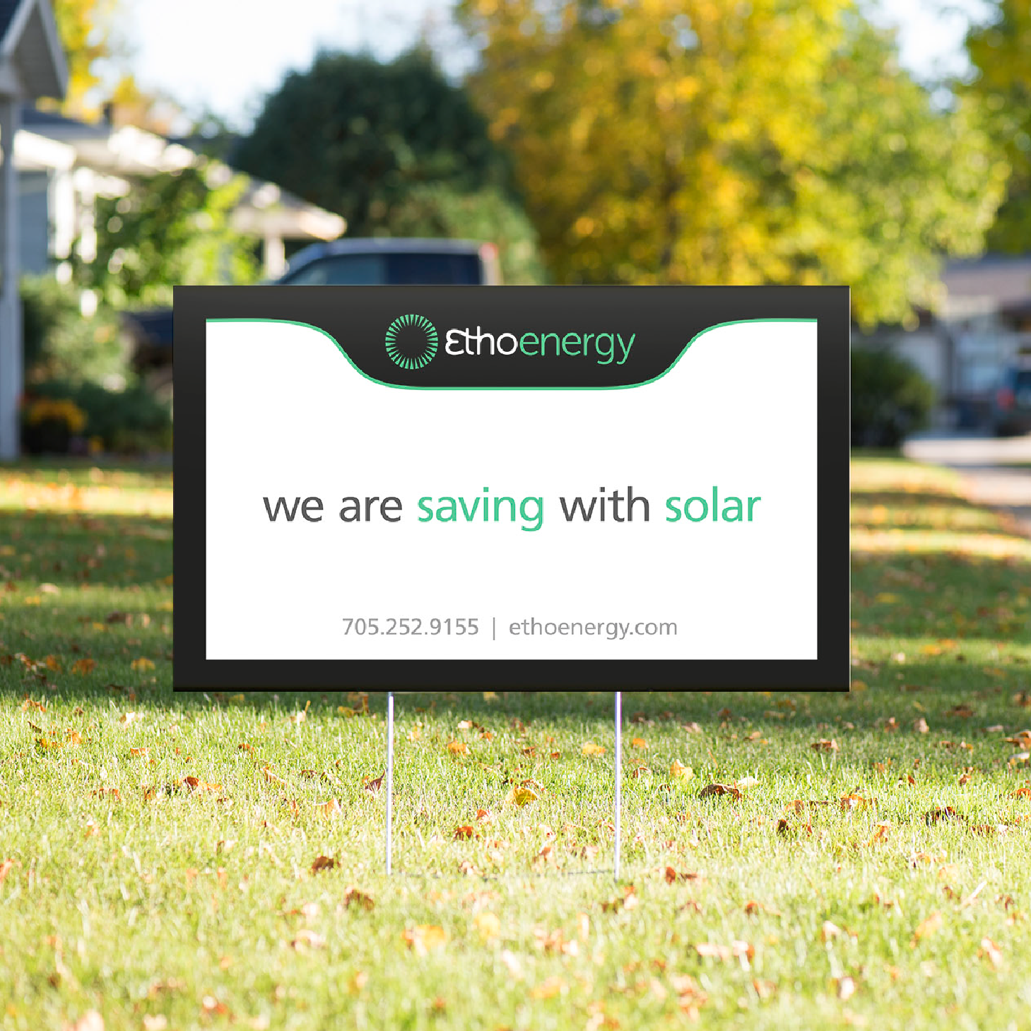
EthoEnergy was Ontario’s longest standing renewable energy solutions provider, directly developing and overseeing 1,500+ projects for agri-business, residential, industrial and commercial clients throughout Ontario and Northeastern US. From 2009 to 2018, they served over 1000 homeowners, business owners and farmers.
Ethoenergy recently has retired from the solar business and the owners have melded their skills and specialties into a new company called OBEC.
Things we worked on:
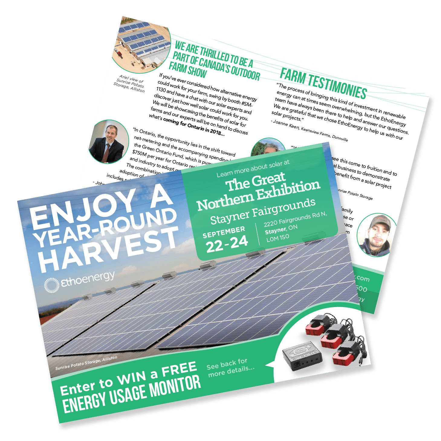
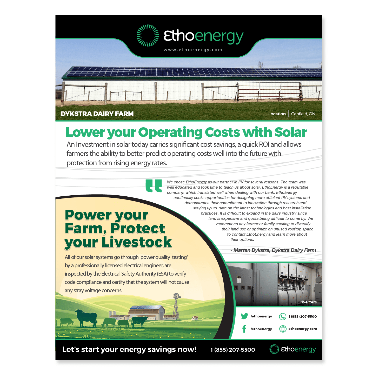
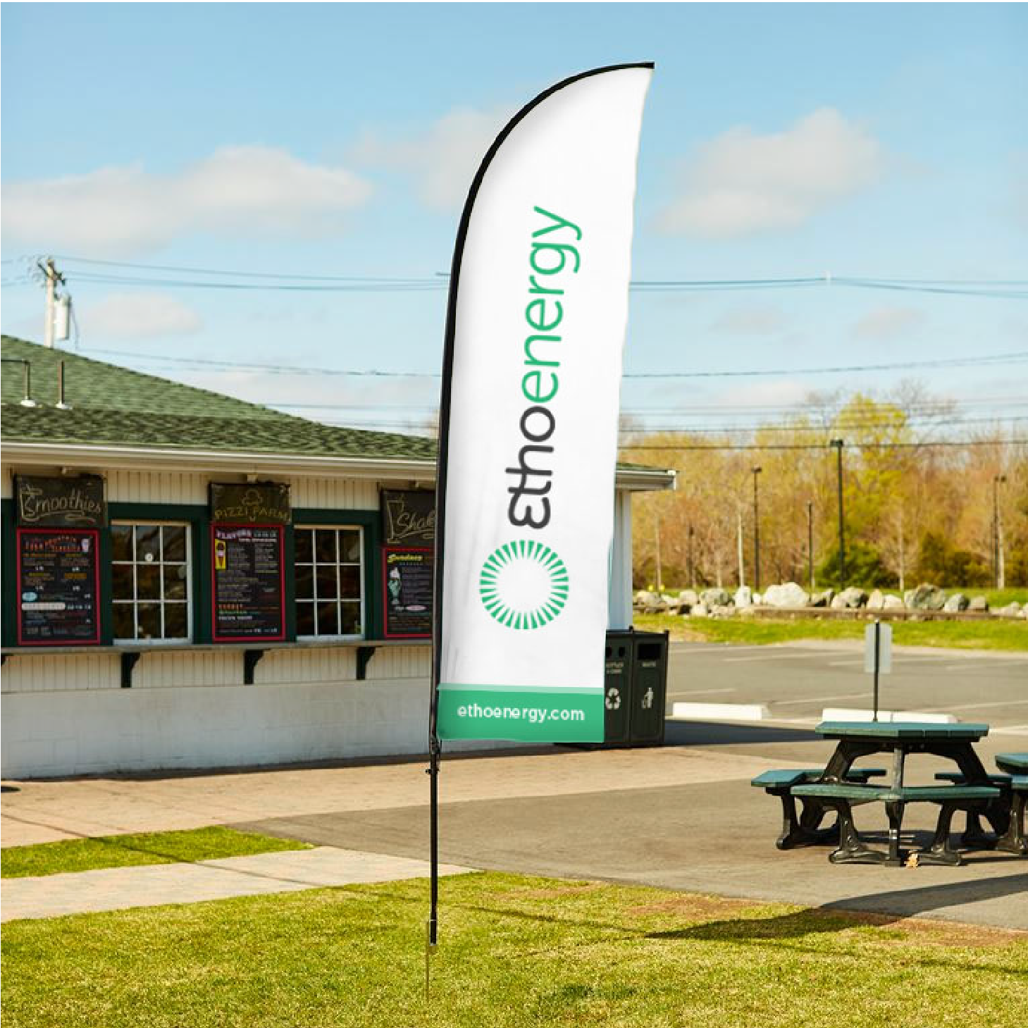
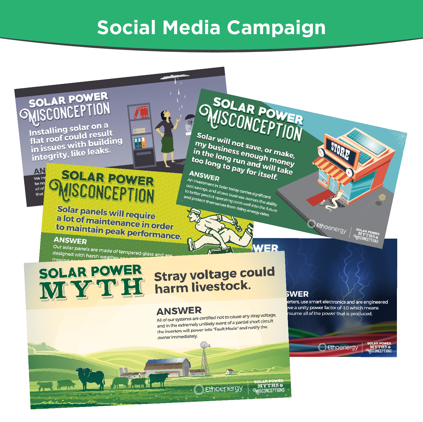
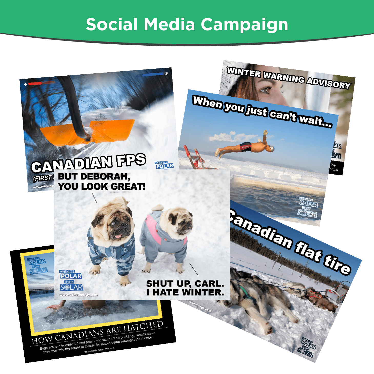
BRANDING, TRADESHOW BANNERS/BOOTHS, PRINT DESIGN, PHOTO MANIPULATION, WEB DESIGN, MARKETING, & SOCIAL MEDIA, VEHICLE WRAP
More Work
The page you requested could not be found. Try refining your search, or use the navigation above to locate the post.
Background
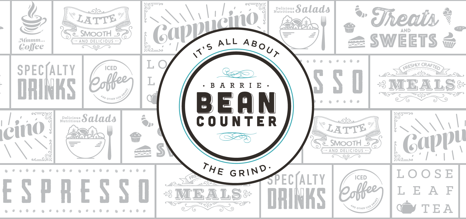
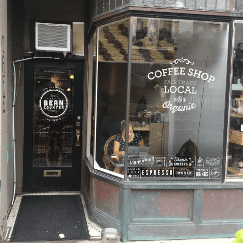
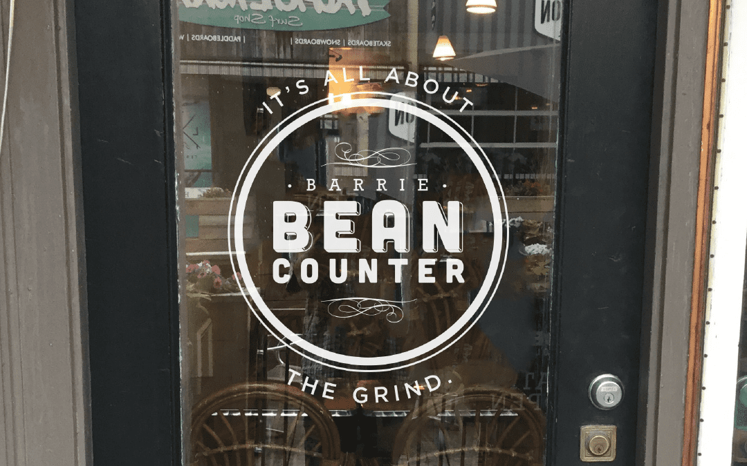
Grabbing a morning coffee or a delicious lunch snack, Barrie Bean Counter is THE place to be. We were really excited to work with them, to revise their branding and design the beautiful storefront artwork they deserve.
BRANDING, PRINT DECALS, ILLUSTRATION
More Work
The page you requested could not be found. Try refining your search, or use the navigation above to locate the post.